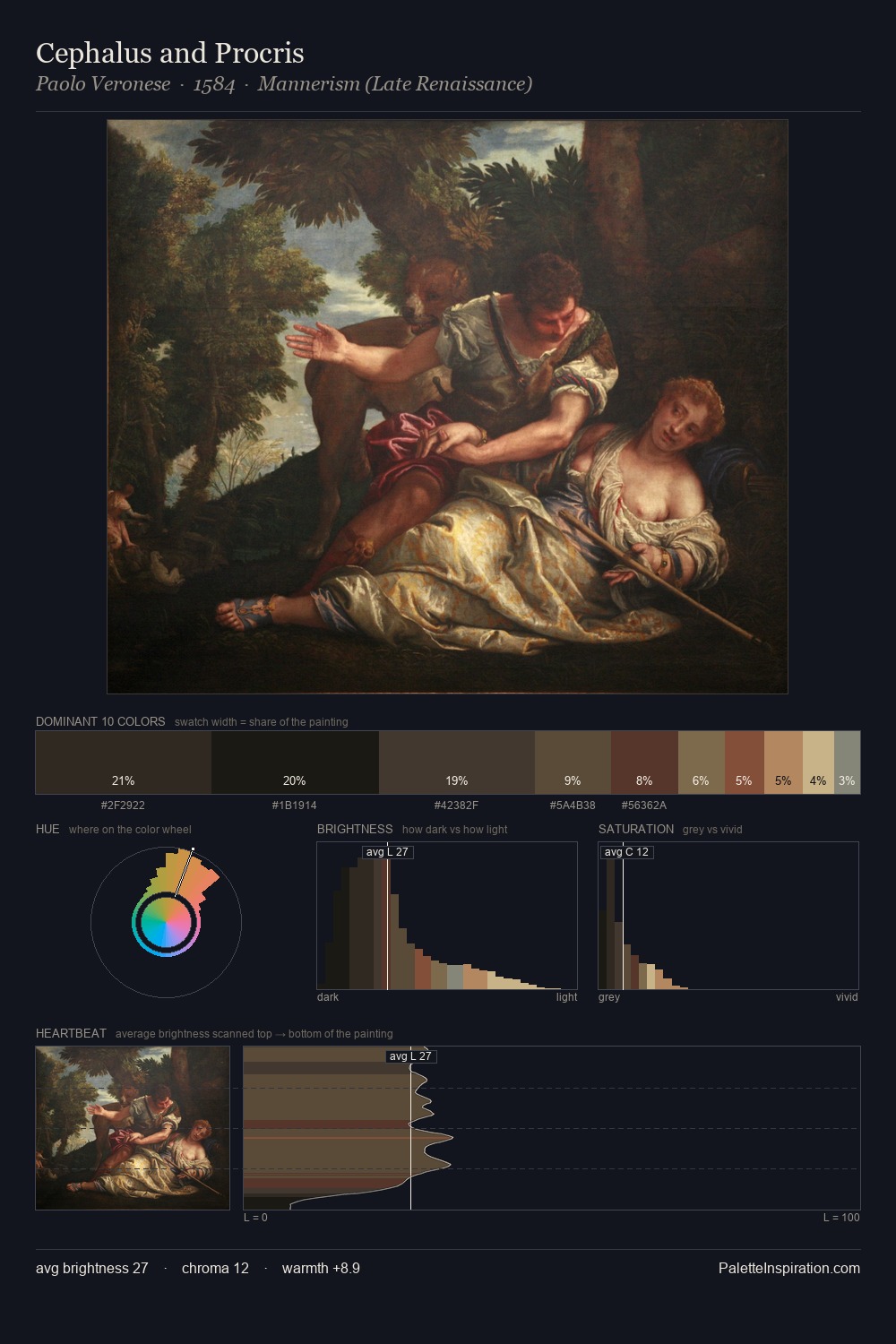
Paolo Veronese Palette 13
Penumbral Bister
Penumbral Partial shadow - the transitional zone between light and full dark, soft-edged.
Bister Dark warm brown - a traditional ink and wash pigment made from wood soot.

Palette Analysis
Values in Paolo Veronese rest in the mid-range - neither dramatically lit nor steeped in shadow. Paolo Veronese tilts toward cool - blues and silver-greys carry the structural weight. Chroma is kept low across all colours, producing the soft, enveloping quality that characterises tonal painting. #AB8658 functions as the palette's exclamation mark: highest chroma, lowest percentage (7.0%). The palette spans 51 value units: a measured range that delivers coherence over drama. The palette has the character of outdoor light: cool, mid-bright, with colour rendered faithfully rather than expressively. Palette 13 sits within the larger chromatic argument that Paolo Veronese's complete body of work advances.
Example use cases
- theater design
- jewelry brands
- tobacco-adjacent retail
- event branding
- film & entertainment
I Love This!
Use This Palette
Copy, export, or download for your project
Copy, export, or download for your project
Copy:
Download:
Share: