Paolo Veronese Palette 15

Palette Analysis
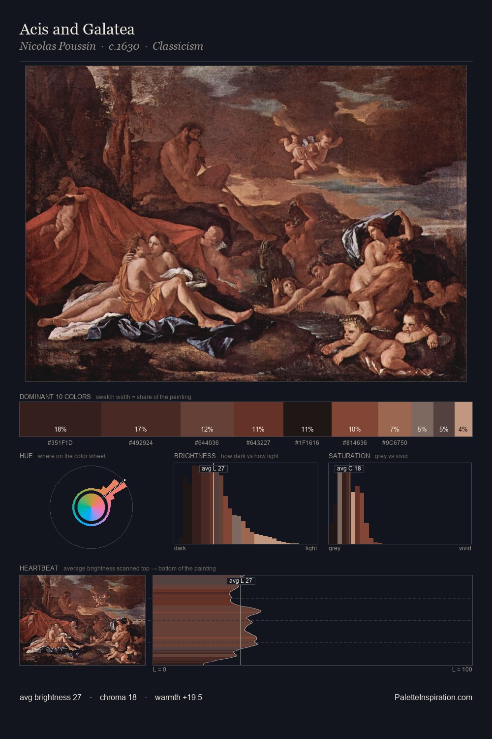
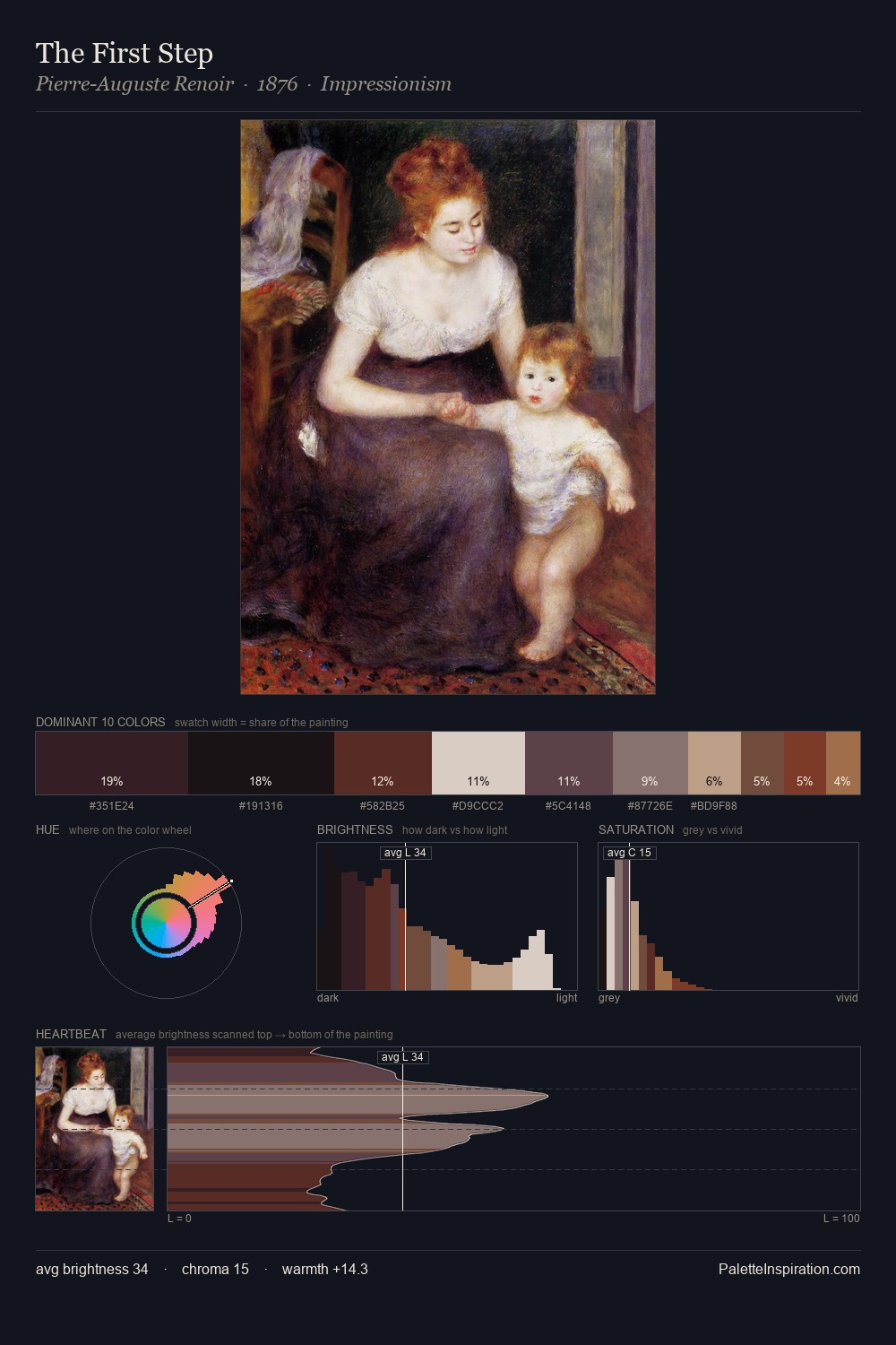
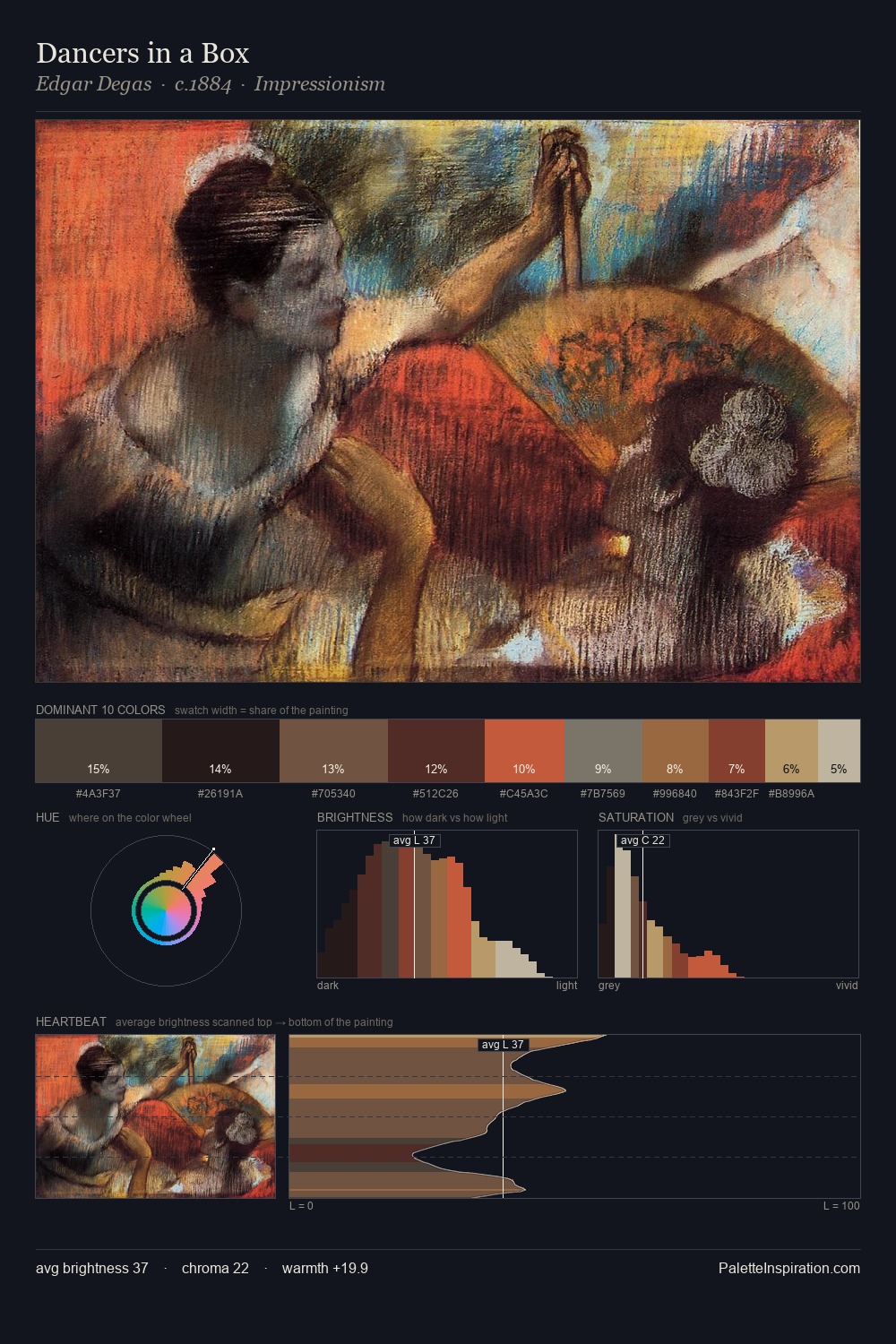
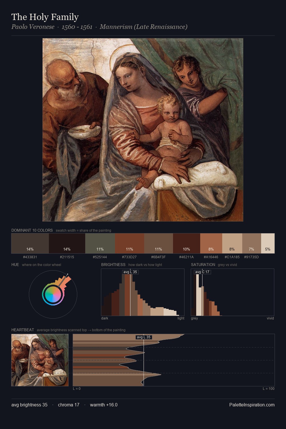
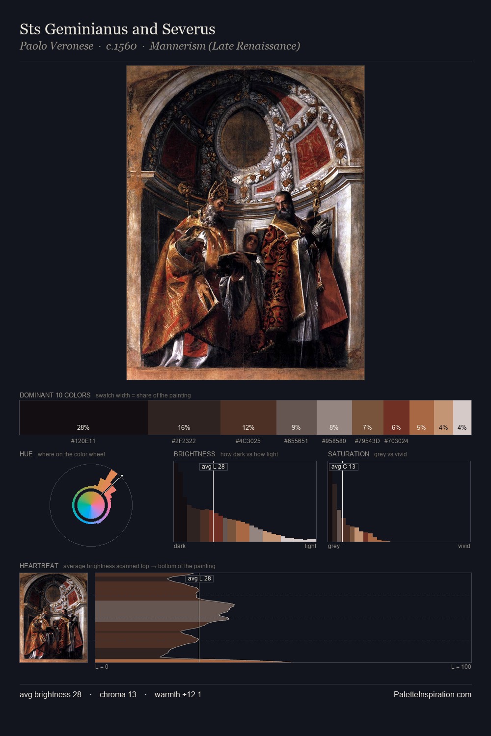
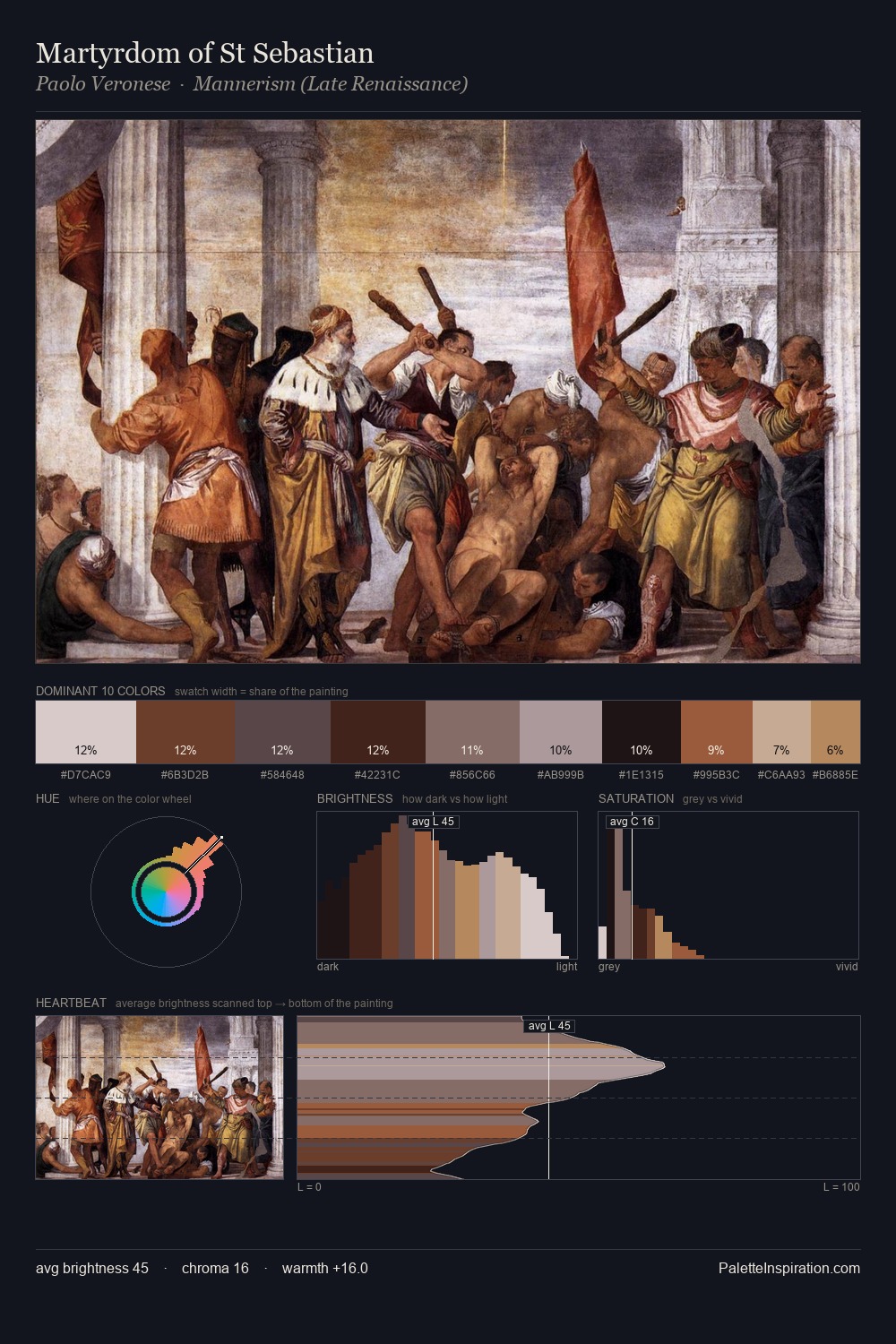
The palette of Paolo Veronese sits in the lower register of the value scale - dense, contained, and weighted. Paolo Veronese orchestrates warmth above all else - reds, ambers, and siennas take the lead. All colours lean toward grey, building depth through value rather than colour punch. 34.0% of the palette belongs to #0B070A, a concentration that makes it the unmistakable visual centre. The saturated accent, #CBA685, registers at 3.0% - sparse enough to feel like a deliberate surprise. From deepest dark to palest light, the palette traverses 61 units of the value scale - a span that creates natural depth. This tonal restraint is characteristic of the Paolo Veronese approach: colour serves light, not the reverse. In the context of Paolo Veronese's full range of palettes, group 15 represents one movement in an ongoing chromatic dialogue.
Example use cases
- film & entertainment
- fine dining
- spirits branding
- menswear
- theater design
I Love This!
Copy, export, or download for your project