Ivan Aivazovsky Palette 16

Palette Analysis
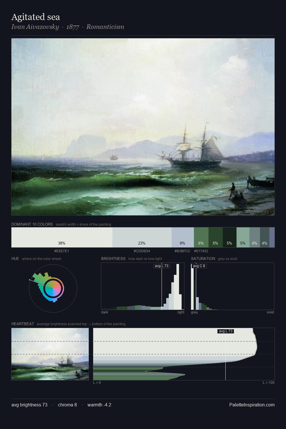
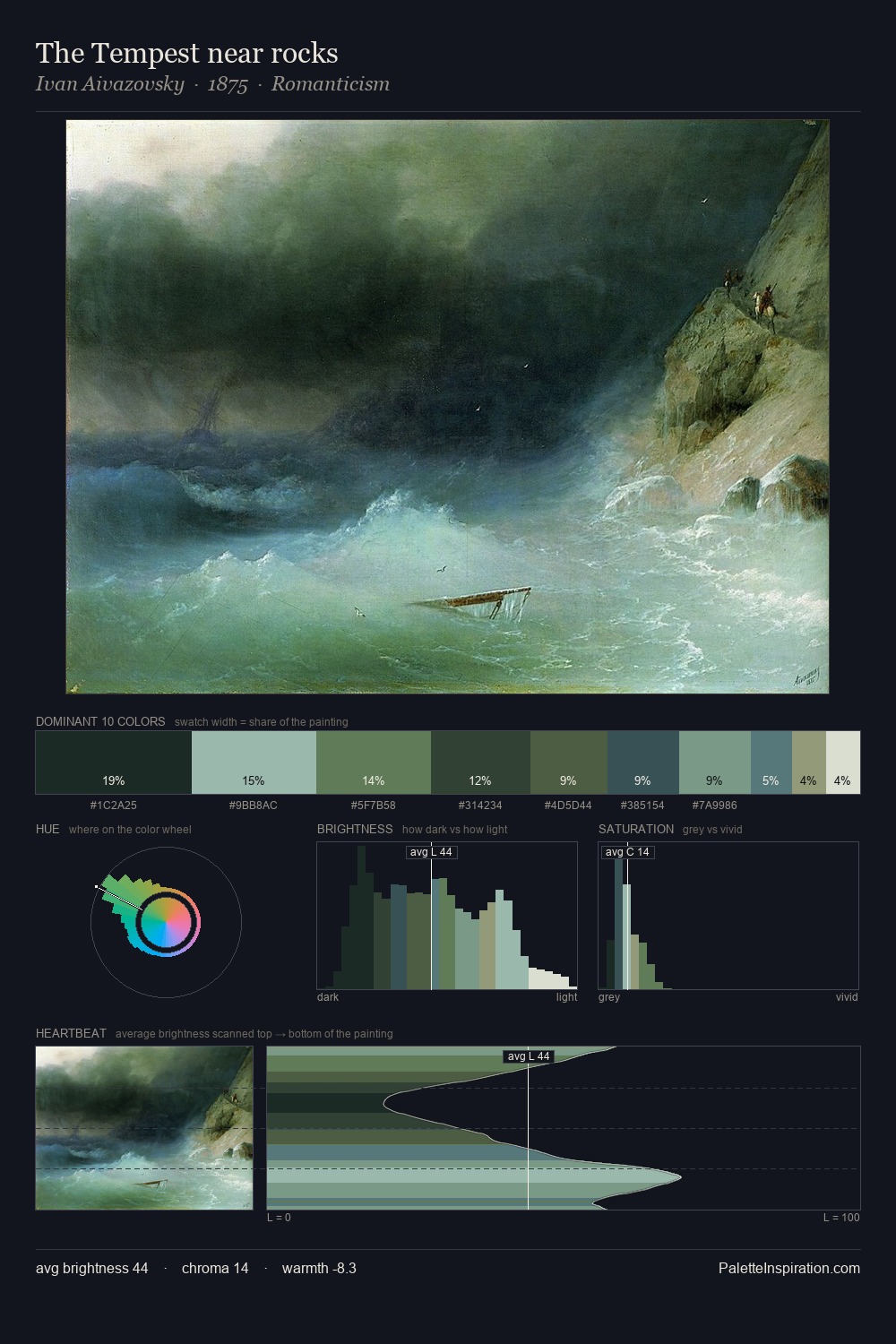
Ivan Aivazovsky is strongly light-biased - shadow is suggested rather than declared. Blues and teal-greys govern the palette, lending it an aquatic or atmospheric quality. Every colour is desaturated; the palette proceeds through near-neutrals and gently-coloured greys. #E6EBEC claims 34.7% of the surface, functioning as the work's tonal foundation. #406362 functions as the palette's exclamation mark: highest chroma, lowest percentage (6.6%). From deepest dark to palest light, the palette traverses 71 units of the value scale - a span that creates natural depth. The mid-to-high key, cool bias, and moderate chroma point to outdoor observation - sky and diffused daylight as the dominant light source. This is palette 16 of Ivan Aivazovsky's sequence - a single chapter in a chromatic story told across many works.
Example use cases
- print magazines
- beauty brands
- real estate
- high-end packaging
- editorial design
I Love This!
Copy, export, or download for your project