Ivan Aivazovsky Palette 1

Palette Analysis
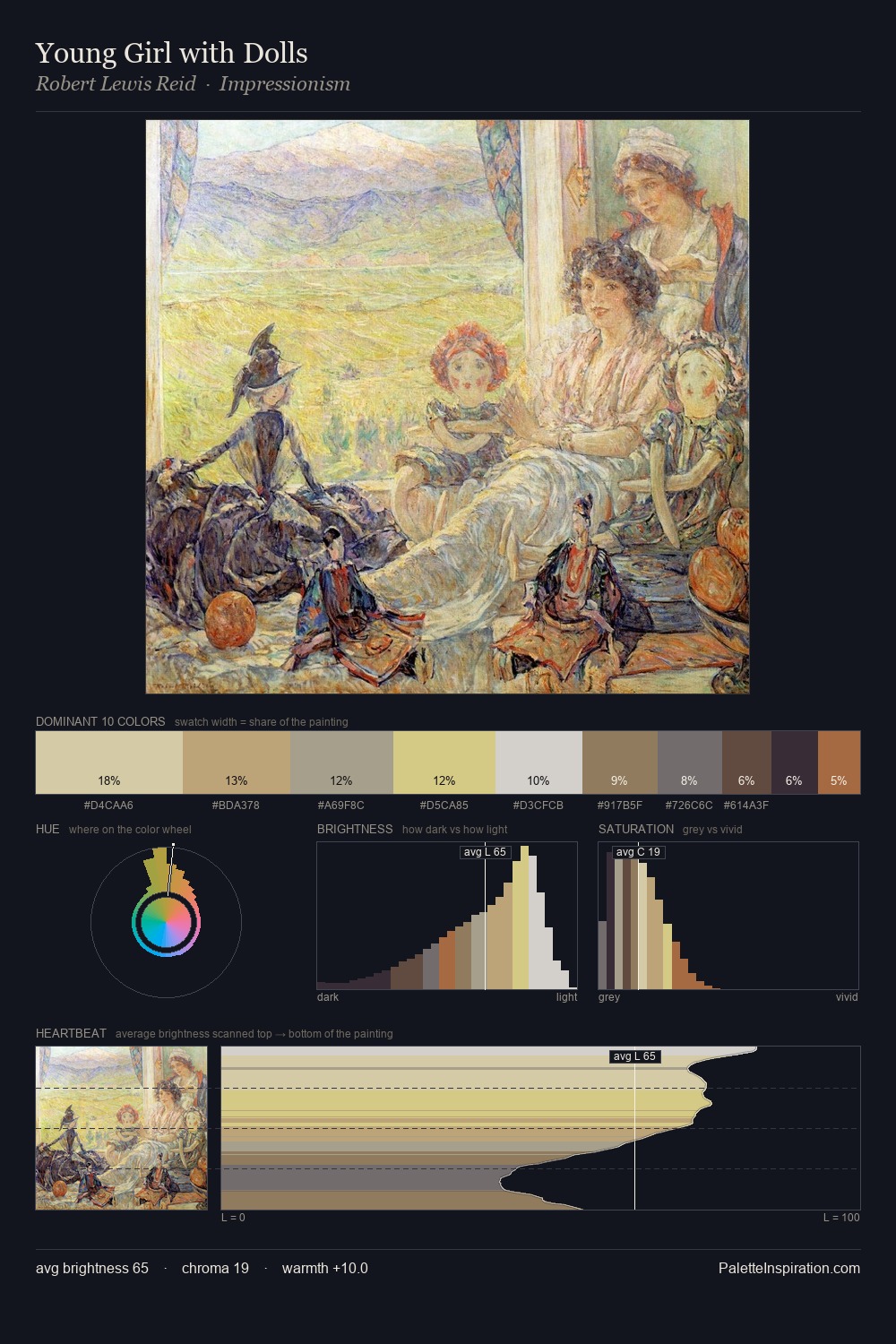
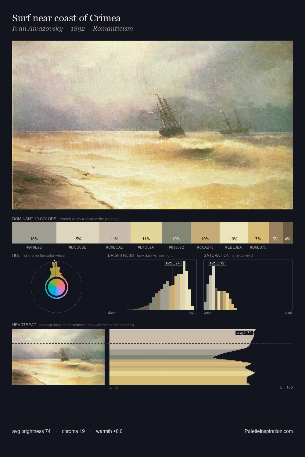
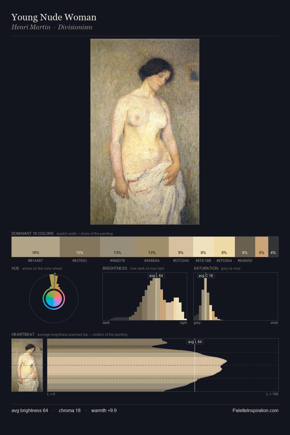
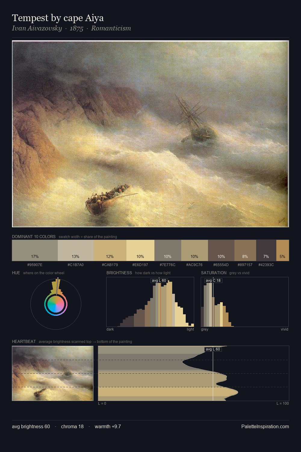
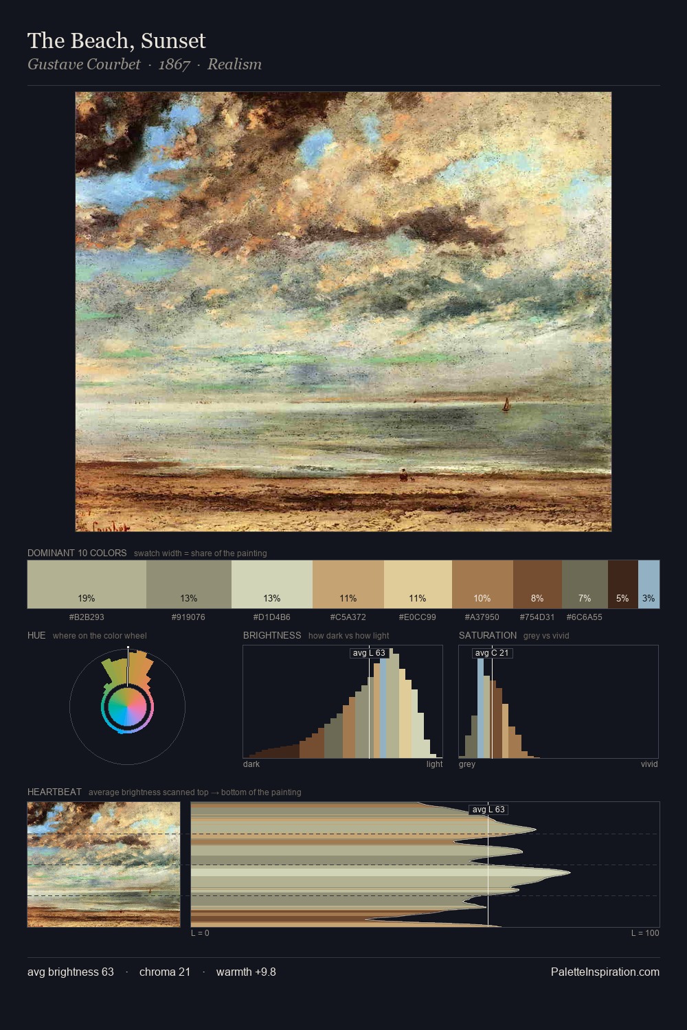
Ivan Aivazovsky is strongly light-biased - shadow is suggested rather than declared. A distinctly cool atmosphere runs through this palette: sky, water, and mist given colour form. Chroma hovers near zero; colour declares itself through subtle shifts in hue rather than outright saturation. The highest-chroma note - #F3E29D - appears at just 7.8%, deployed as a precision accent against the quieter ground. At 45 units across the value scale, the palette keeps contrast readable without letting it dominate. The mid-to-high key, cool bias, and moderate chroma point to outdoor observation - sky and diffused daylight as the dominant light source. Ivan Aivazovsky's palette 1 carries its own internal logic while remaining in conversation with the artist's broader colour intelligence.
Example use cases
- ceramics & pottery
- boutique hospitality
- menswear
- heritage food brands
- craft & artisan brands
I Love This!
Copy, export, or download for your project