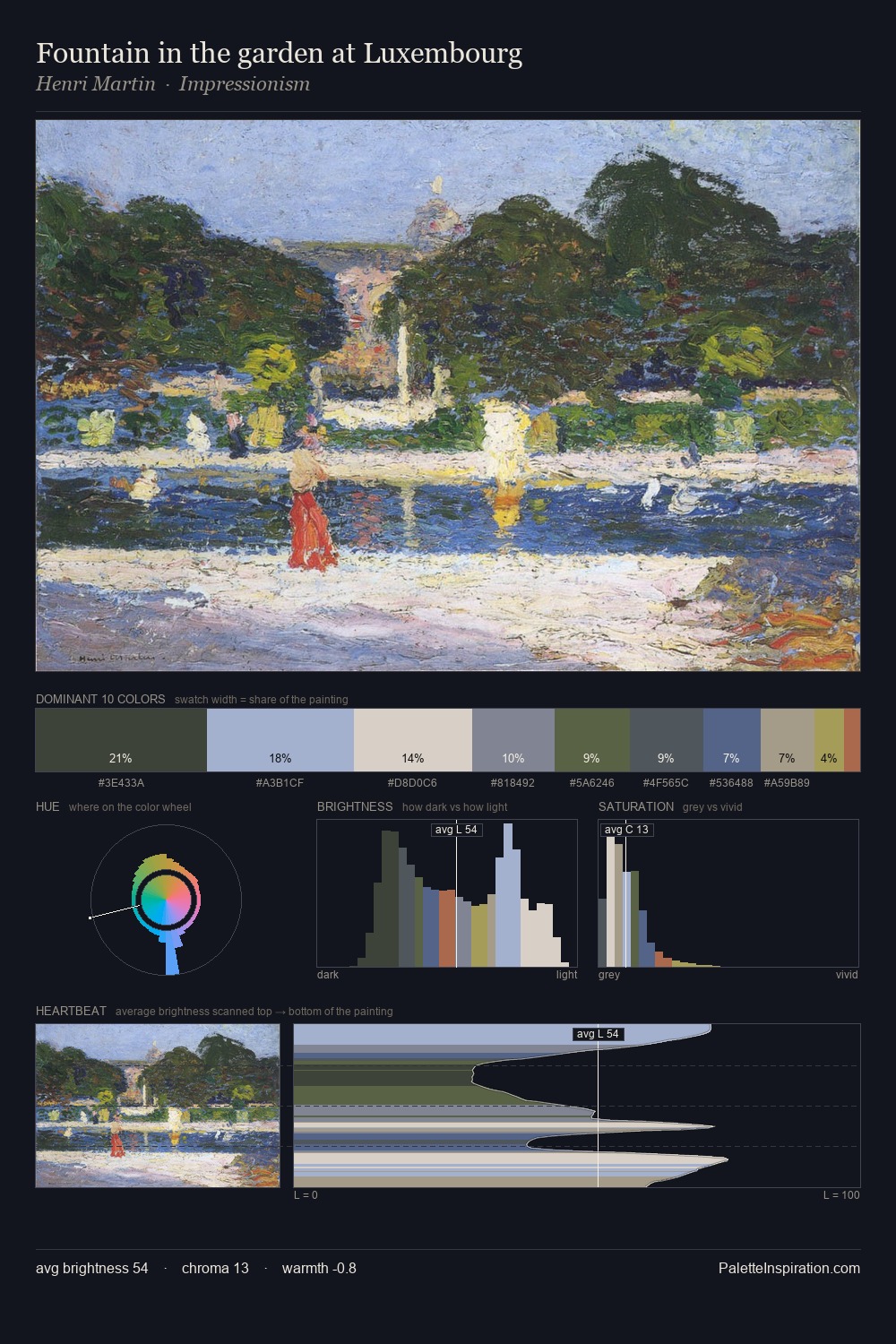
Flower Painting Palette 5
Soft Ivory
Soft Low-contrast, gentle chroma - mid-key values and low saturation, approachable and calm.
Ivory Warm creamy white - the color of natural ivory, warmer than pure white.

Palette Analysis
flower painting is high-key - luminous, open, and weighted toward light. The palette tilts toward cool - blues and silver-greys carry the structural weight. Muted throughout, the palette achieves its effects through value and temperature rather than chromatic force. The dominant colour, #E5D7C0, takes 28.0% of the total area, establishing the overall mood before any other hue is introduced. #4E638B functions as the palette's exclamation mark: highest chroma, lowest percentage (4.3%). At 66 units of value range, the palette has the tonal breadth to sustain complex spatial readings. High luminosity and cool temperature suggest the plein-air condition: unfiltered daylight and open sky.
Example use cases
- florist branding
- event design
- real estate
- jewelry retail
- hospitality branding
I Love This!
Use This Palette
Copy, export, or download for your project
Copy, export, or download for your project
Copy:
Download:
Share: