Flower Painting Palette 27
Muted Rust
Muted Deliberately desaturated - chroma pulled toward gray, the restraint of tonal painting.
Rust Oxidized red-brown - the color of iron corrosion, warm and earthy-red.

Palette Analysis
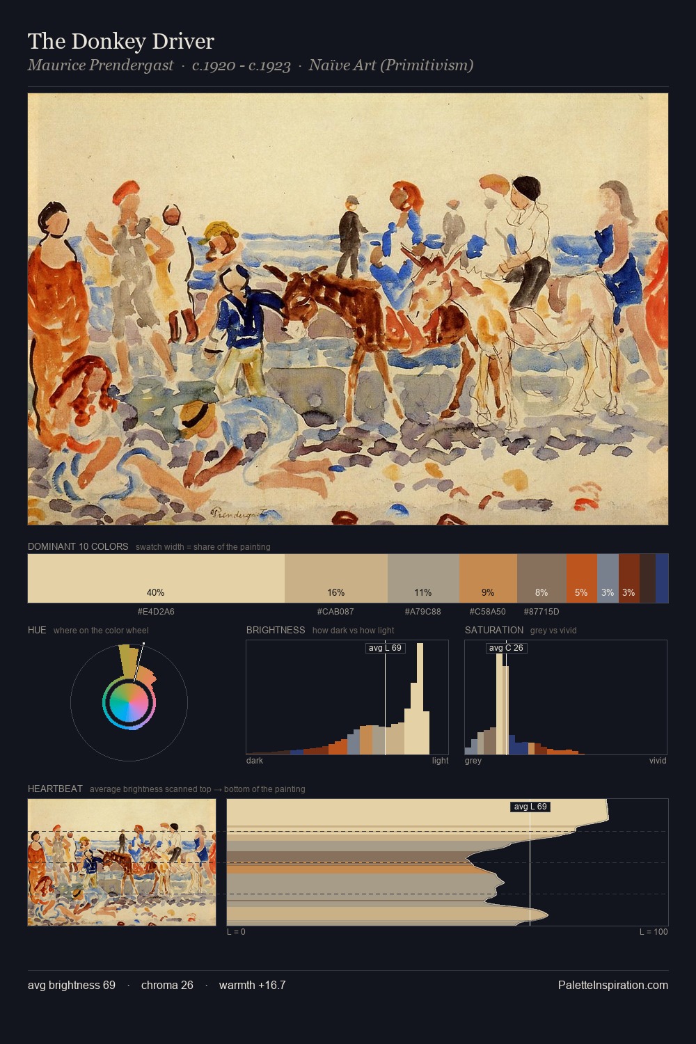
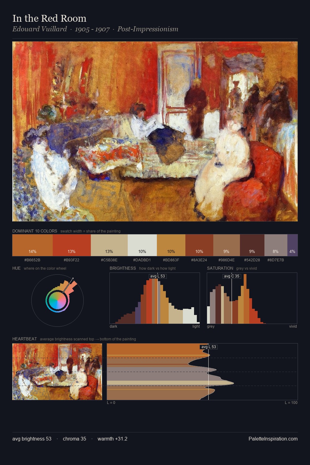
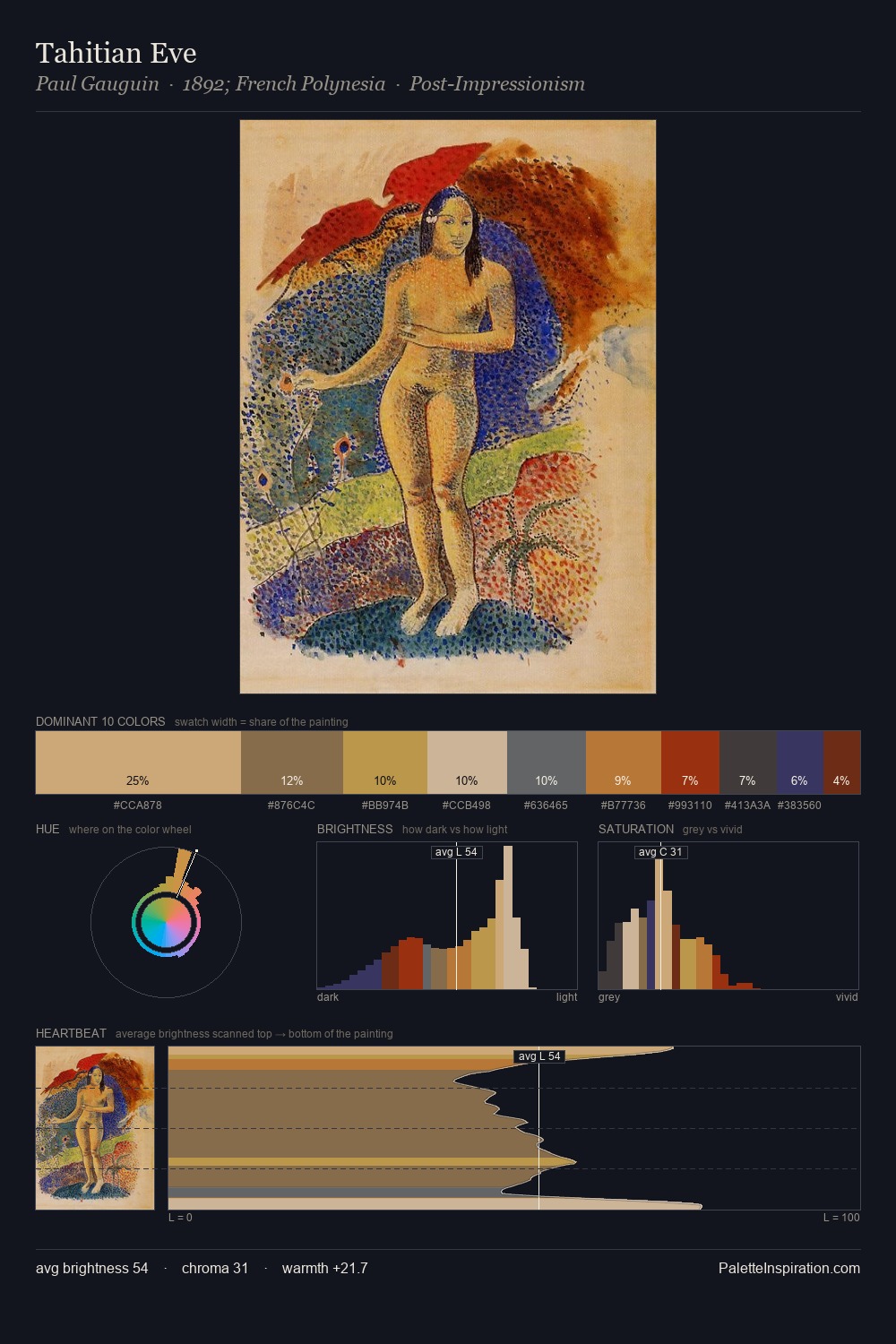
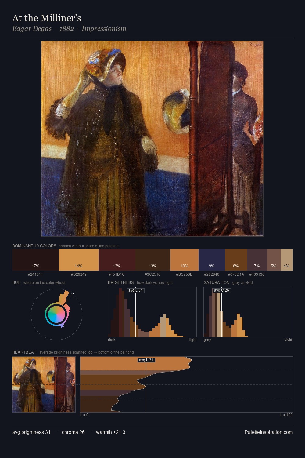
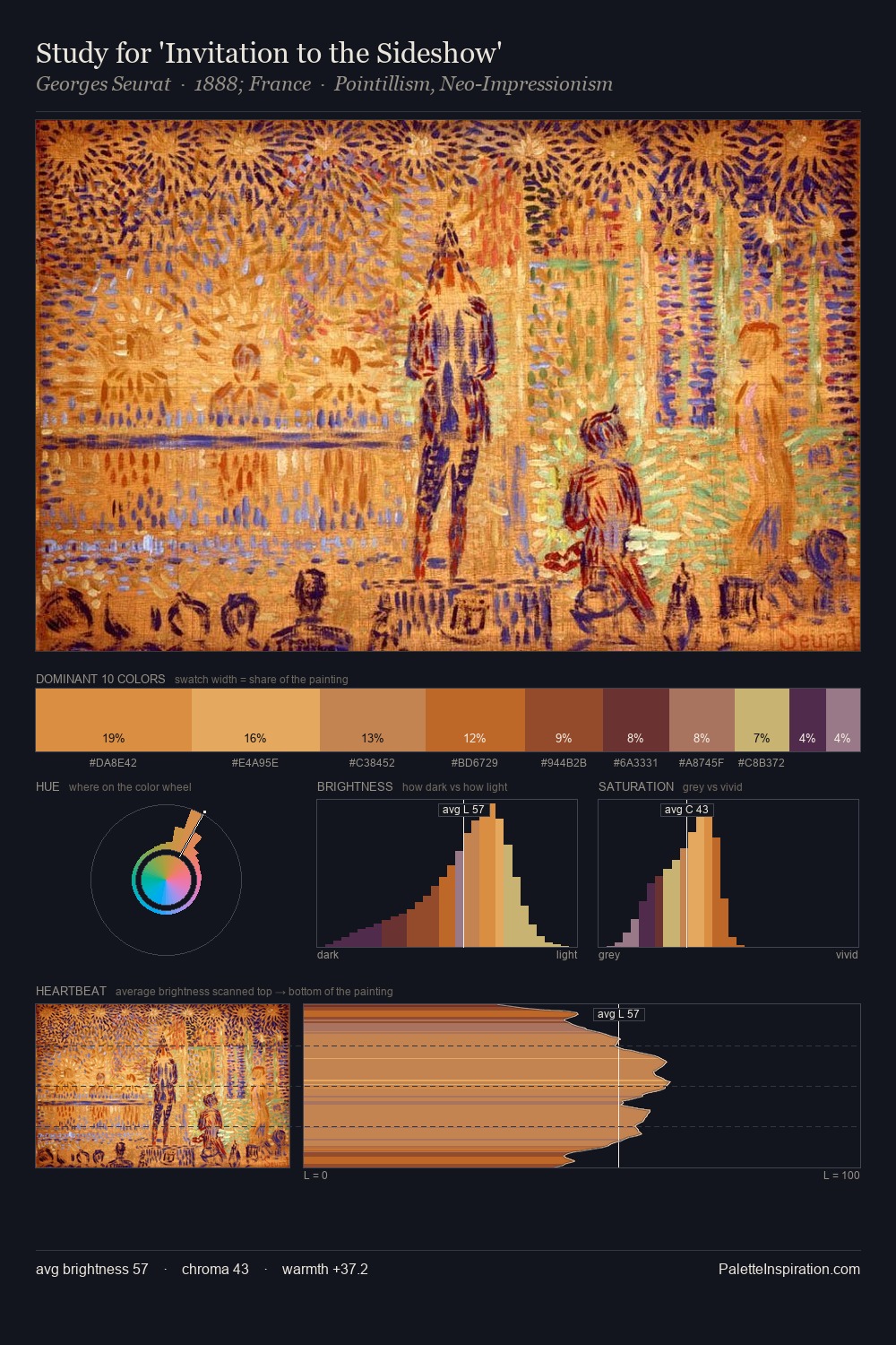
flower painting occupies the comfortable middle of the value scale, avoiding both extremes to hold the eye in a sustained middle grey. Warm hues command this palette; it favours the reds, oranges, and yellows of firelight and earth. Saturation is measured and controlled, giving the palette presence without visual aggression. Rather than a studied accent, #D79943 takes 6.2% - a bold allocation that saturates the composition's atmosphere. The value range of 44 units sits in the comfortable middle: enough depth, enough light, neither extreme.
Example use cases
- publishing
- corporate identity
- consumer apps
- hospitality
- design agencies
I Love This!
Use This Palette
Copy, export, or download for your project
Copy, export, or download for your project
Copy:
Download:
Share: