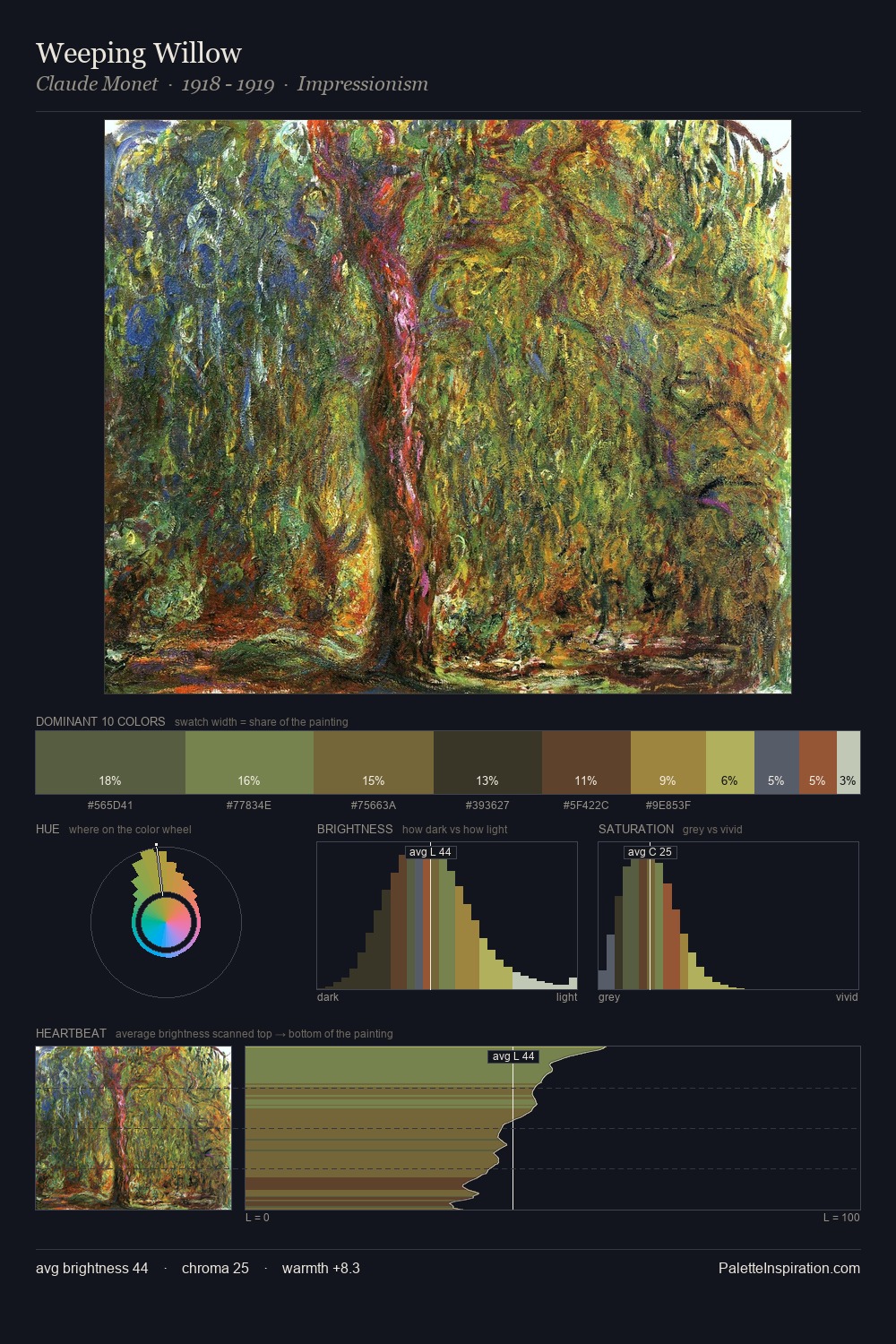
Flower Painting Palette 21
Veiled Tawny
Veiled Partially obscured light - mid-dark with a hazy, scrim-filtered quality.
Tawny Warm orange-brown - a traditional term for the color of tanned leather or lion fur.

Palette Analysis
Values in flower painting rest in the mid-range - neither dramatically lit nor steeped in shadow. Built on cool foundations: the palette favours the blue-cyan-green arc. All colours lean toward grey, building depth through value rather than colour punch. Only 5.7% is devoted to #B3A148, yet that small allocation delivers the palette's entire chromatic tension. The value range of 45 units sits in the comfortable middle: enough depth, enough light, neither extreme. The mid-to-high key, cool bias, and moderate chroma point to outdoor observation - sky and diffused daylight as the dominant light source.
Example use cases
- music labels
- luxury hospitality
- editorial photography
- leather goods
- premium streaming
I Love This!
Use This Palette
Copy, export, or download for your project
Copy, export, or download for your project
Copy:
Download:
Share: