Flower Painting Palette 14
Muted Parchment
Muted Deliberately desaturated - chroma pulled toward gray, the restraint of tonal painting.
Parchment Aged warm neutral - the color of old manuscript parchment, tan and slightly yellowed.

Palette Analysis
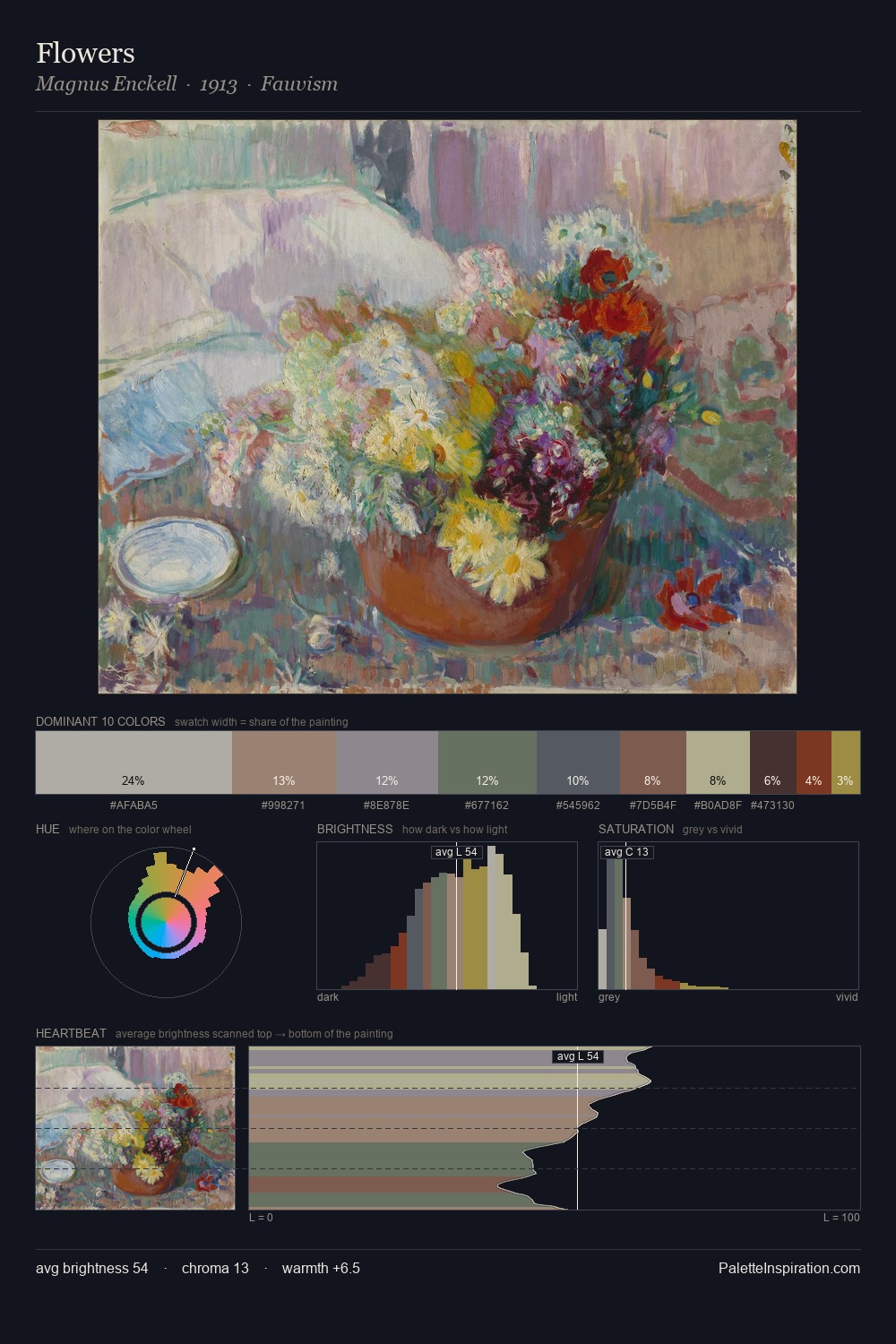
flower painting sits in the centre of the value range, lending the palette a sense of even, sustained light. The palette balances warm and cool with remarkable evenness, giving the composition its characteristic vibrancy. All colours lean toward grey, building depth through value rather than colour punch. The saturated accent, #A24C35, registers at 4.3% - sparse enough to feel like a deliberate surprise. 52 units of value spread create a palette that is varied but unified - contrast in the service of harmony.
Example use cases
- exhibition design
- foundation branding
- estate management
- art education
- museums & galleries
I Love This!
Use This Palette
Copy, export, or download for your project
Copy, export, or download for your project
Copy:
Download:
Share: