Flower Painting Palette 1
Luminous Ivory
Luminous Self-illuminated feeling - high-key values with an inner glow quality.
Ivory Warm creamy white - the color of natural ivory, warmer than pure white.

Palette Analysis
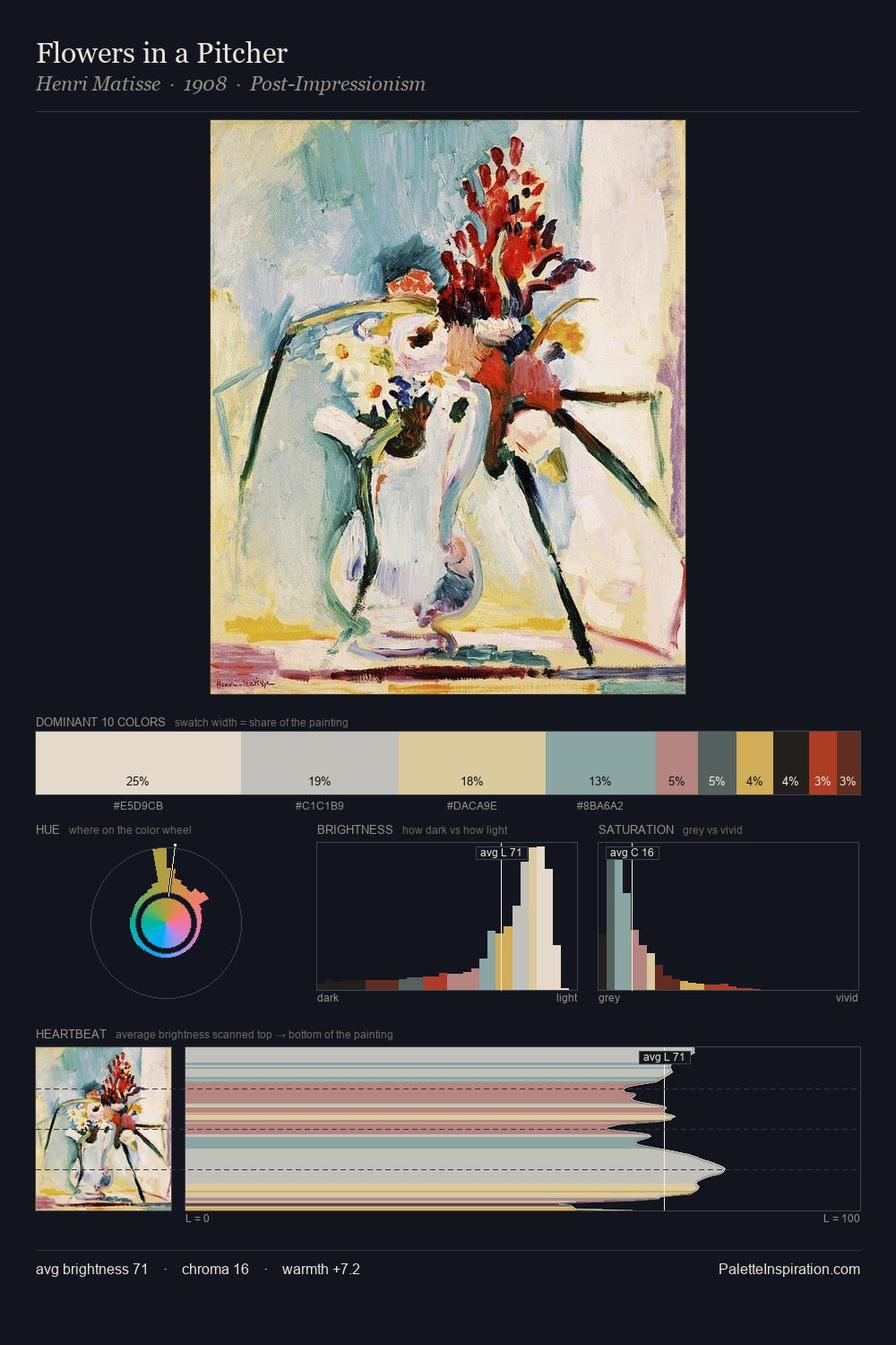
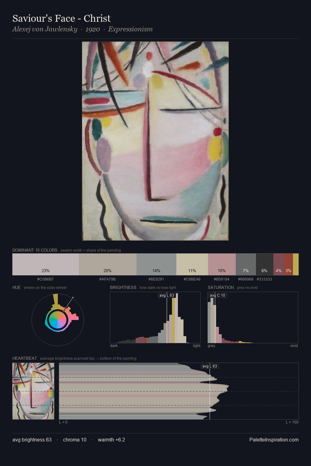
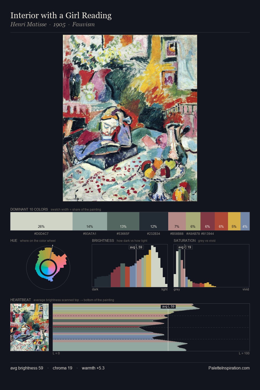
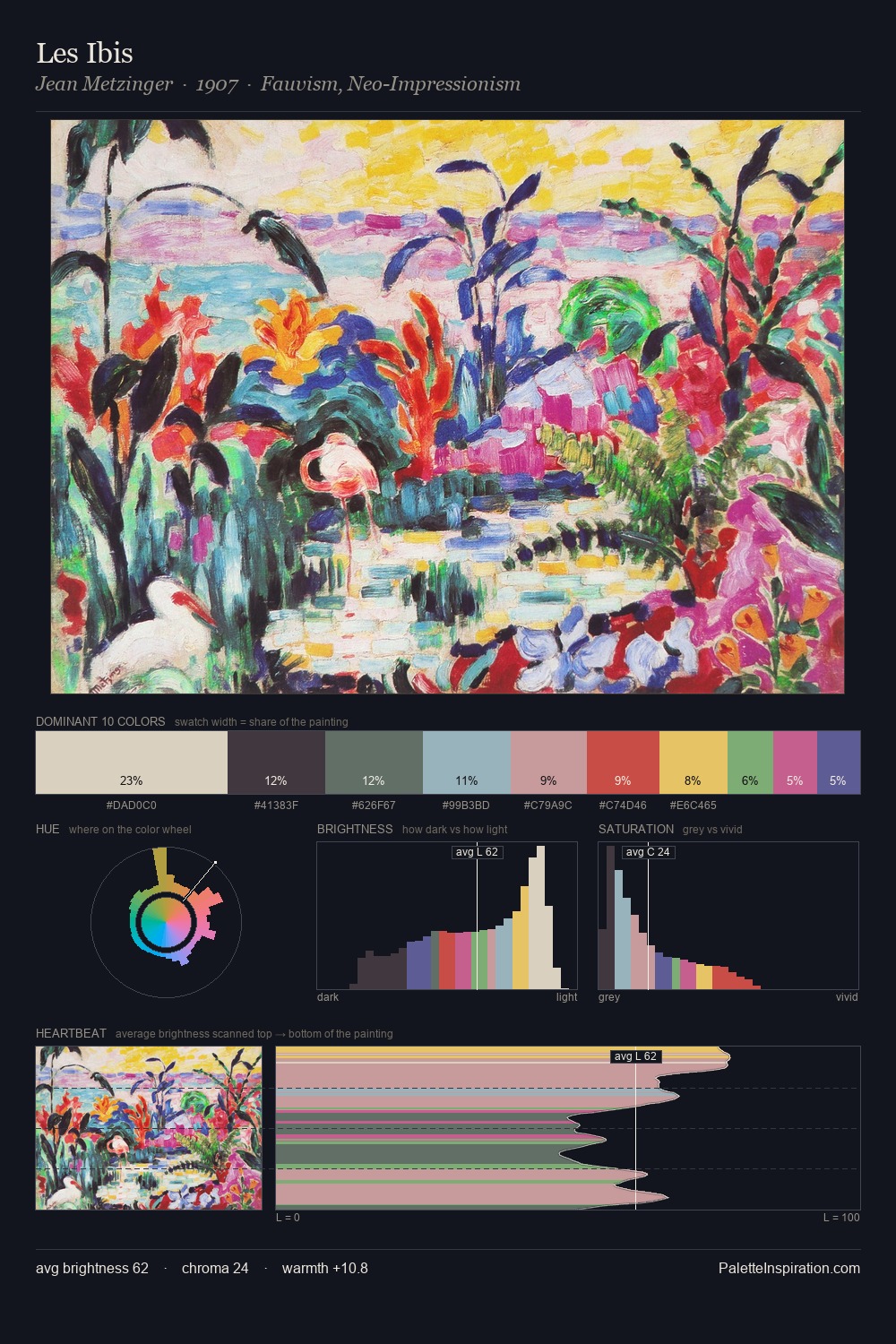
Values in flower painting tilt decisively toward white, giving the palette its luminous character. A distinctly cool atmosphere runs through this palette: sky, water, and mist given colour form. Every colour is desaturated; the palette proceeds through near-neutrals and gently-coloured greys. 33.6% of the palette belongs to #C8C2B8, a concentration that makes it the unmistakable visual centre. The saturated accent, #D79BA2, registers at 9.3% - sparse enough to feel like a deliberate surprise. At 59 units of value range, the palette has the tonal breadth to sustain complex spatial readings. High luminosity and cool temperature suggest the plein-air condition: unfiltered daylight and open sky.
Example use cases
- florist branding
- event design
- real estate
- jewelry retail
- hospitality branding
I Love This!
Use This Palette
Copy, export, or download for your project
Copy, export, or download for your project
Copy:
Download:
Share: