Flower Painting Palette 12
Veiled Fawn
Veiled Partially obscured light - mid-dark with a hazy, scrim-filtered quality.
Fawn Light warm tan - the color of a young deer, soft and golden-brown.

Palette Analysis
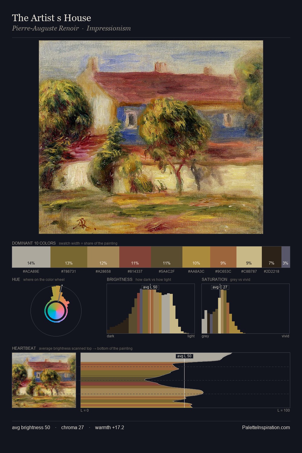
flower painting distributes its values across the middle register, creating harmony without high contrast. Neither warm nor cool has the upper hand here; the equilibrium between the two generates the palette's visual energy. Chroma is moderate: colours carry enough saturation to be read as colour, but the palette stops well short of garish intensity. Only 12.0% is devoted to #B39D3D, yet that small allocation delivers the palette's entire chromatic tension. Value range is moderate at 51 units - enough contrast for legibility, not so much as to fragment the tonal unity. Together these qualities point to the open-air Impressionist method: recording light rather than local colour.
Example use cases
- ceramics & pottery
- boutique hospitality
- menswear
- heritage food brands
- craft & artisan brands
I Love This!
Use This Palette
Copy, export, or download for your project
Copy, export, or download for your project
Copy:
Download:
Share: