Émile Prisse d'Avennes Palette 3
Palette Analysis
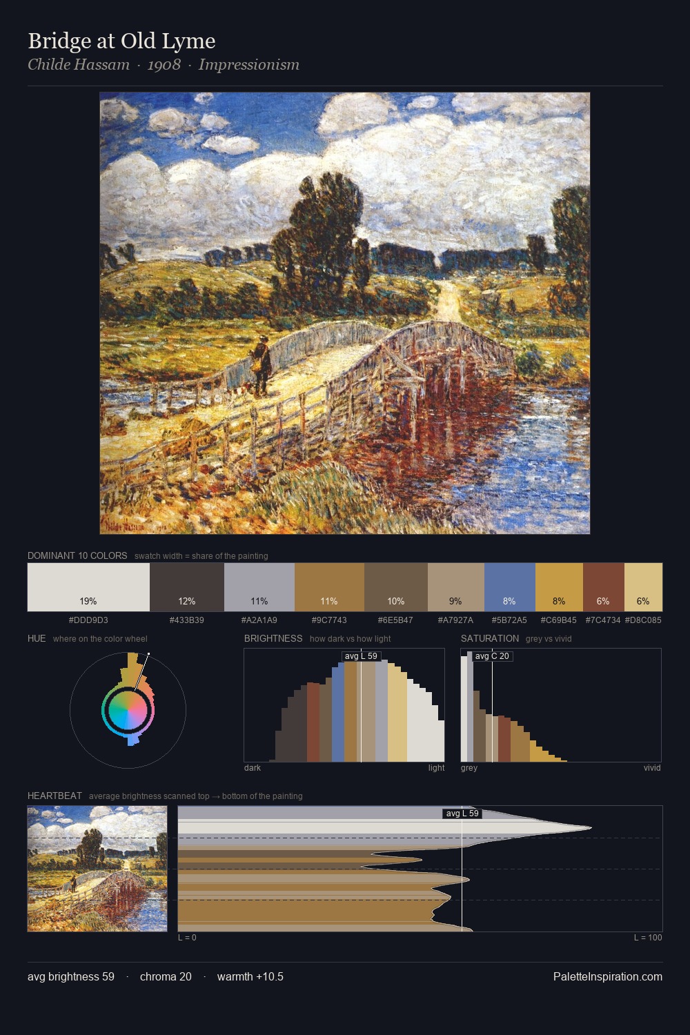
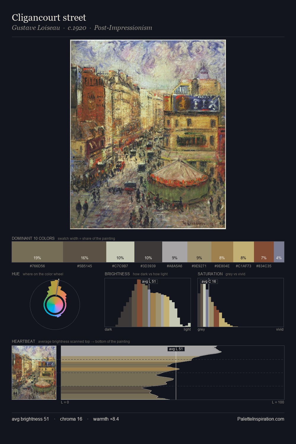
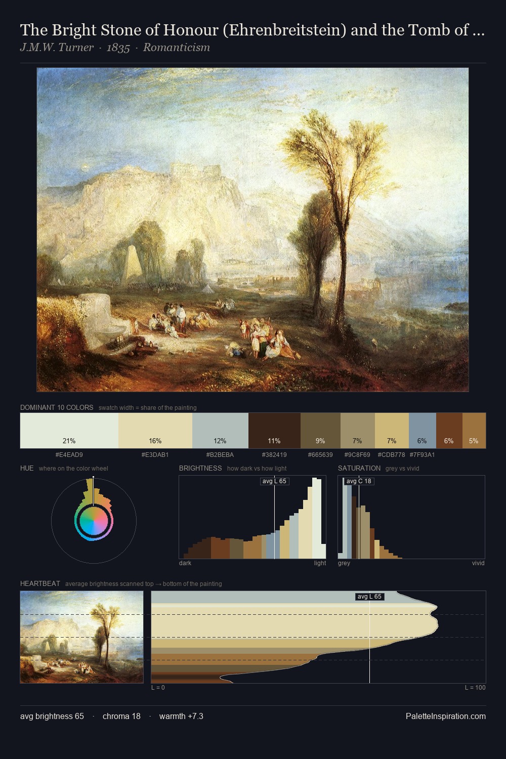
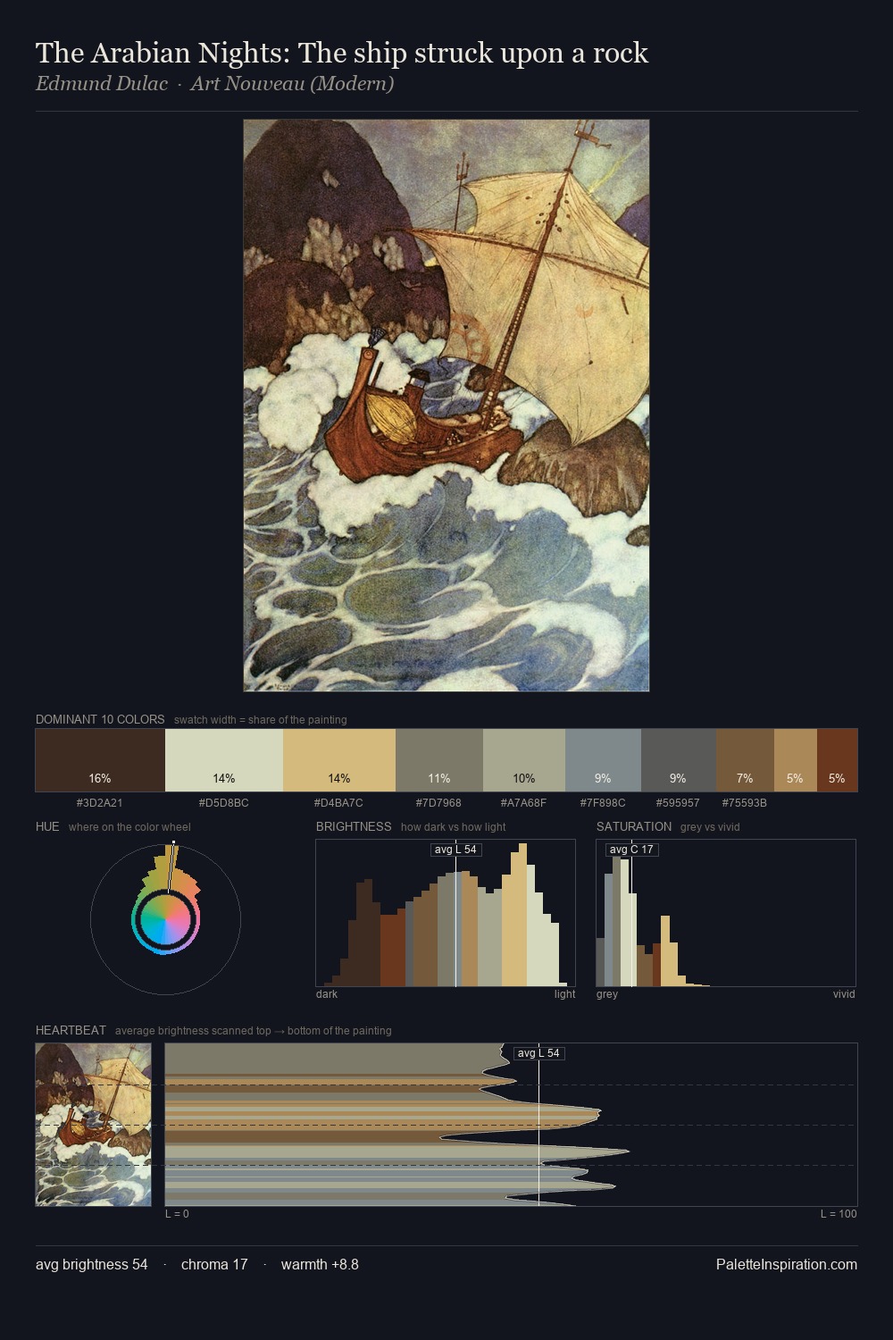
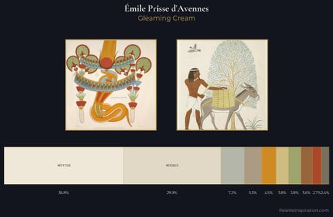
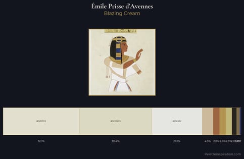
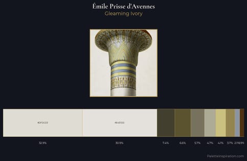
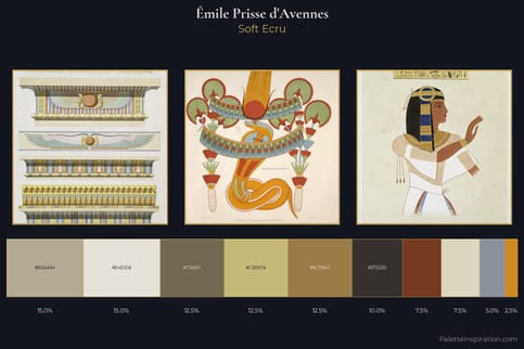
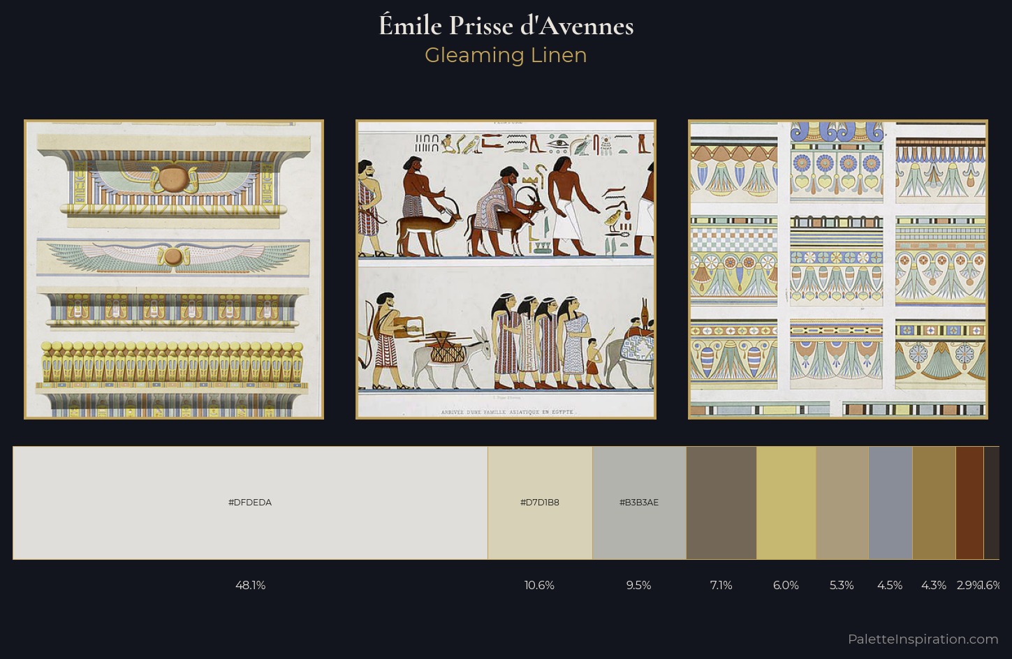
Émile Prisse d'Avennes is high-key - luminous, open, and weighted toward light. Émile Prisse d'Avennes builds on cool foundations: the palette favours the blue-cyan-green arc. Saturation is deliberately withheld - the beauty here lies in the near-monochromatic gradations rather than colour difference. At 48.1%, #DFDEDA functions less as a colour accent and more as a complete atmospheric environment. The highest-chroma note - #947A45 - appears at just 4.3%, deployed as a precision accent against the quieter ground. From deepest dark to palest light, the palette traverses 60 units of the value scale - a span that creates natural depth. The palette has the character of outdoor light: cool, mid-bright, with colour rendered faithfully rather than expressively. Palette 3 sits within the larger chromatic argument that Émile Prisse d'Avennes's complete body of work advances.
Example use cases
- hospitality branding
- boutique hotels
- restaurant identity
- home goods
- florist branding
I Love This!
Copy, export, or download for your project