Émile Prisse d'Avennes Palette 4
Palette Analysis
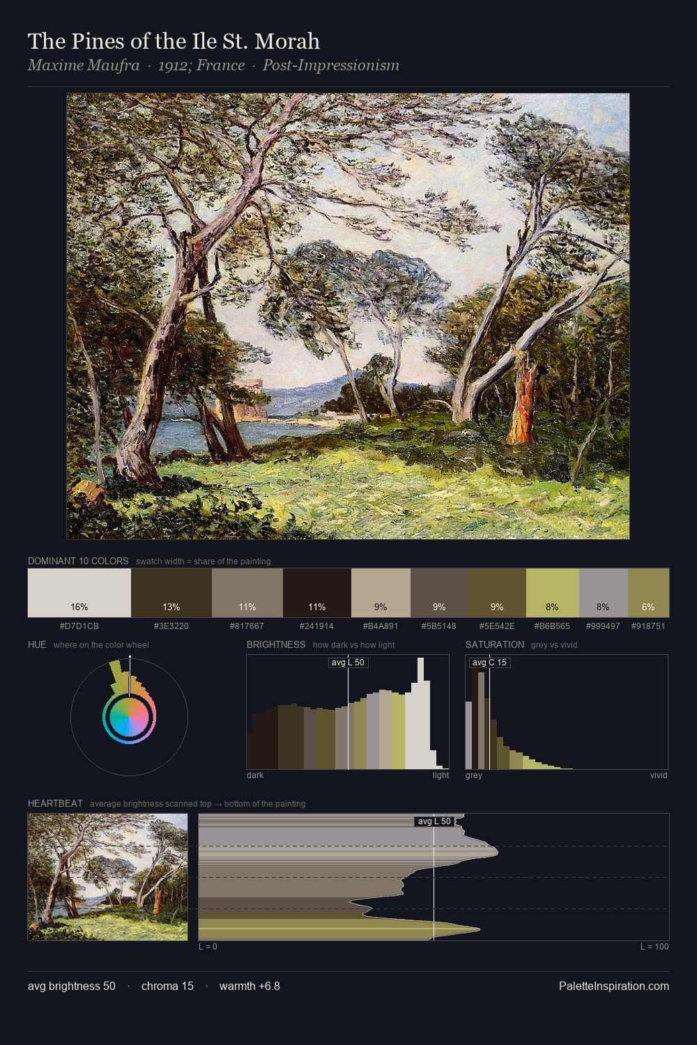
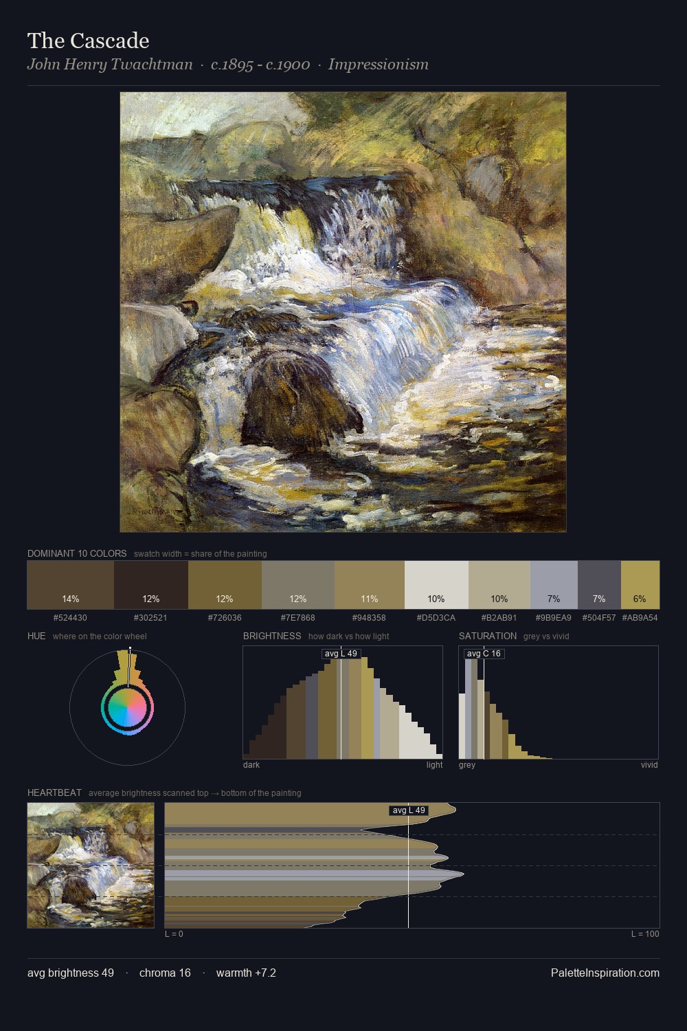
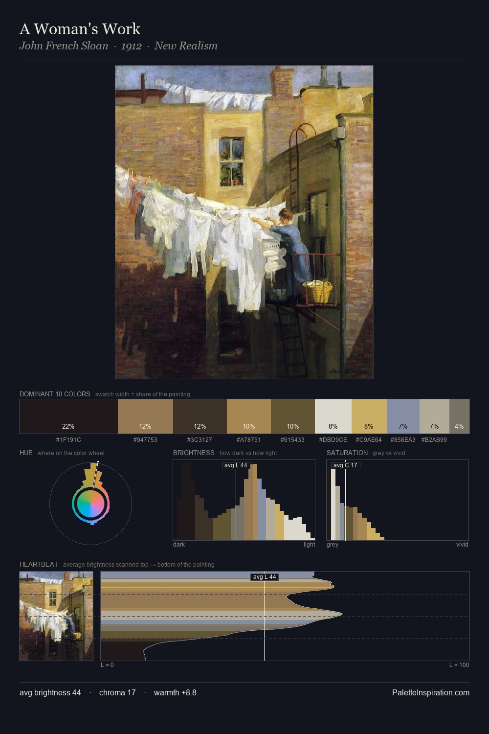
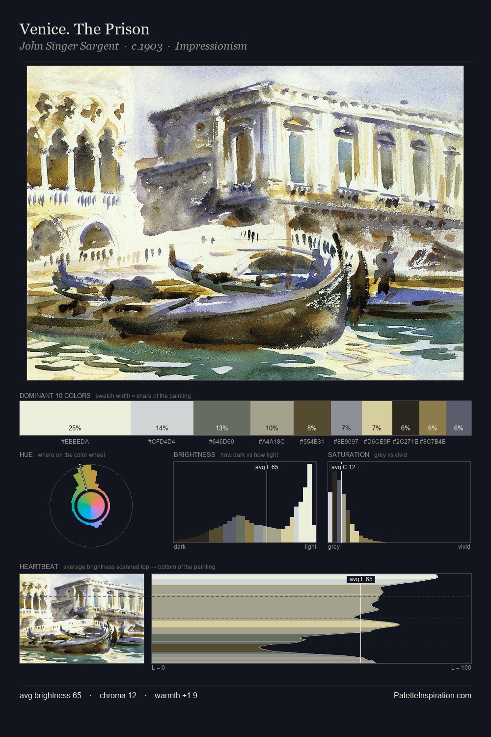
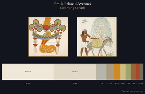
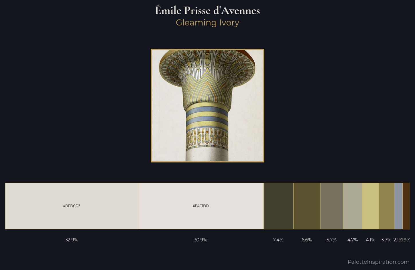
Émile Prisse d'Avennes is strongly light-biased - shadow is suggested rather than declared. Temperature is cool-dominant, with blue and green families claiming the largest areas. Chroma is kept low across all colours, producing the soft, enveloping quality that characterises tonal painting. Émile Prisse d'Avennes gives 32.9% of the composition to a single #DFDCD3 - a decisive chromatic anchor. #CAC080 functions as the palette's exclamation mark: highest chroma, lowest percentage (4.1%). 57 units of value range underpin the palette's structural clarity: the eye always knows where light falls. The palette has the character of outdoor light: cool, mid-bright, with colour rendered faithfully rather than expressively. In the context of Émile Prisse d'Avennes's full range of palettes, group 4 represents one movement in an ongoing chromatic dialogue.
Example use cases
- florist branding
- event design
- real estate
- jewelry retail
- hospitality branding
I Love This!
Copy, export, or download for your project