Émile Prisse d'Avennes Palette 2

Palette Analysis
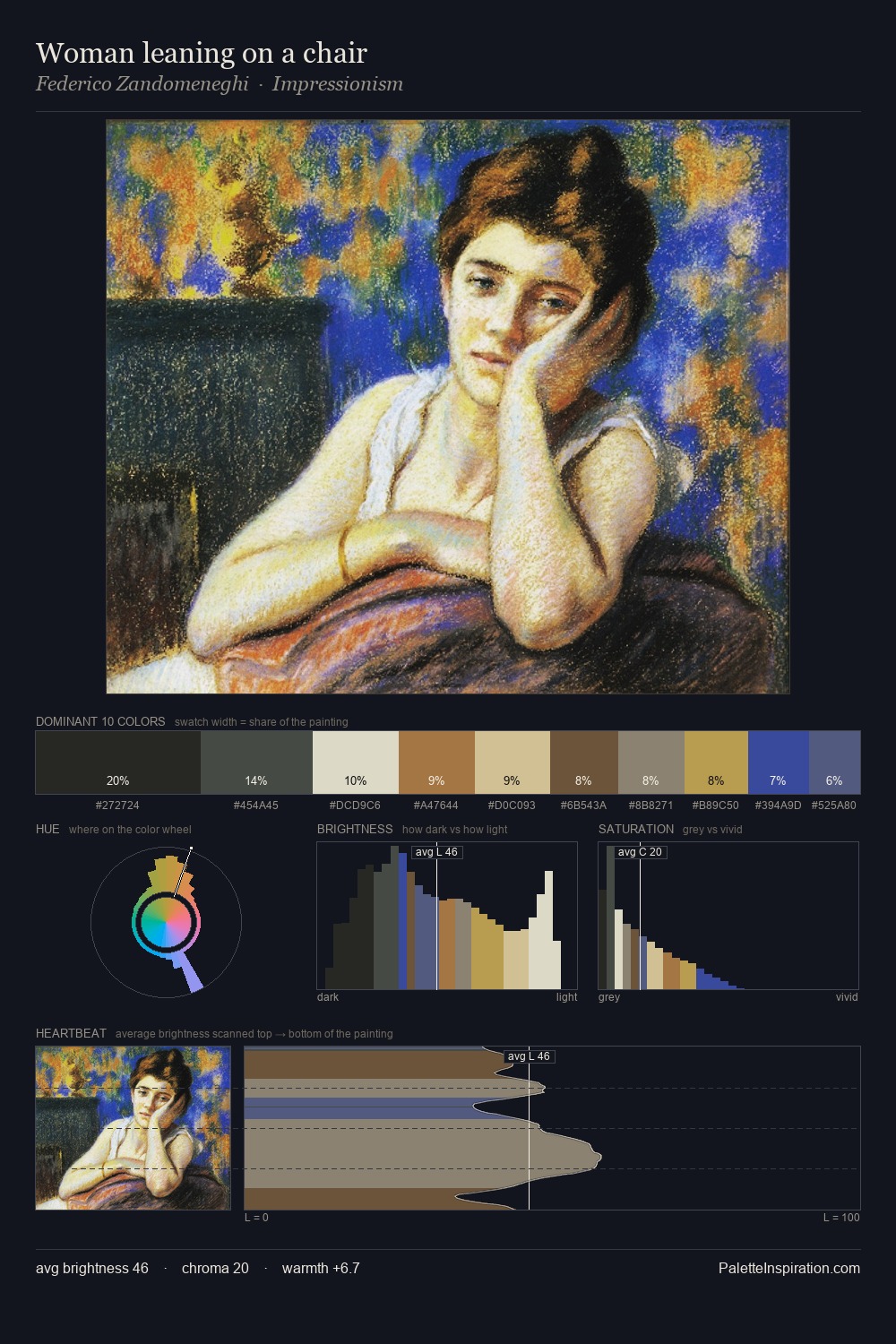
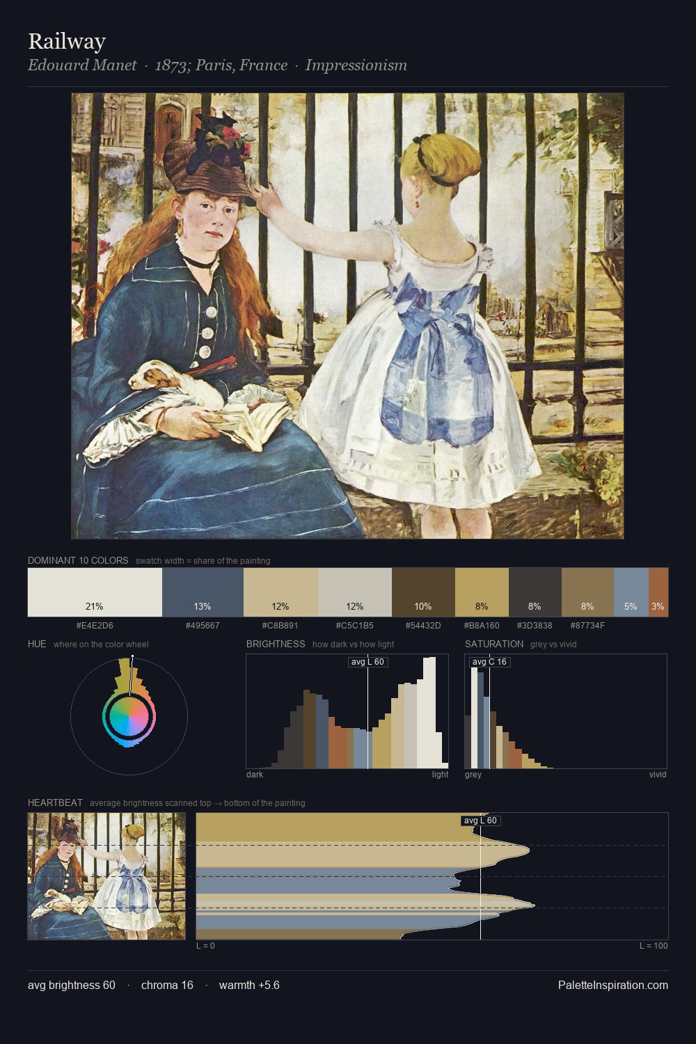
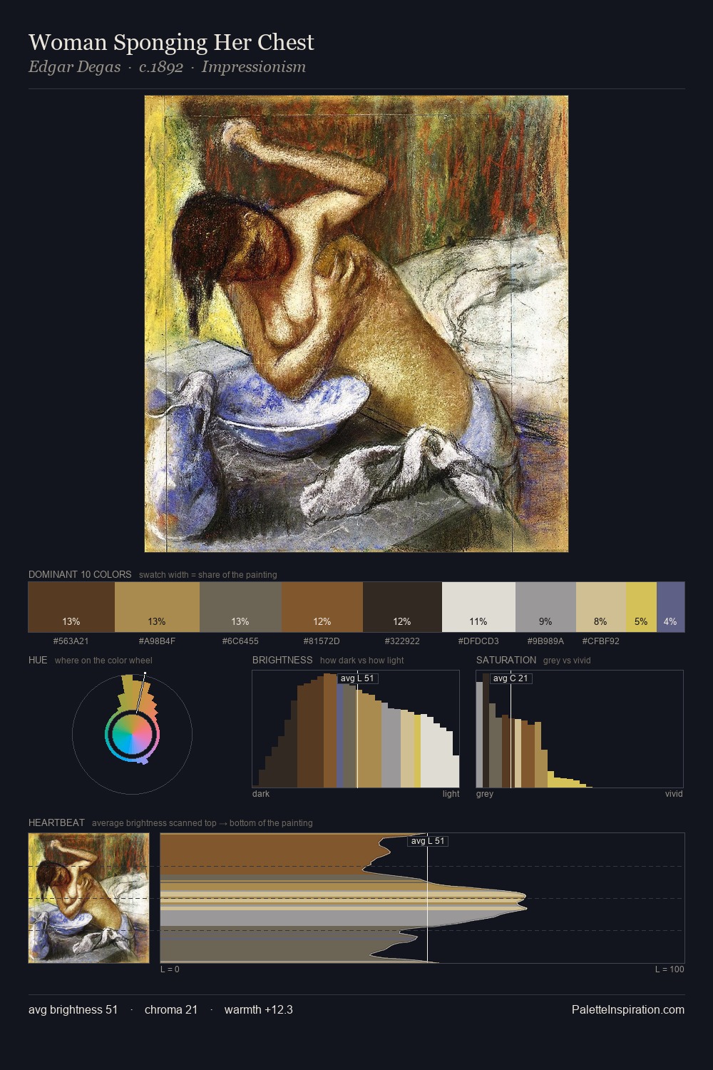
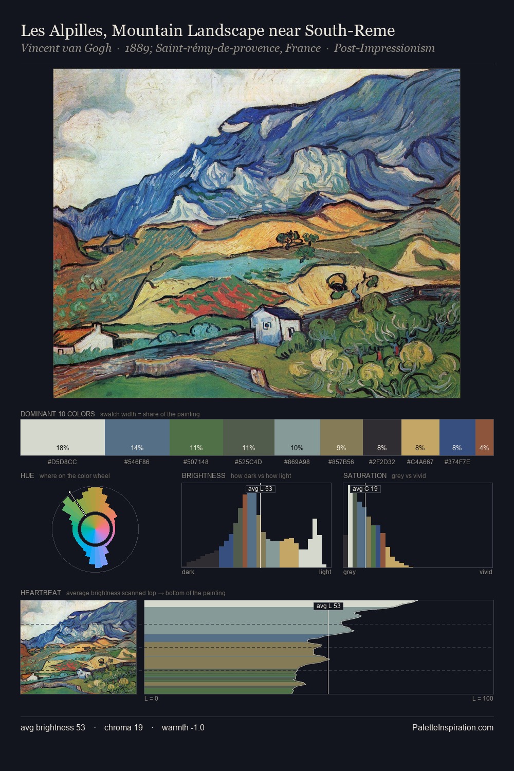
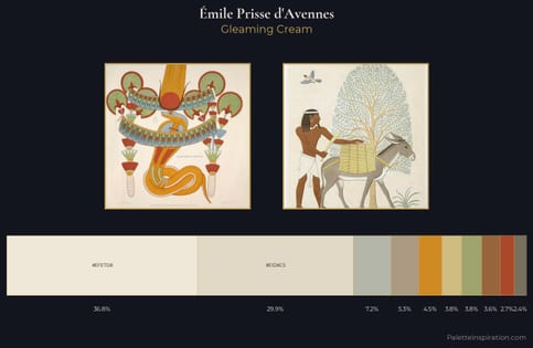
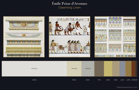
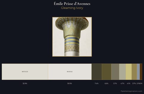
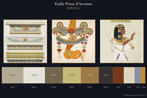
Values in Émile Prisse d'Avennes tilt decisively toward white, giving the palette its luminous character. Blues and teal-greys govern the palette, lending it an aquatic or atmospheric quality. All colours lean toward grey, building depth through value rather than colour punch. At 32.1%, #E2DFCE functions less as a colour accent and more as a complete atmospheric environment. The highest-chroma note - #C2B77A - appears at just 2.5%, deployed as a precision accent against the quieter ground. The full value range is 66 units: broad enough to build convincing three-dimensional form. High luminosity and cool temperature suggest the plein-air condition: unfiltered daylight and open sky. In the context of Émile Prisse d'Avennes's full range of palettes, group 2 represents one movement in an ongoing chromatic dialogue.
Example use cases
- publishing
- corporate identity
- consumer apps
- hospitality
- design agencies
I Love This!
Copy, export, or download for your project