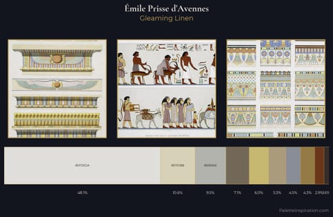
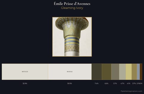
Émile Prisse d'Avennes Master Palette
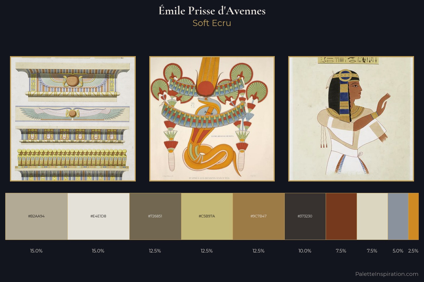
Palette Analysis
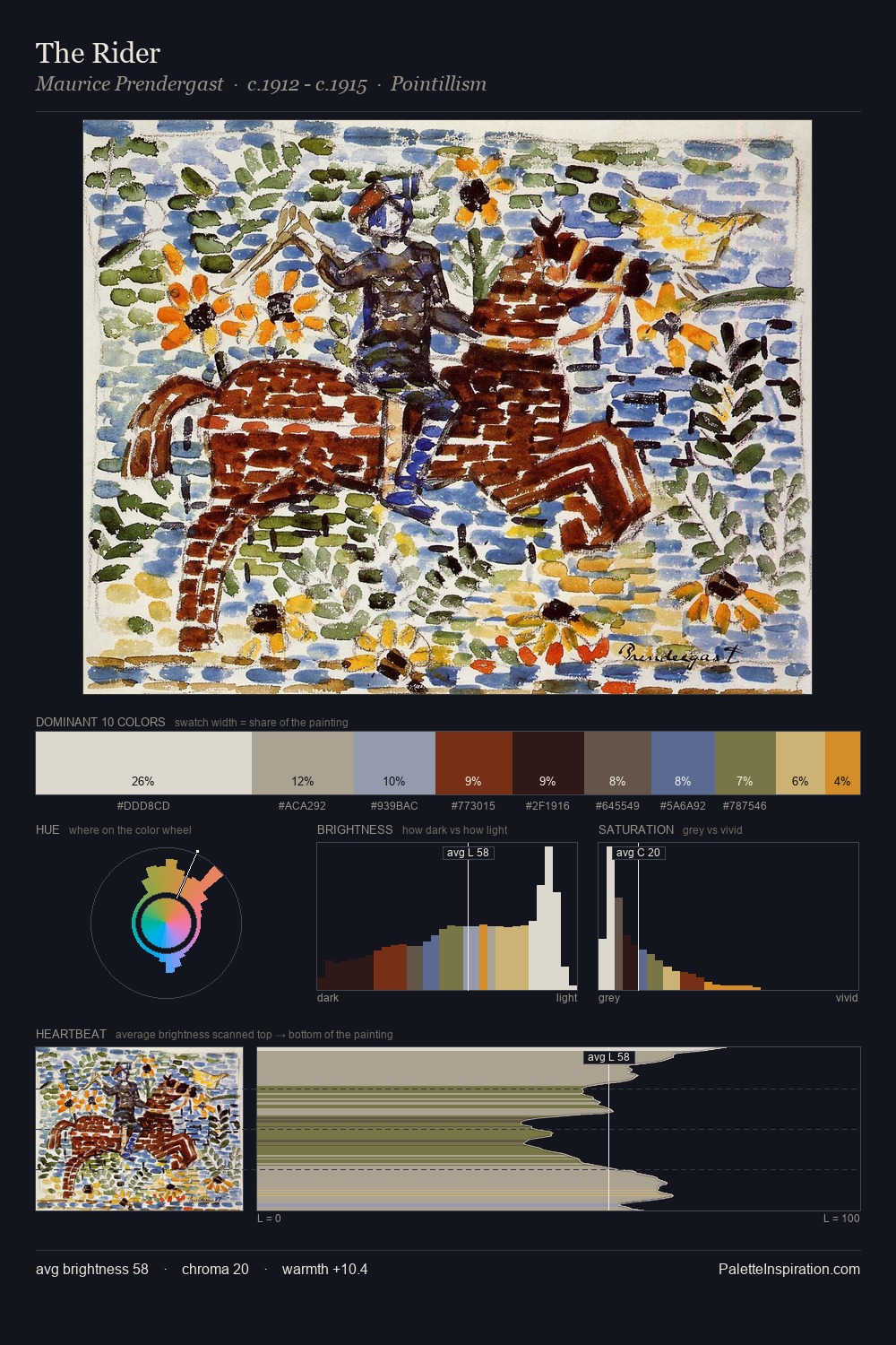
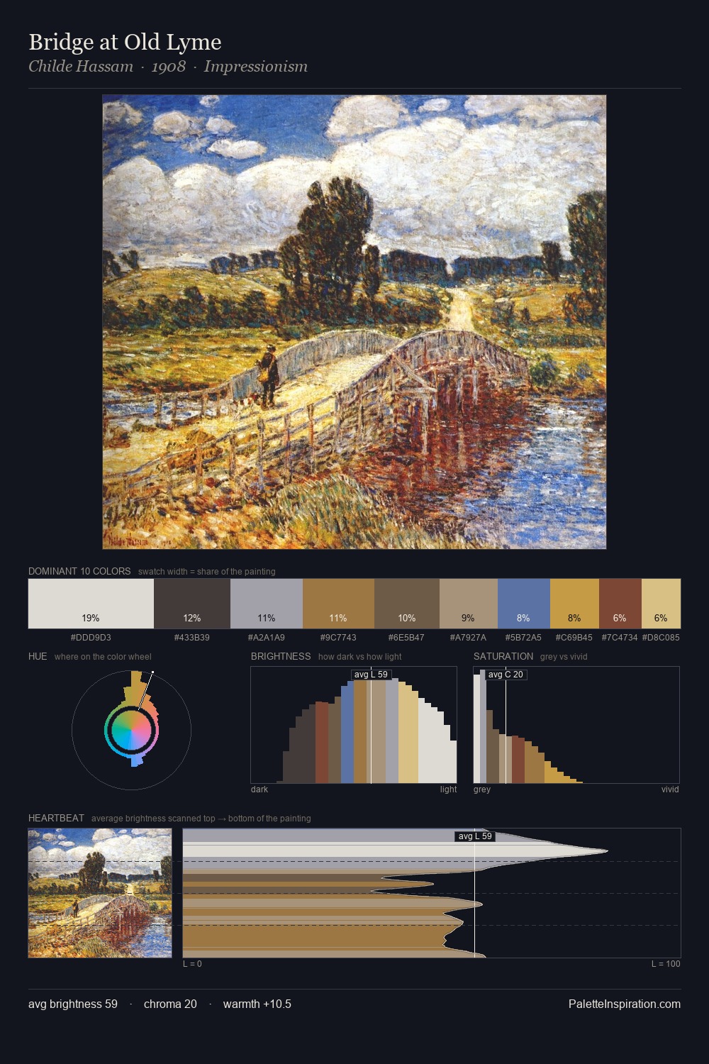
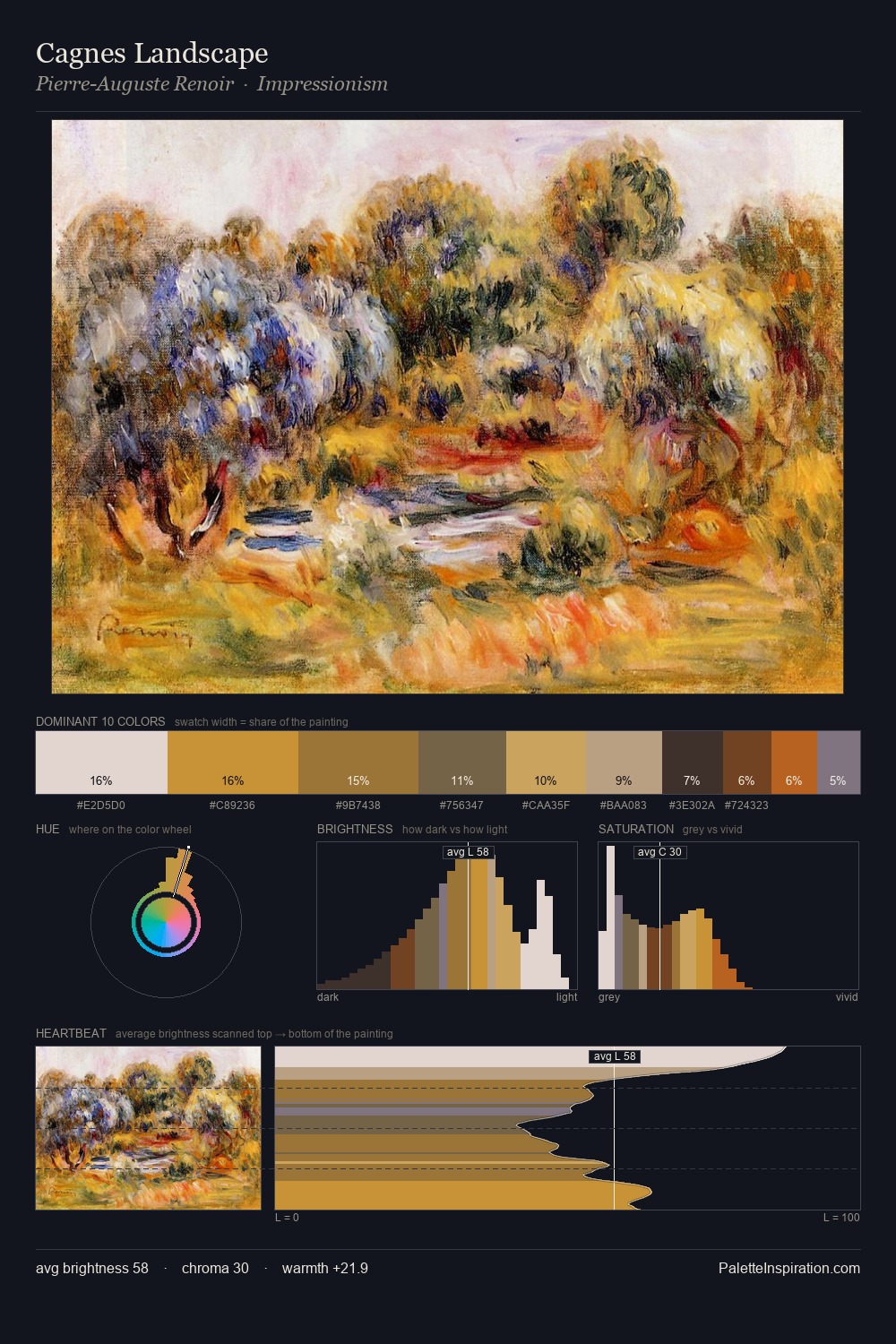
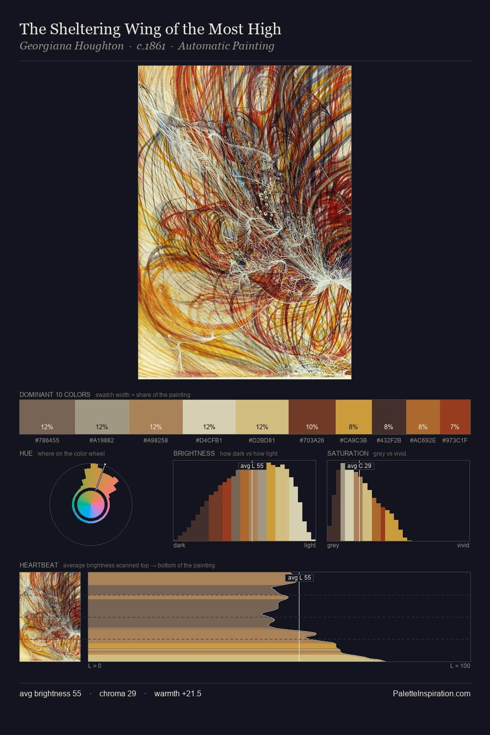
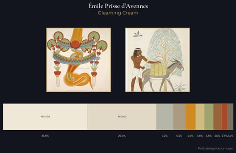
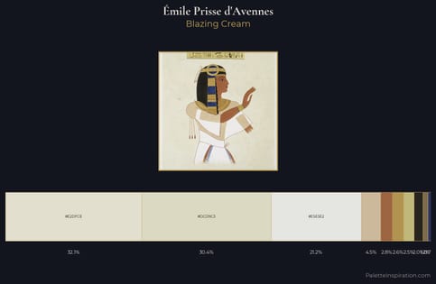
Émile Prisse d'Avennes is high-key - luminous, open, and weighted toward light. Émile Prisse d'Avennes builds on cool foundations: the palette favours the blue-cyan-green arc. Every colour is desaturated; the palette proceeds through near-neutrals and gently-coloured greys. At 2.5%, #D08A23 carries the palette's sharpest chromatic charge: an accent that earns its place precisely because it is withheld. A value spread of 59 units gives the palette both depth and air - shadows are genuinely dark, lights genuinely light. The mid-to-high key, cool bias, and moderate chroma point to outdoor observation - sky and diffused daylight as the dominant light source. Émile Prisse d'Avennes arrived at this balance through long practice; the palette carries the weight of that experience.
Example use cases
- craft & artisan brands
- specialty coffee
- home goods
- lifestyle retail
- ceramics & pottery
I Love This!
Copy, export, or download for your project