Émile Prisse d'Avennes Palette 1
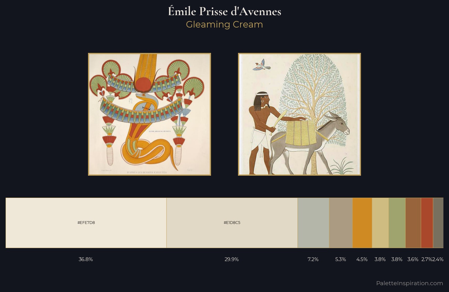
Palette Analysis
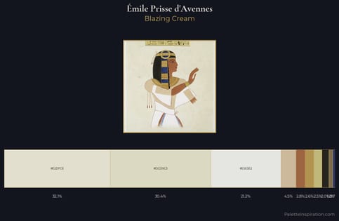
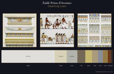
Values in Émile Prisse d'Avennes tilt decisively toward white, giving the palette its luminous character. Temperature is cool-dominant, with blue and green families claiming the largest areas. The absence of saturated colour is itself an expressive choice: this is a palette of restraint and atmosphere. #EFE7D8 at 36.8% of the palette: an overwhelming presence that pulls all other colours into its gravitational field. The highest-chroma note - #AA482C - appears at just 2.7%, deployed as a precision accent against the quieter ground. Spanning 40 units on the value axis, the palette achieves the balance between tonal flatness and fragmentation. The mid-to-high key, cool bias, and moderate chroma point to outdoor observation - sky and diffused daylight as the dominant light source. In the context of Émile Prisse d'Avennes's full range of palettes, group 1 represents one movement in an ongoing chromatic dialogue.
Example use cases
- ceramics & pottery
- boutique hospitality
- menswear
- heritage food brands
- craft & artisan brands
I Love This!
Copy, export, or download for your project