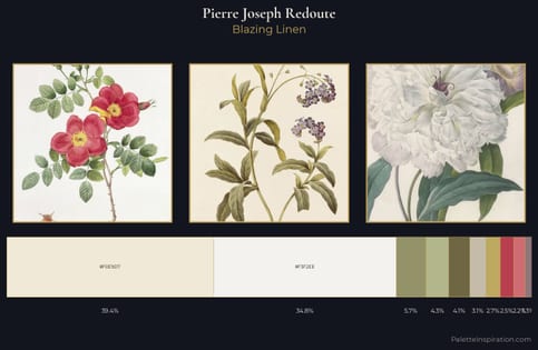
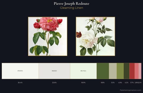
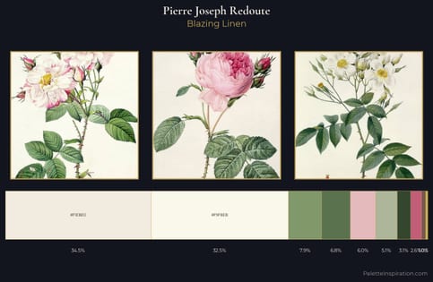
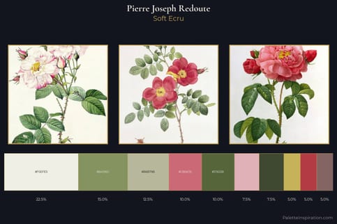
Pierre Joseph Redoute Palette 4
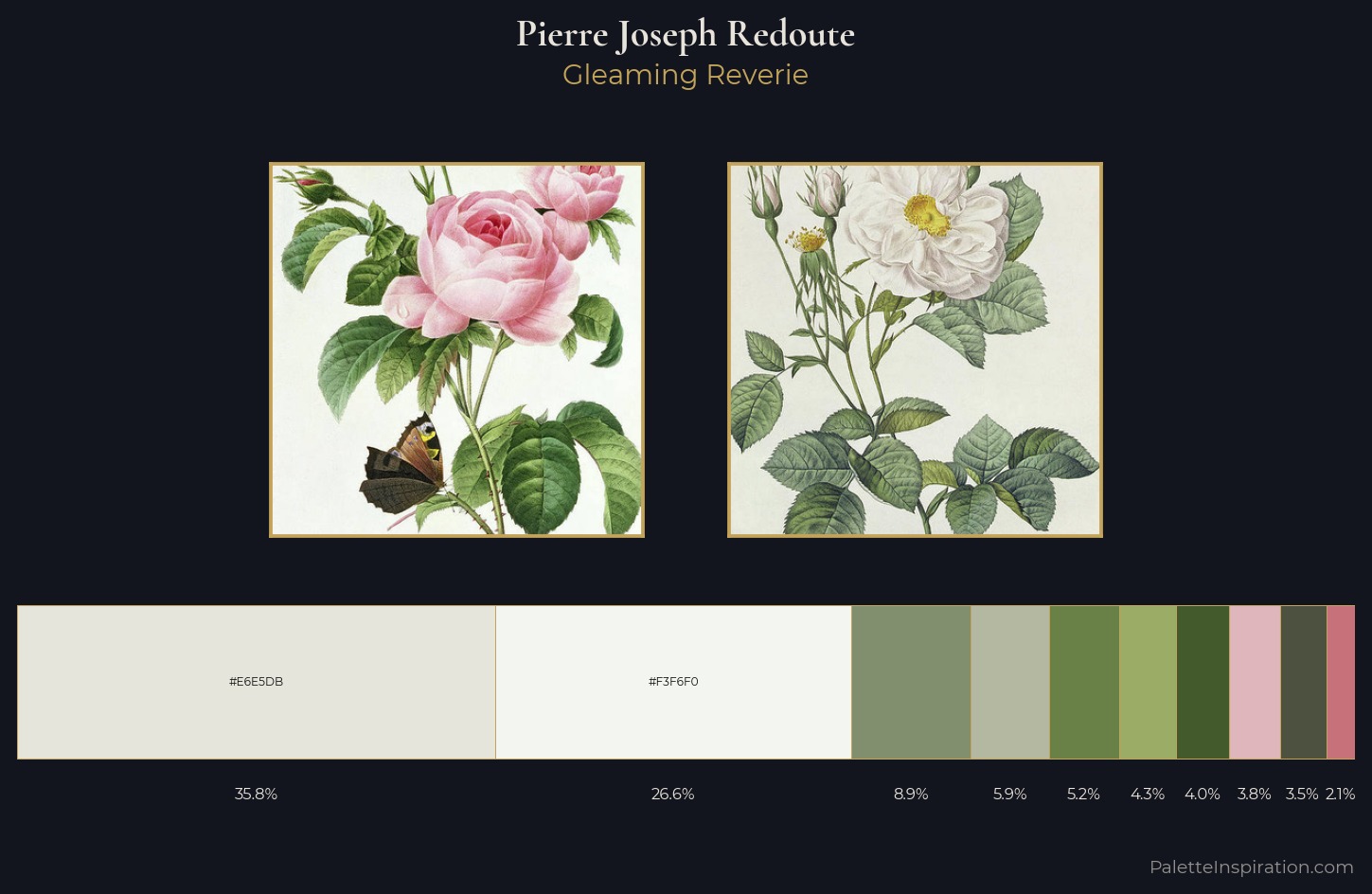
Palette Analysis
Pierre Joseph Redoute is strongly light-biased - shadow is suggested rather than declared. Temperature is cool-dominant, with blue and green families claiming the largest areas. Saturation is deliberately withheld - the beauty here lies in the near-monochromatic gradations rather than colour difference. #E6E5DB claims 35.8% of the surface, functioning as the work's tonal foundation. Only 2.1% is devoted to #C7727A, yet that small allocation delivers the palette's entire chromatic tension. The value range of 54 units sits in the comfortable middle: enough depth, enough light, neither extreme. High luminosity and cool temperature suggest the plein-air condition: unfiltered daylight and open sky. Palette 4 sits within the larger chromatic argument that Pierre Joseph Redoute's complete body of work advances.
Example use cases
- ceramics & pottery
- boutique hospitality
- menswear
- heritage food brands
- craft & artisan brands
I Love This!
Copy, export, or download for your project