Jacob van der Ulft Palette 3

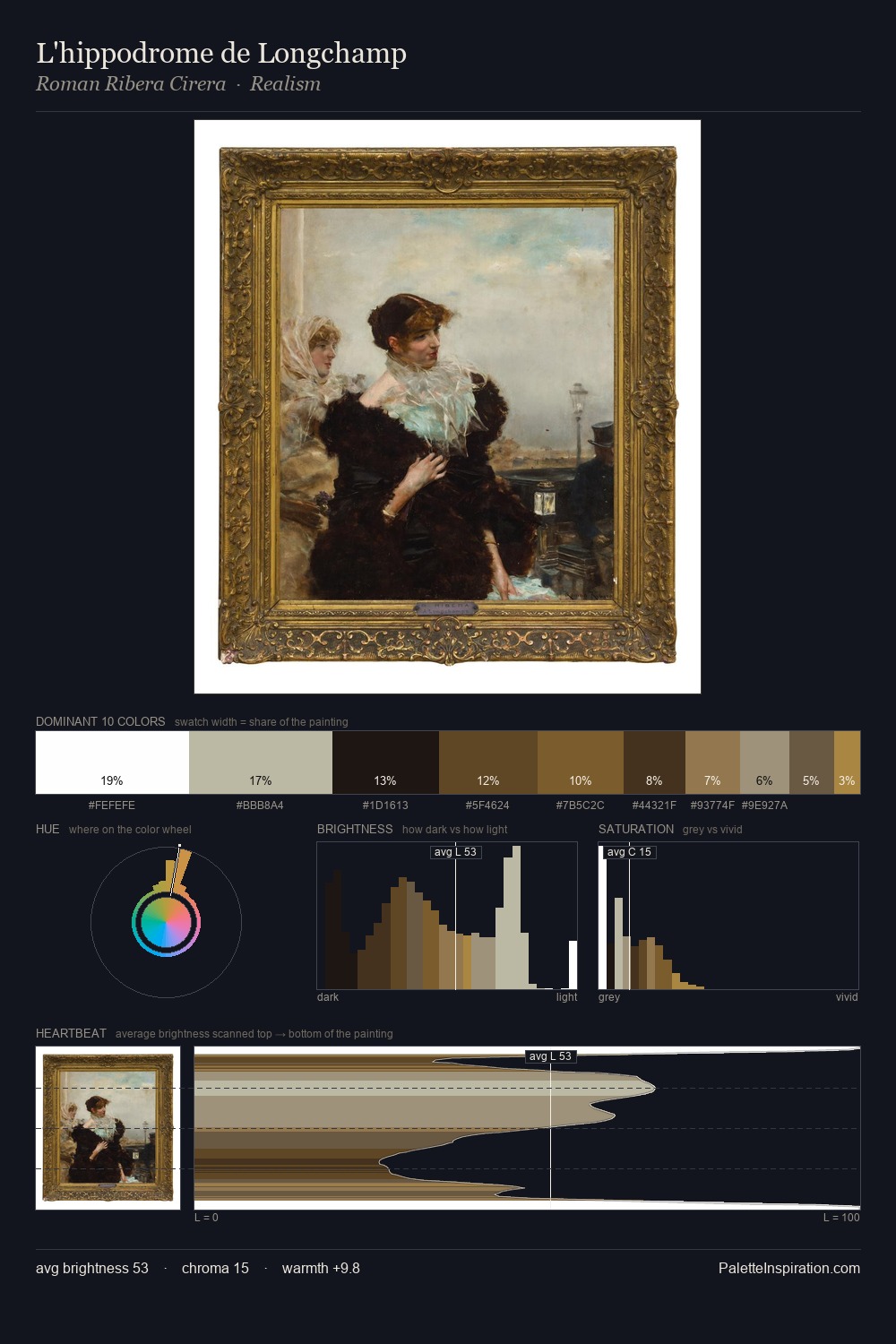
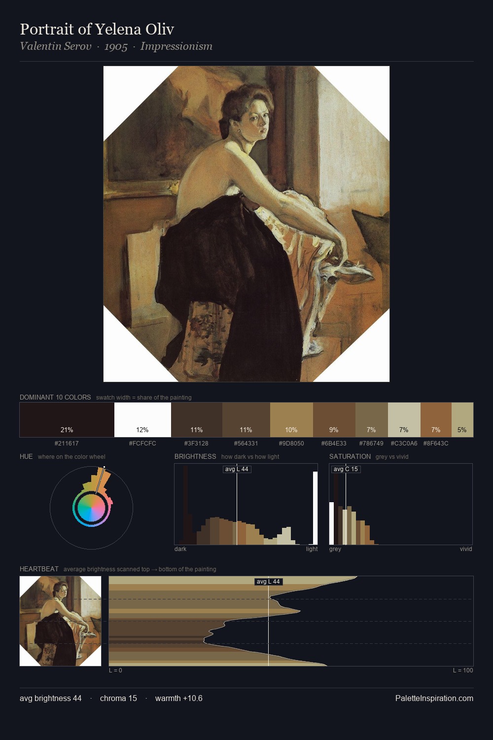
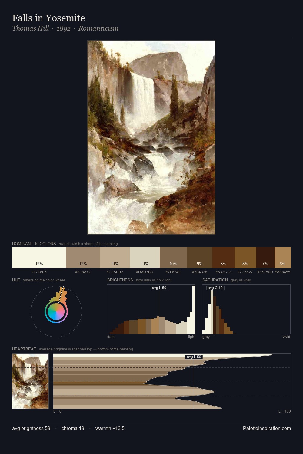
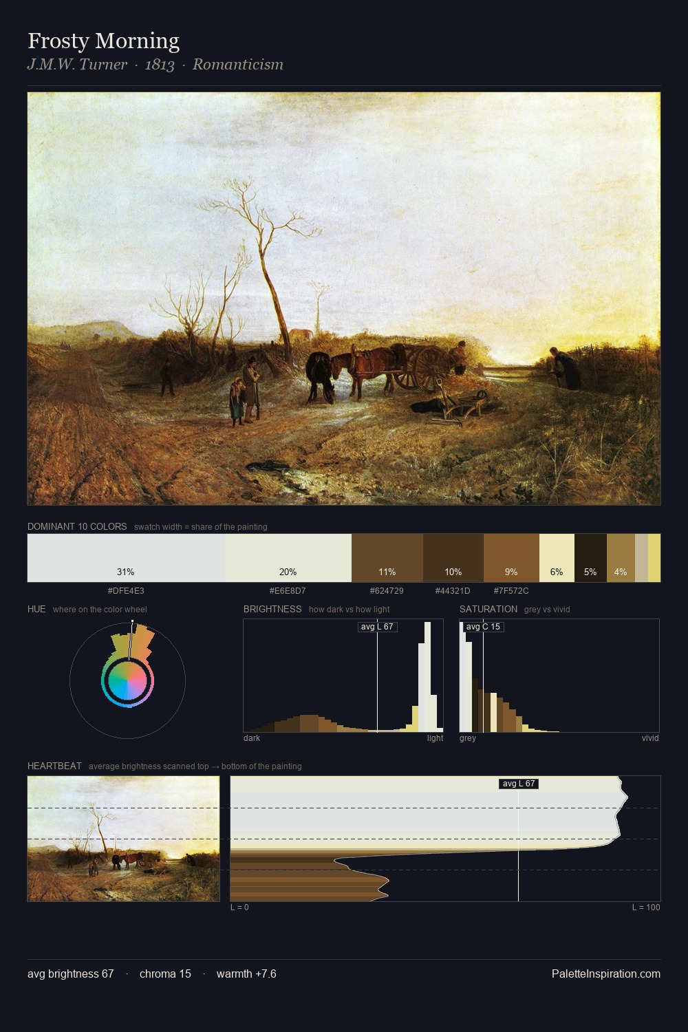
Palette Analysis
Jacob van der Ulft works in the upper reaches of the value scale, creating an atmosphere of brightness and expansiveness. Jacob van der Ulft builds on cool foundations: the palette favours the blue-cyan-green arc. Chroma is kept low across all colours, producing the soft, enveloping quality that characterises tonal painting. The dominant colour, #FFFFFE, takes 41.0% of the total area, establishing the overall mood before any other hue is introduced. The most saturated colour, #855729, is reserved to 2.1% of the surface, where it acts as a focal punctuation. The value range spans 71 units across the palette, providing the full gamut from deep shadow to near-white and ensuring clear tonal hierarchy. The palette has the character of outdoor light: cool, mid-bright, with colour rendered faithfully rather than expressively. This is palette 3 of Jacob van der Ulft's sequence - a single chapter in a chromatic story told across many works.
Example use cases
- professional services
- specialty retail
- photography agencies
- tech products
- art galleries
I Love This!
Copy, export, or download for your project