Jacob van der Ulft Palette 1
Soft Ecru
Soft Low-contrast, gentle chroma - mid-key values and low saturation, approachable and calm.
Ecru Unbleached linen - warm mid-neutral, slightly grayed, raw and natural.

Palette Analysis
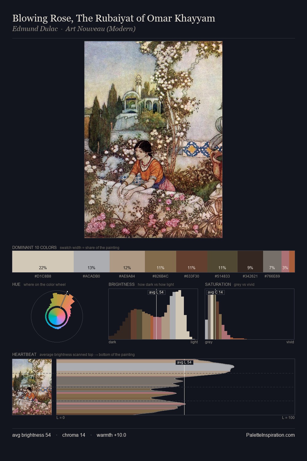
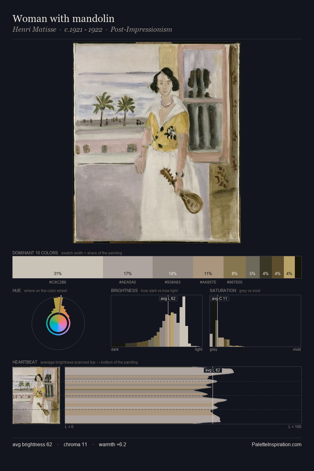
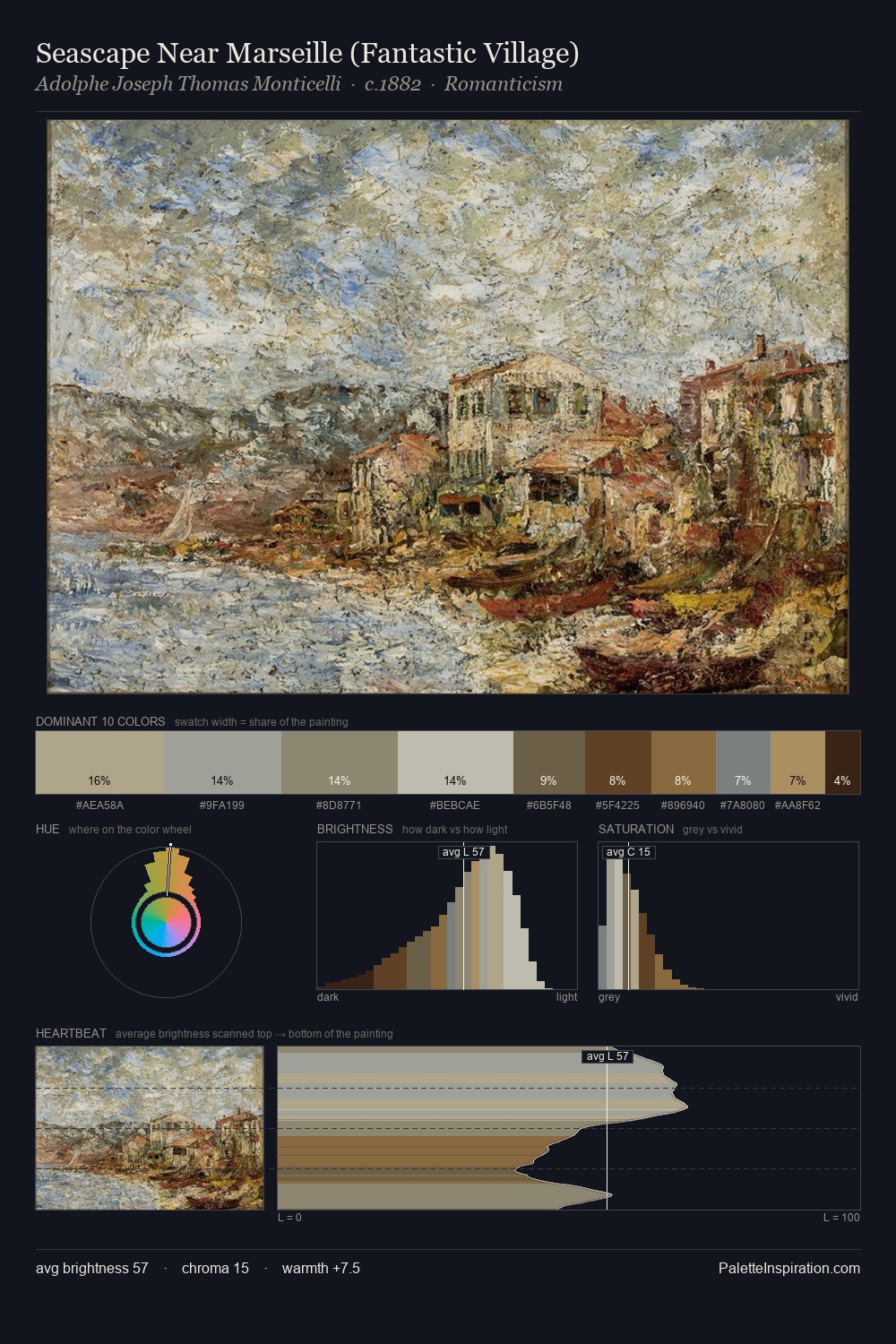
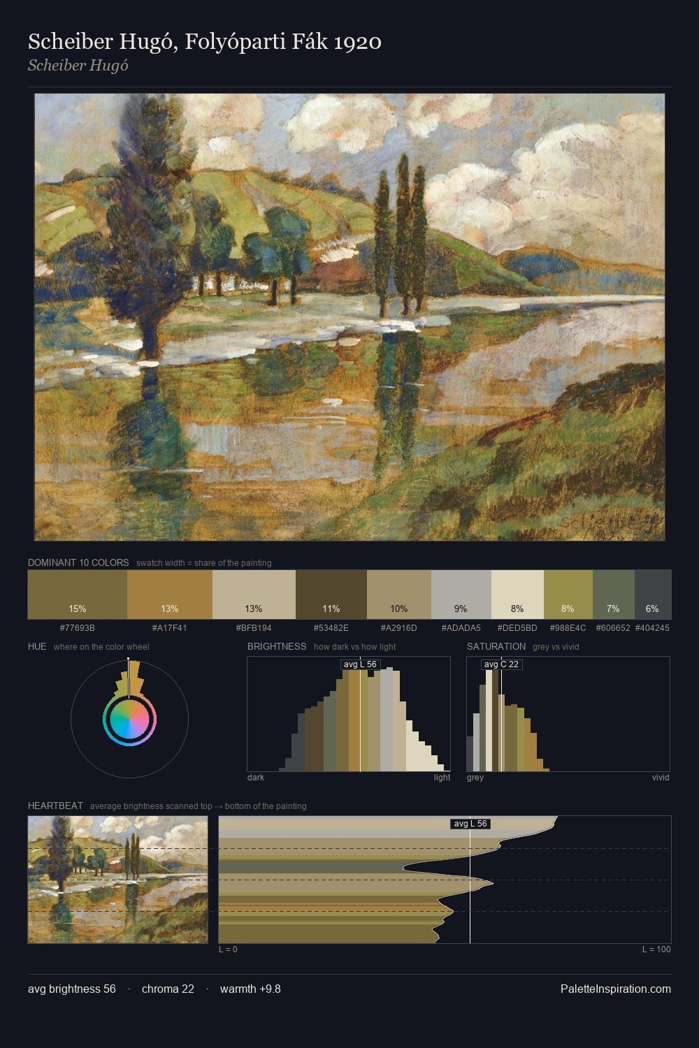
The high-key values of Jacob van der Ulft give it an effulgent, almost bleached quality. Cool tones set the register here - the blues and greens easily outweigh any warm accents. All colours lean toward grey, building depth through value rather than colour punch. #57472E functions as the palette's exclamation mark: highest chroma, lowest percentage (5.0%). Spanning 41 units on the value axis, the palette achieves the balance between tonal flatness and fragmentation. The palette has the character of outdoor light: cool, mid-bright, with colour rendered faithfully rather than expressively. In the context of Jacob van der Ulft's full range of palettes, group 1 represents one movement in an ongoing chromatic dialogue.
Example use cases
- exhibition design
- foundation branding
- estate management
- art education
- museums & galleries
I Love This!
Use This Palette
Copy, export, or download for your project
Copy, export, or download for your project
Copy:
Download:
Share: