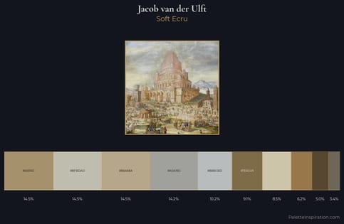
Jacob van der Ulft Palette 2
Palette Analysis
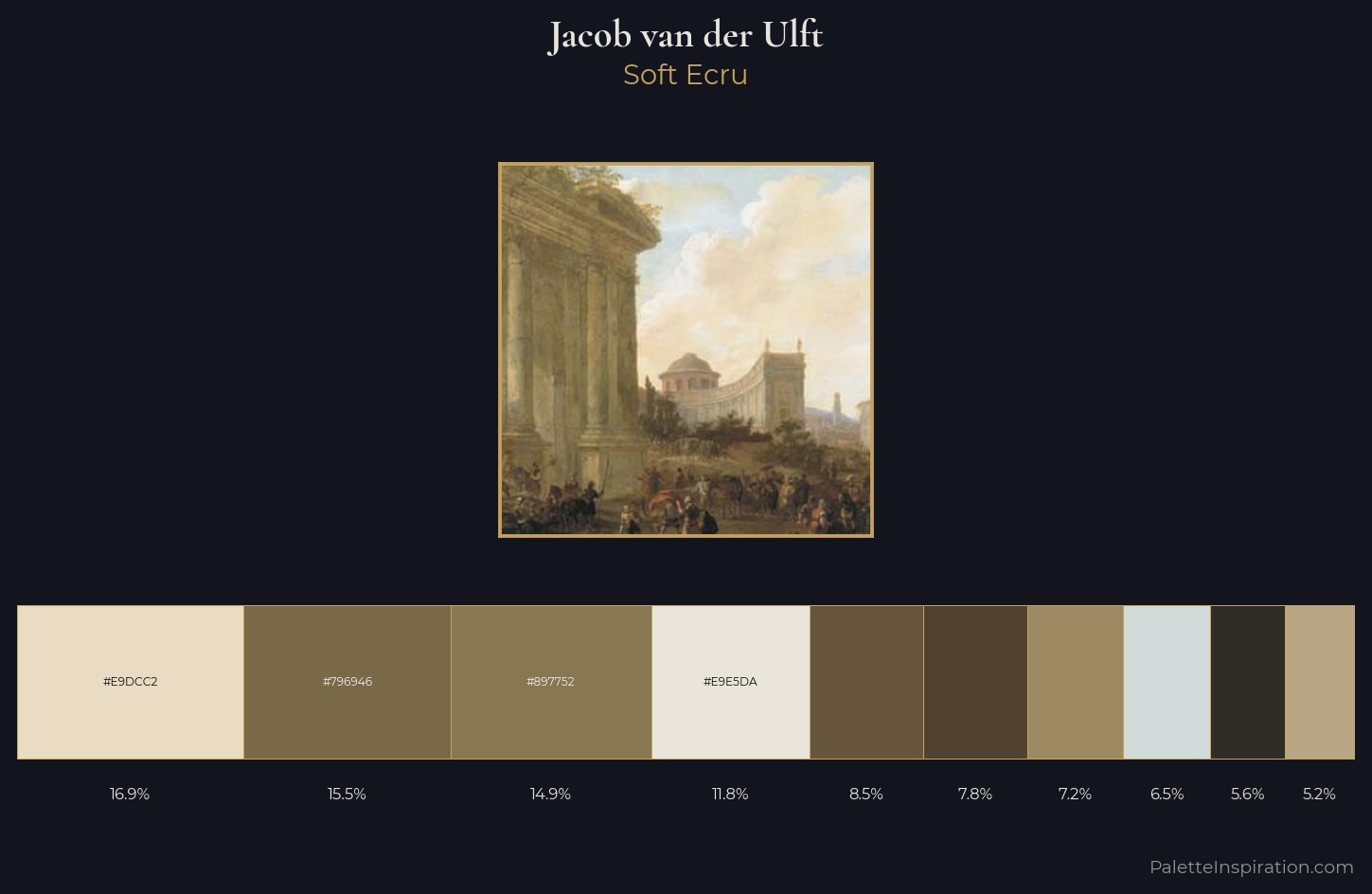
Light floods Jacob van der Ulft; the palette keeps values pale and airy across its range. Cool tones set the register here - the blues and greens easily outweigh any warm accents. All colours lean toward grey, building depth through value rather than colour punch. The highest-chroma note - #B9A684 - appears at just 5.2%, deployed as a precision accent against the quieter ground. The value range spans 63 units across the palette, providing the full gamut from deep shadow to near-white and ensuring clear tonal hierarchy. High luminosity and cool temperature suggest the plein-air condition: unfiltered daylight and open sky. Jacob van der Ulft's palette 2 carries its own internal logic while remaining in conversation with the artist's broader colour intelligence.
Example use cases
- ceramics & pottery
- boutique hospitality
- menswear
- heritage food brands
- craft & artisan brands
I Love This!
Copy, export, or download for your project