James Malton Palette 2

Palette Analysis
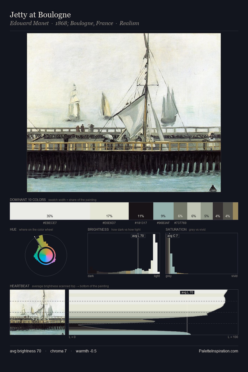
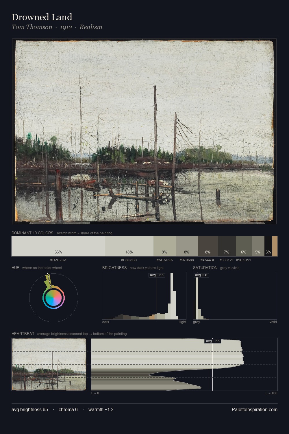
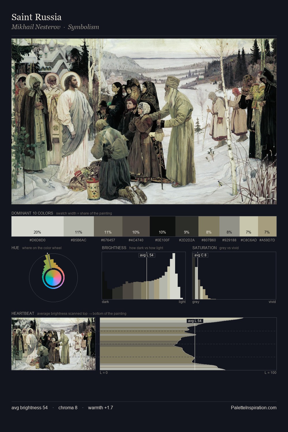
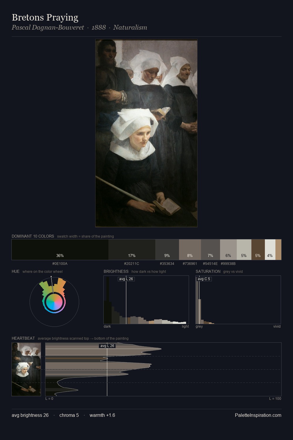
James Malton works in the upper reaches of the value scale, creating an atmosphere of brightness and expansiveness. Blues and teal-greys govern the palette, lending it an aquatic or atmospheric quality. The absence of saturated colour is itself an expressive choice: this is a palette of restraint and atmosphere. A single dominant - #E8E9E2 at 47.0% - sets the character of the whole composition. The highest-chroma note - #A49367 - appears at just 1.6%, deployed as a precision accent against the quieter ground. At 74 units of value range, the palette has the tonal breadth to sustain complex spatial readings. High luminosity and cool temperature suggest the plein-air condition: unfiltered daylight and open sky. In the context of James Malton's full range of palettes, group 2 represents one movement in an ongoing chromatic dialogue.
Example use cases
- florist branding
- event design
- real estate
- jewelry retail
- hospitality branding
I Love This!
Copy, export, or download for your project