William Bradford Palette 3

Palette Analysis
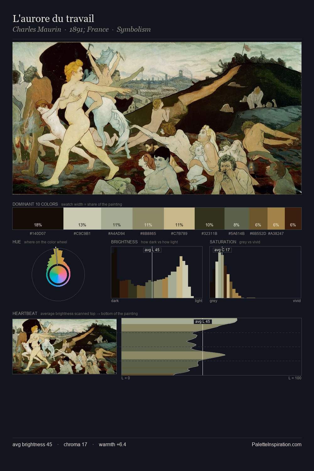
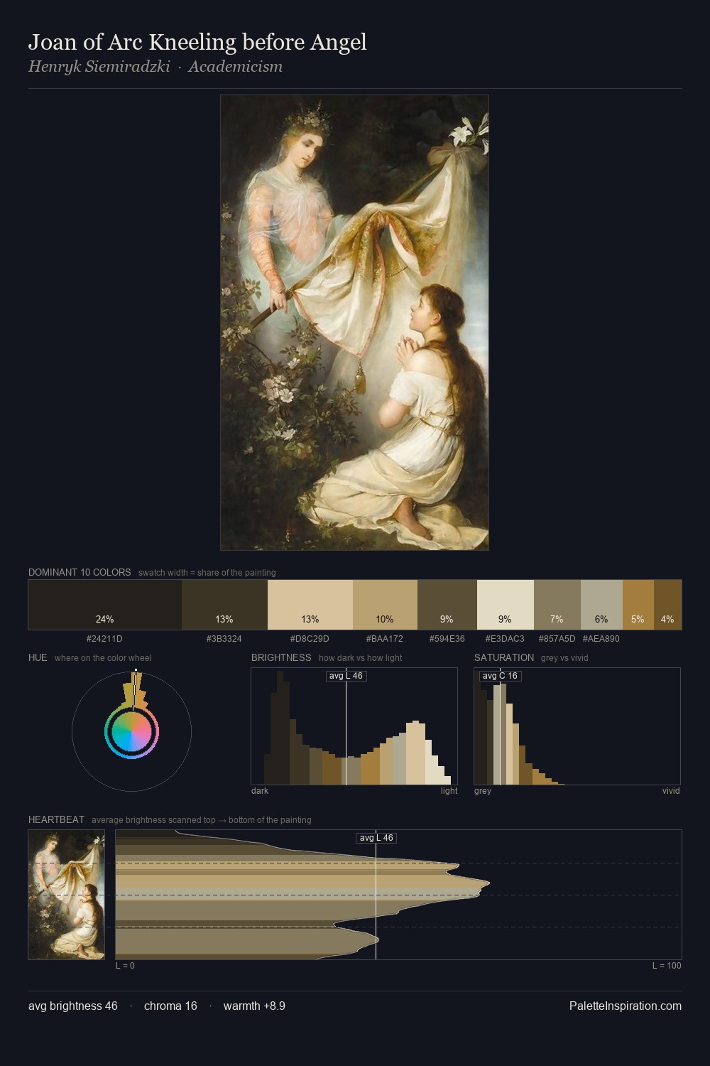
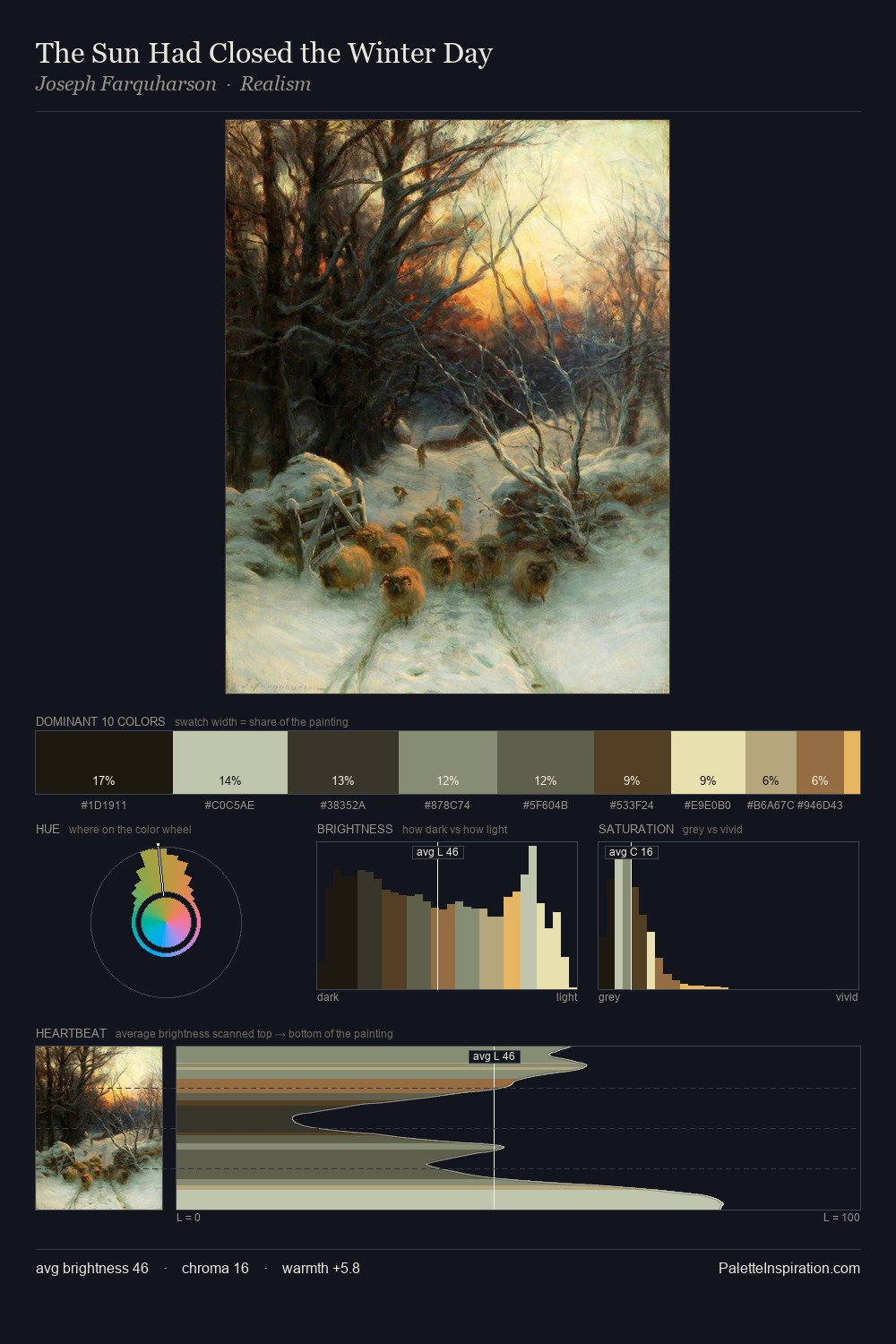
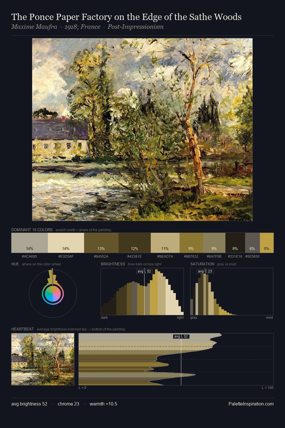
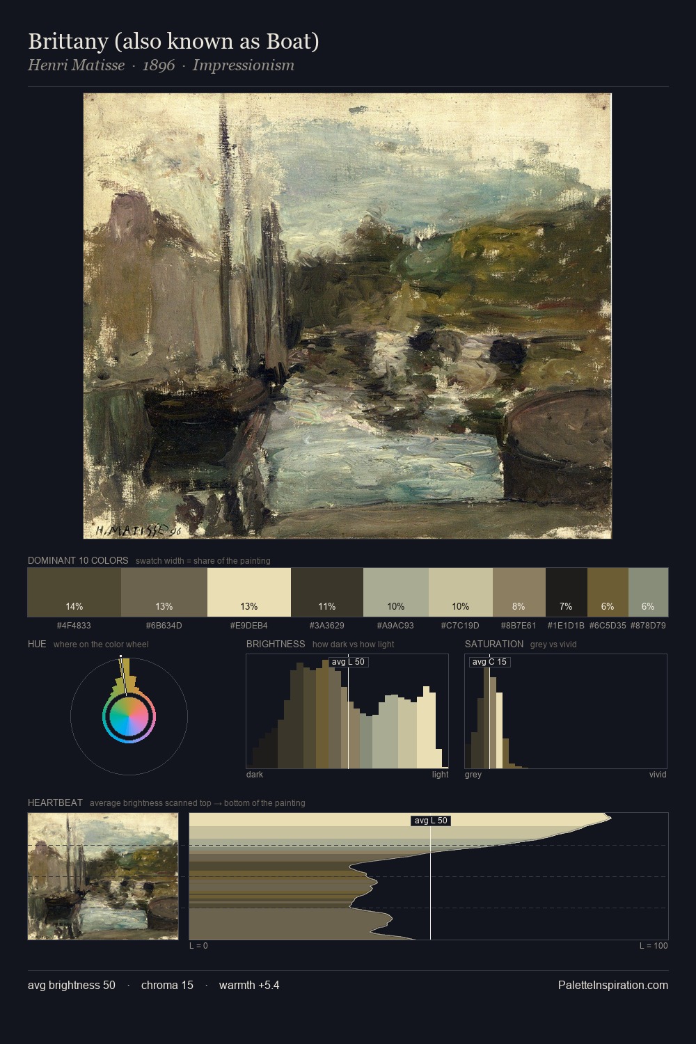
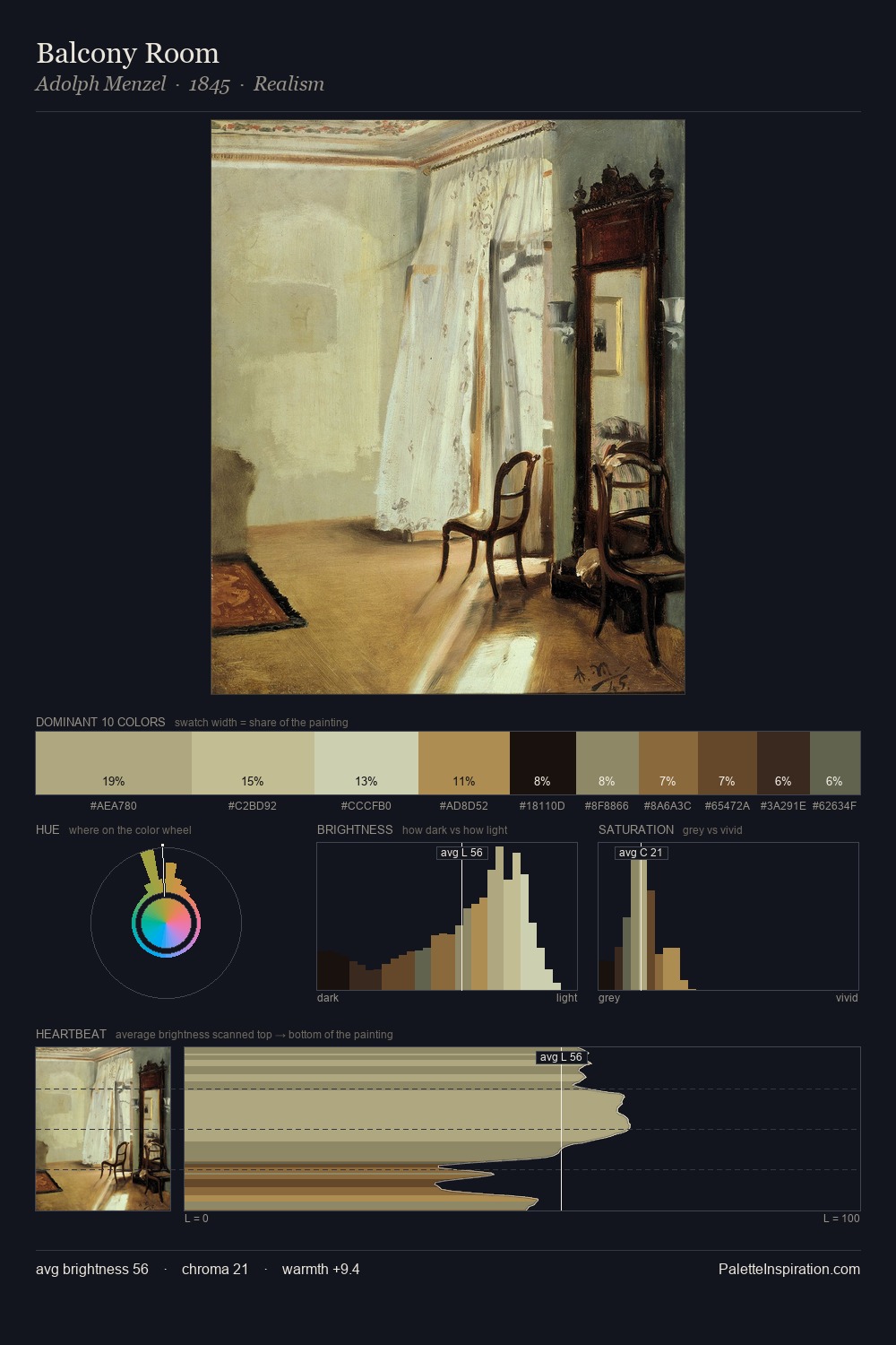
William Bradford is high in key: pale, luminous, and filled with optical air. William Bradford builds on cool foundations: the palette favours the blue-cyan-green arc. The absence of saturated colour is itself an expressive choice: this is a palette of restraint and atmosphere. #413824 is not a small accent - at 6.1% it qualifies as a major presence and gives the palette its chromatic identity. From deepest dark to palest light, the palette traverses 69 units of the value scale - a span that creates natural depth. High luminosity and cool temperature suggest the plein-air condition: unfiltered daylight and open sky. In the context of William Bradford's full range of palettes, group 3 represents one movement in an ongoing chromatic dialogue.
Example use cases
- publishing
- corporate identity
- consumer apps
- hospitality
- design agencies
I Love This!
Copy, export, or download for your project