William Bradford Palette 2

Palette Analysis
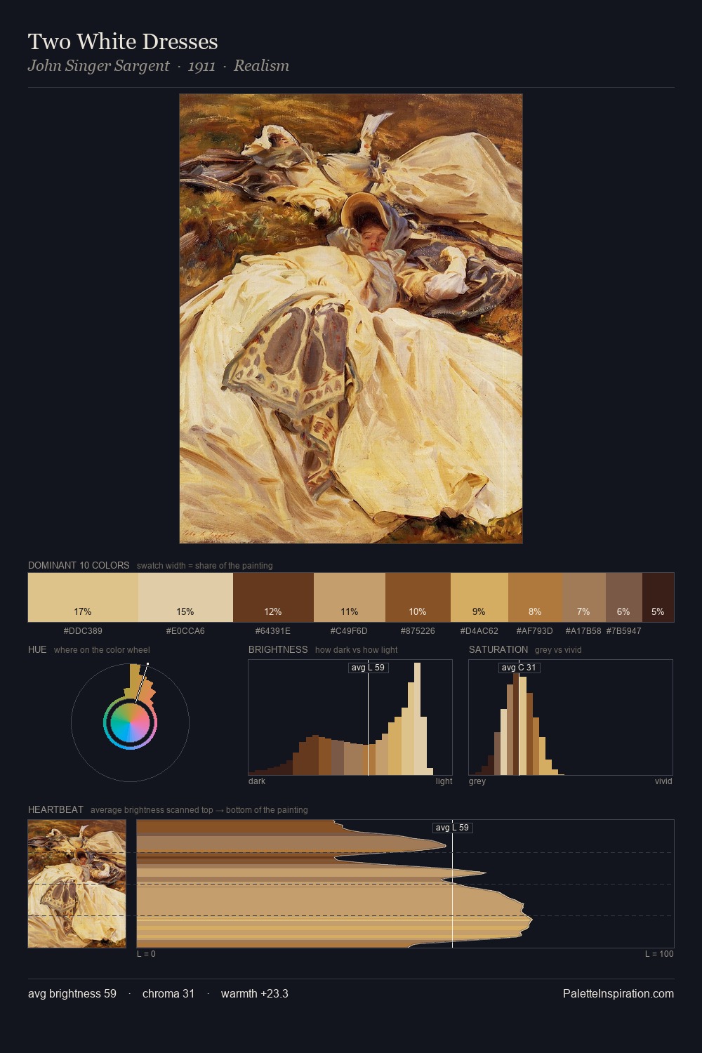
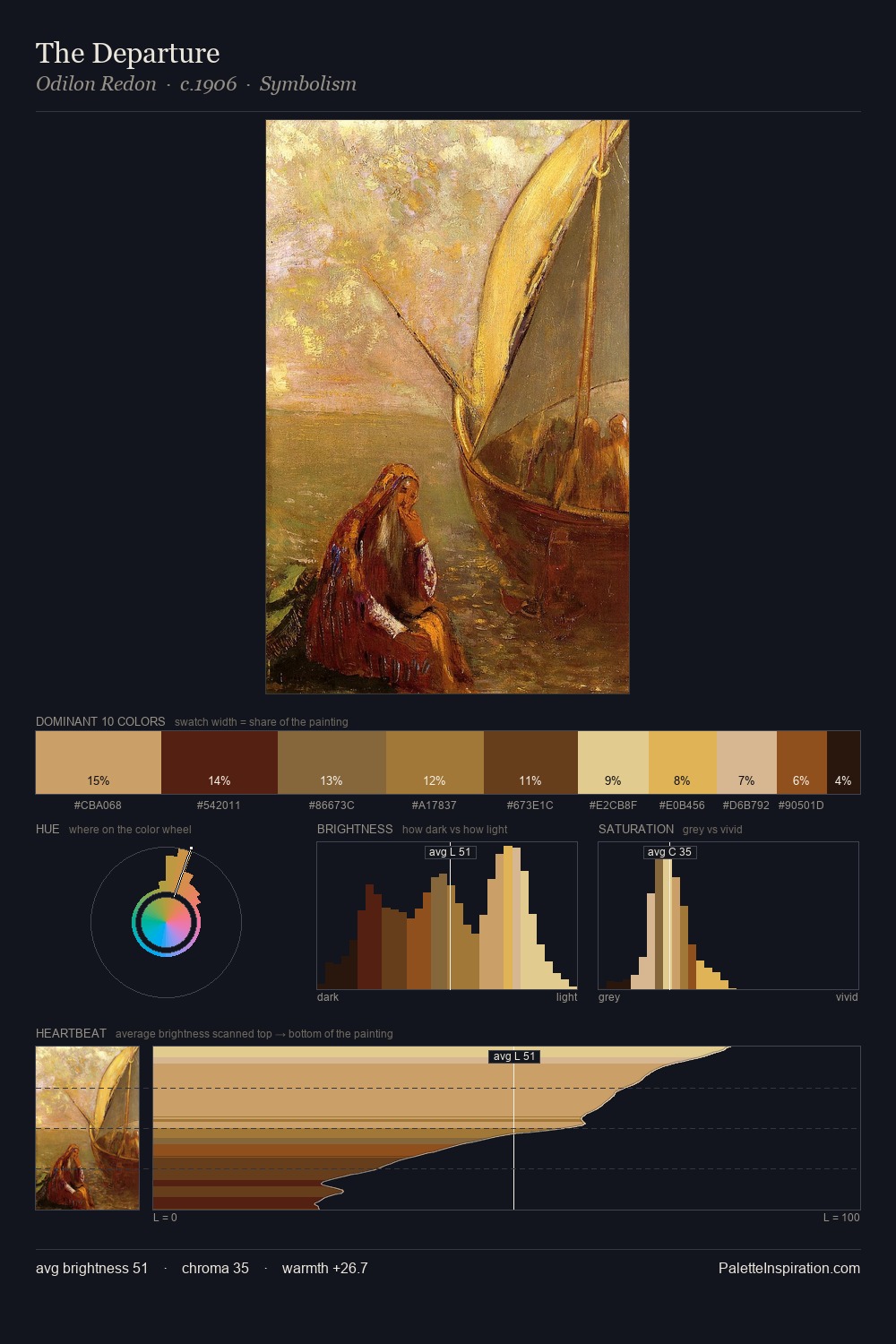
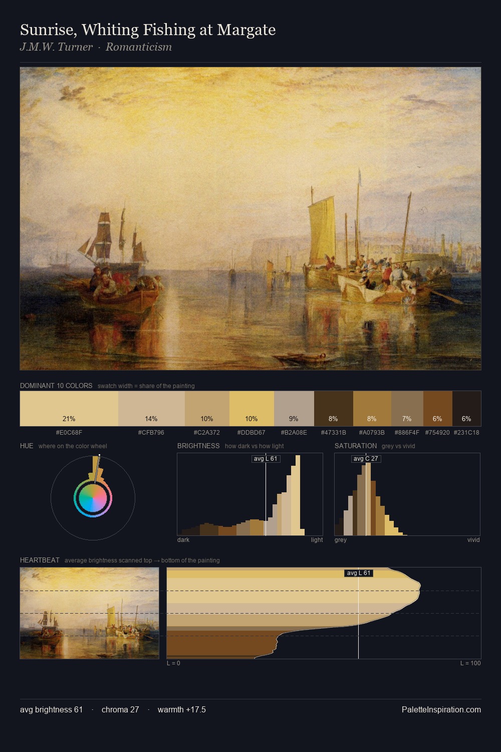
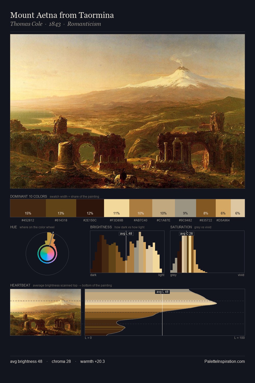
Values in William Bradford tilt decisively toward white, giving the palette its luminous character. William Bradford tilts toward cool - blues and silver-greys carry the structural weight. Mid-range chroma keeps the palette grounded - colourful but not strident. At 7.8%, #552E1B carries the palette's sharpest chromatic charge: an accent that earns its place precisely because it is withheld. From deepest dark to palest light, the palette traverses 67 units of the value scale - a span that creates natural depth. The palette has the character of outdoor light: cool, mid-bright, with colour rendered faithfully rather than expressively. This is palette 2 of William Bradford's sequence - a single chapter in a chromatic story told across many works.
Example use cases
- publishing
- corporate identity
- consumer apps
- hospitality
- design agencies
I Love This!
Copy, export, or download for your project