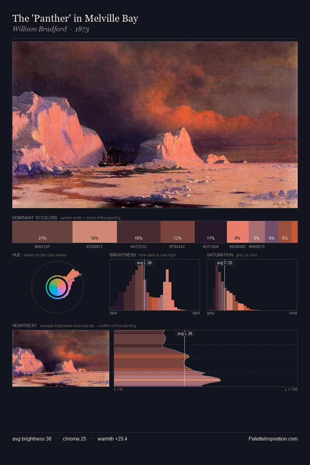
William Bradford Palette 11
Shadowed Terracotta
Shadowed Low-key - values weighted toward shadow, the palette of dim interiors and overcast skies.
Terracotta Fired clay red-orange - the color of unglazed earthenware pottery.

Palette Analysis
William Bradford occupies the comfortable middle of the value scale, avoiding both extremes to hold the eye in a sustained middle grey. Temperature reads distinctly warm: the reds and earth tones from William Bradford carry the compositional weight. Mid-saturation across the board: the palette has colour character without chromatic excess. #B9411C functions as the palette's exclamation mark: highest chroma, lowest percentage (7.9%). Value range is moderate at 45 units - enough contrast for legibility, not so much as to fragment the tonal unity. Palette 11 sits within the larger chromatic argument that William Bradford's complete body of work advances.
Example use cases
- music labels
- luxury hospitality
- editorial photography
- leather goods
- premium streaming
I Love This!
Use This Palette
Copy, export, or download for your project
Copy, export, or download for your project
Copy:
Download:
Share: