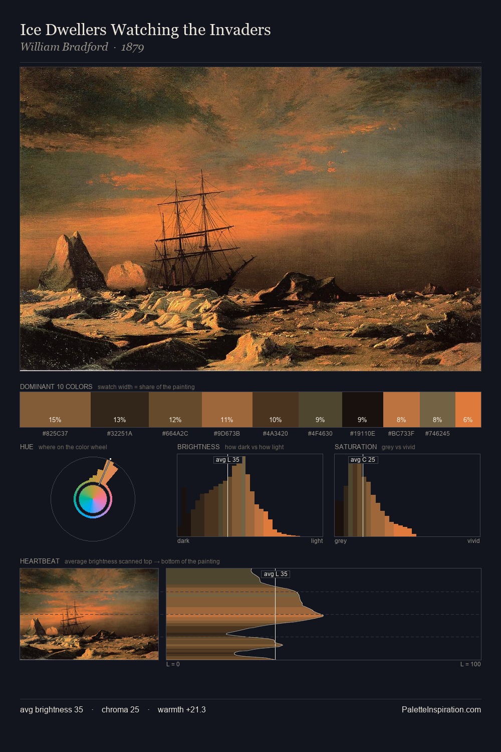
William Bradford Palette 12
Shadowed Caramel
Shadowed Low-key - values weighted toward shadow, the palette of dim interiors and overcast skies.
Caramel Warm mid-brown - the color of cooked sugar, smooth and amber-toned.

Palette Analysis
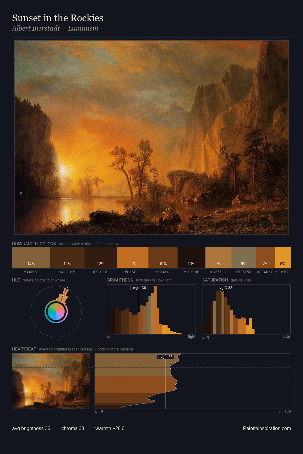
Values in William Bradford rest in the mid-range - neither dramatically lit nor steeped in shadow. Warm hues command this palette; William Bradford favours the reds, oranges, and yellows of firelight and earth. Saturation is measured and controlled, giving the palette presence without visual aggression. The most saturated colour, #B36E3B, is reserved to 7.9% of the surface, where it acts as a focal punctuation. Value range is moderate at 49 units - enough contrast for legibility, not so much as to fragment the tonal unity. This is palette 12 of William Bradford's sequence - a single chapter in a chromatic story told across many works.
Example use cases
- theater design
- jewelry brands
- tobacco-adjacent retail
- event branding
- film & entertainment
I Love This!
Use This Palette
Copy, export, or download for your project
Copy, export, or download for your project
Copy:
Download:
Share: