David Roberts Palette 2

Palette Analysis
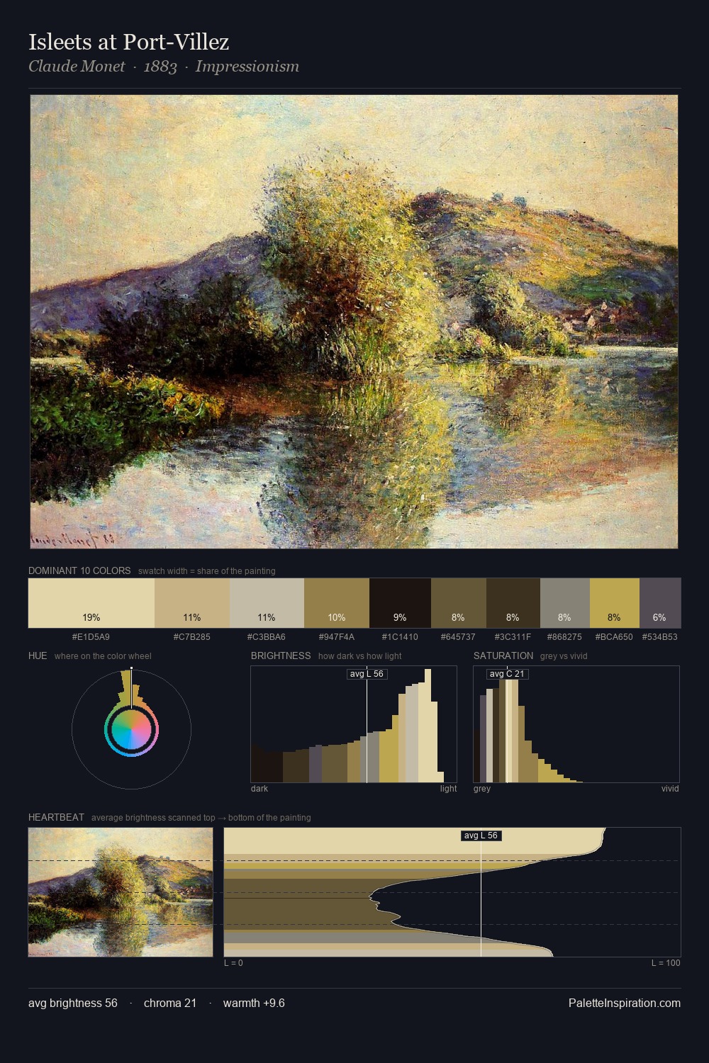
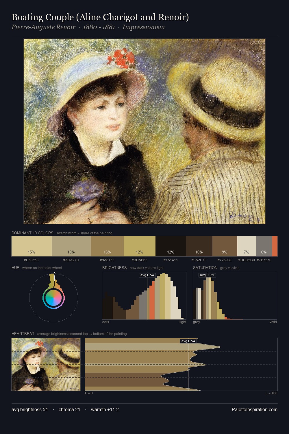
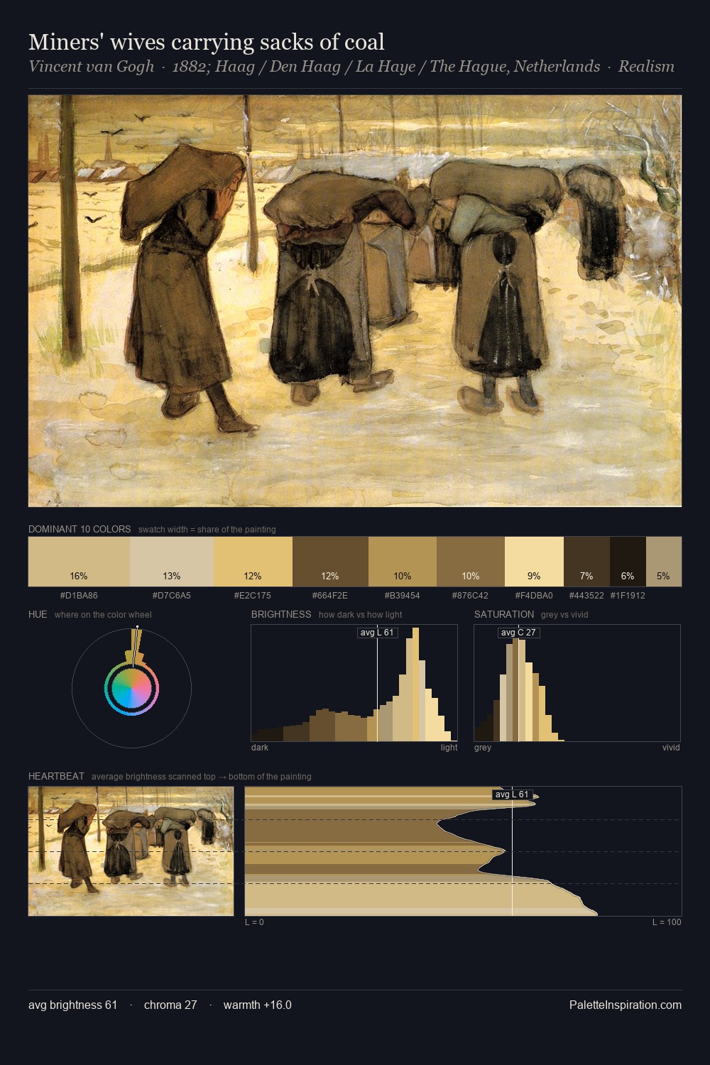
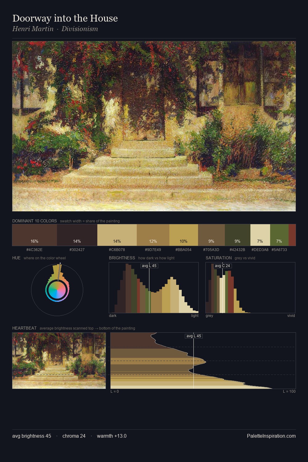
The high-key values of David Roberts give it an effulgent, almost bleached quality. Cool hues prevail: blues, greens, and greys anchor the palette's emotional temperature. Chroma hovers near zero; colour declares itself through subtle shifts in hue rather than outright saturation. At 2.4%, #B6984A carries the palette's sharpest chromatic charge: an accent that earns its place precisely because it is withheld. A value spread of 56 units gives the palette both depth and air - shadows are genuinely dark, lights genuinely light. High luminosity and cool temperature suggest the plein-air condition: unfiltered daylight and open sky. In the context of David Roberts's full range of palettes, group 2 represents one movement in an ongoing chromatic dialogue.
Example use cases
- design agencies
- product brands
- e-commerce
- editorial sites
- publishing
I Love This!
Copy, export, or download for your project