David Roberts Palette 3
Pale Apricot
Pale High-key and low-chroma - delicate, bleached, washed with light.
Apricot Soft warm orange - peach-adjacent, the color of ripe stone fruit.

Palette Analysis
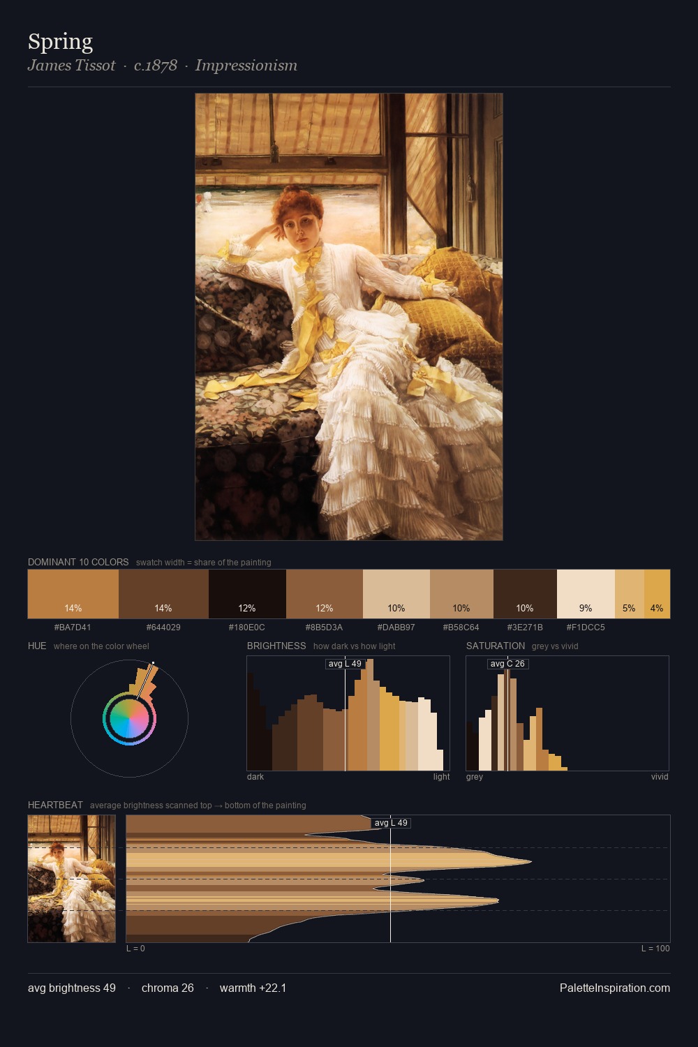
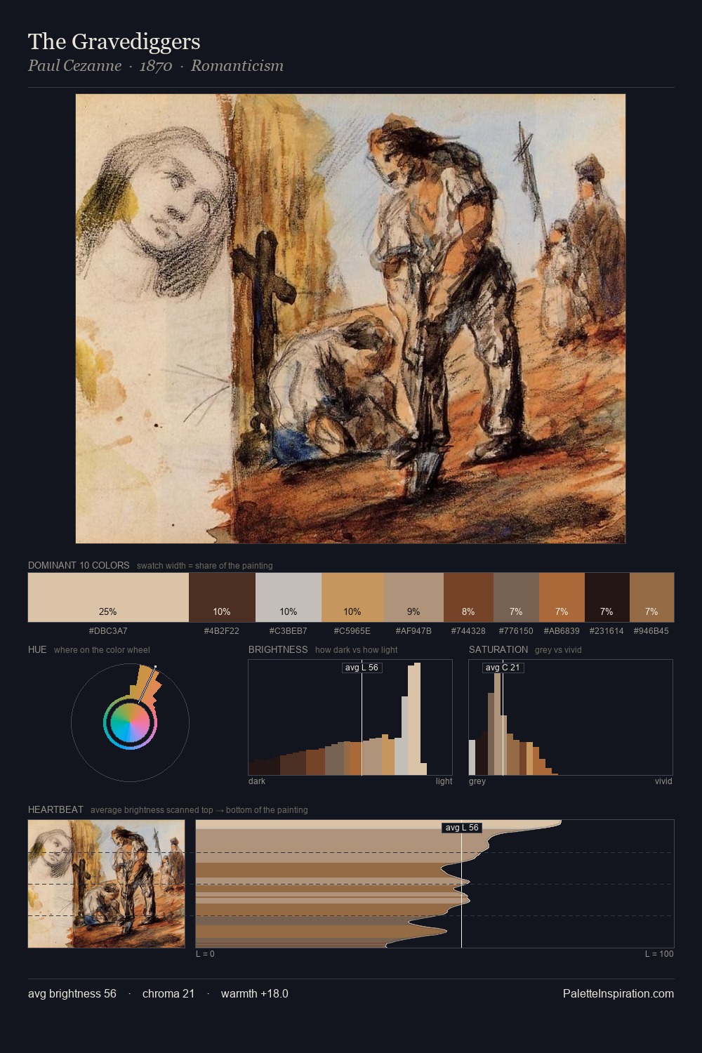
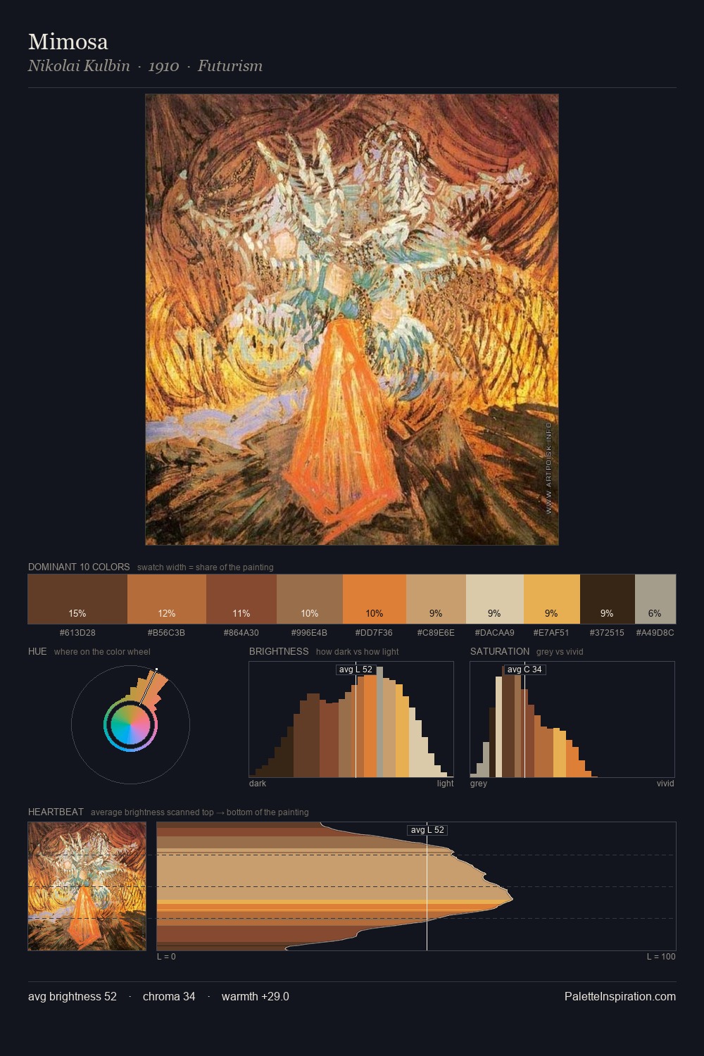
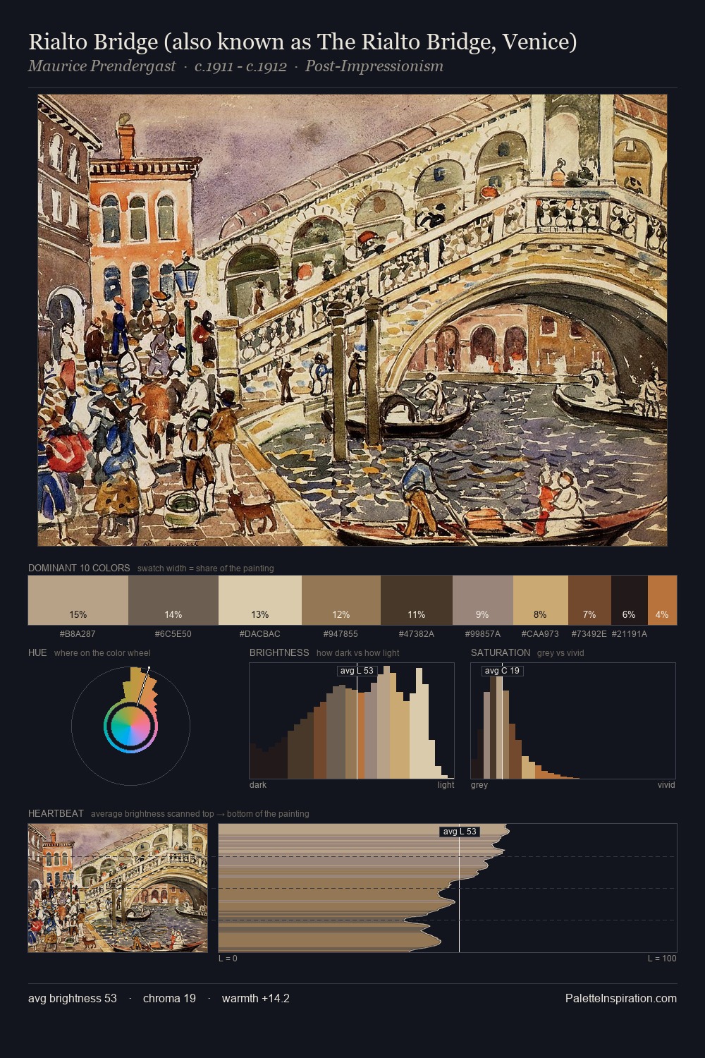
David Roberts distributes its values across the middle register, creating harmony without high contrast. Yellow, ochre, sienna: warm hues that David Roberts deploys as the palette's primary energy. The absence of saturated colour is itself an expressive choice: this is a palette of restraint and atmosphere. Only 9.3% is devoted to #D0A56F, yet that small allocation delivers the palette's entire chromatic tension. At 63 units of value range, the palette has the tonal breadth to sustain complex spatial readings. In the context of David Roberts's full range of palettes, group 3 represents one movement in an ongoing chromatic dialogue.
Example use cases
- ceramics & pottery
- boutique hospitality
- menswear
- heritage food brands
- craft & artisan brands
I Love This!
Use This Palette
Copy, export, or download for your project
Copy, export, or download for your project
Copy:
Download:
Share: