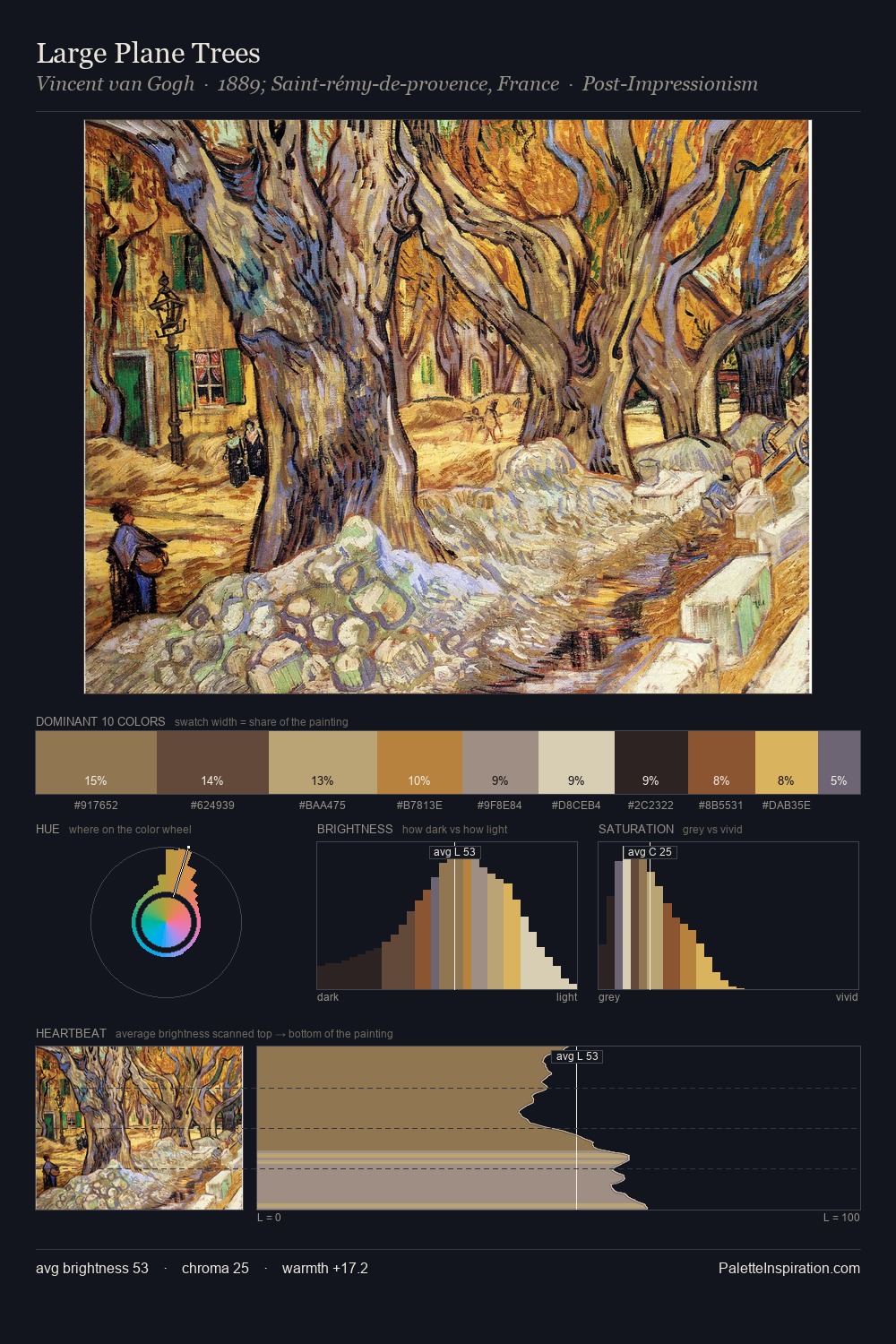
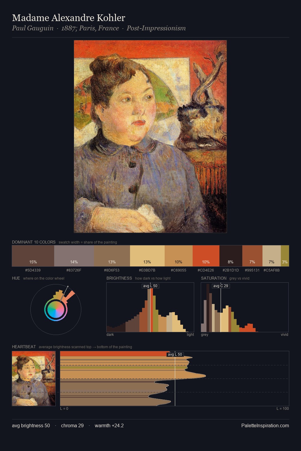
Portrait Palette 7
Soft Apricot
Soft Low-contrast, gentle chroma - mid-key values and low saturation, approachable and calm.
Apricot Soft warm orange - peach-adjacent, the color of ripe stone fruit.
Palette Analysis
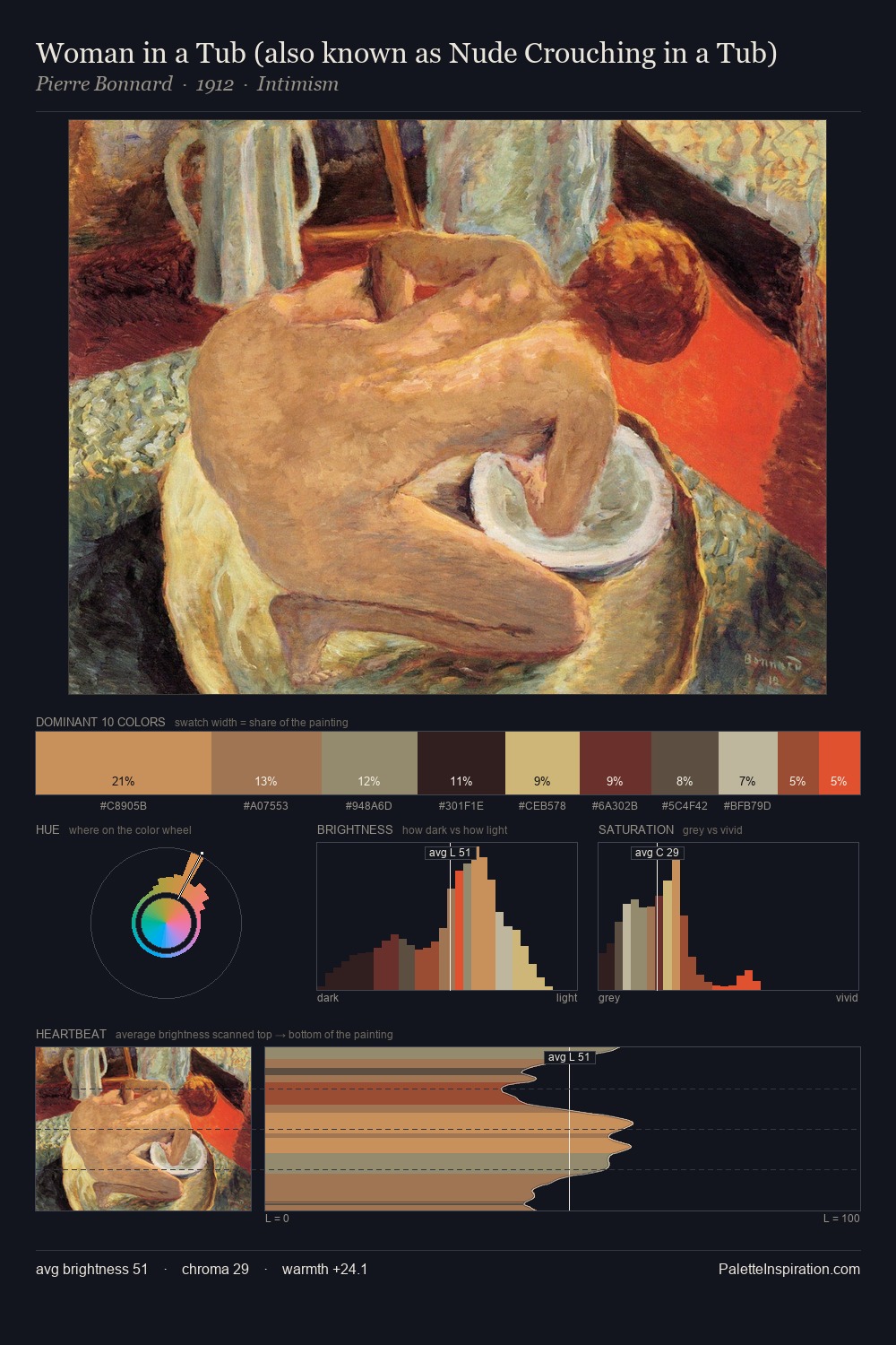
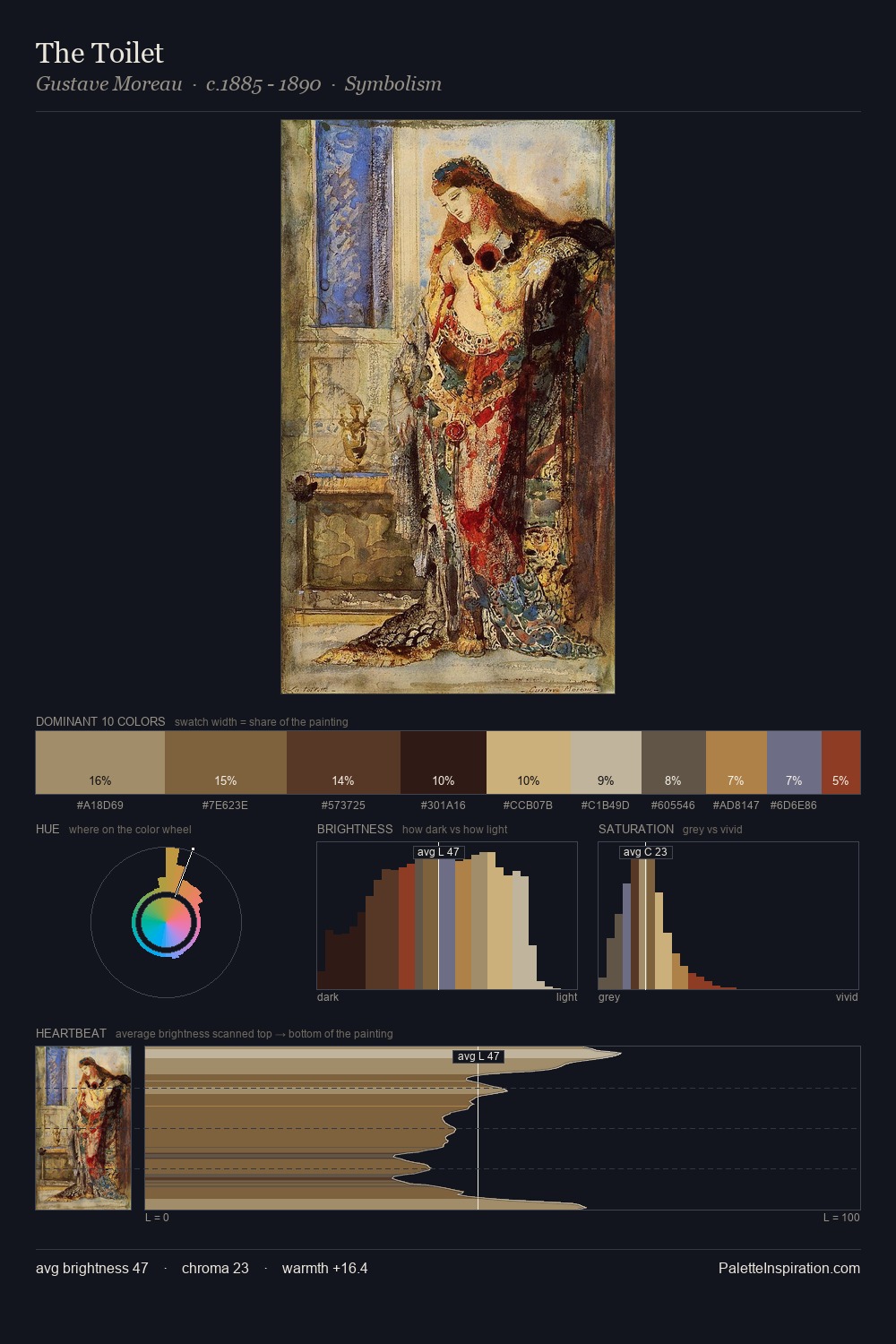
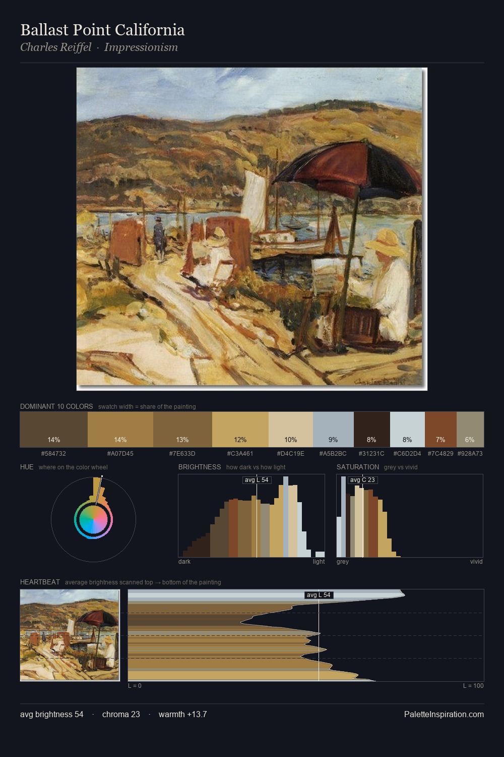
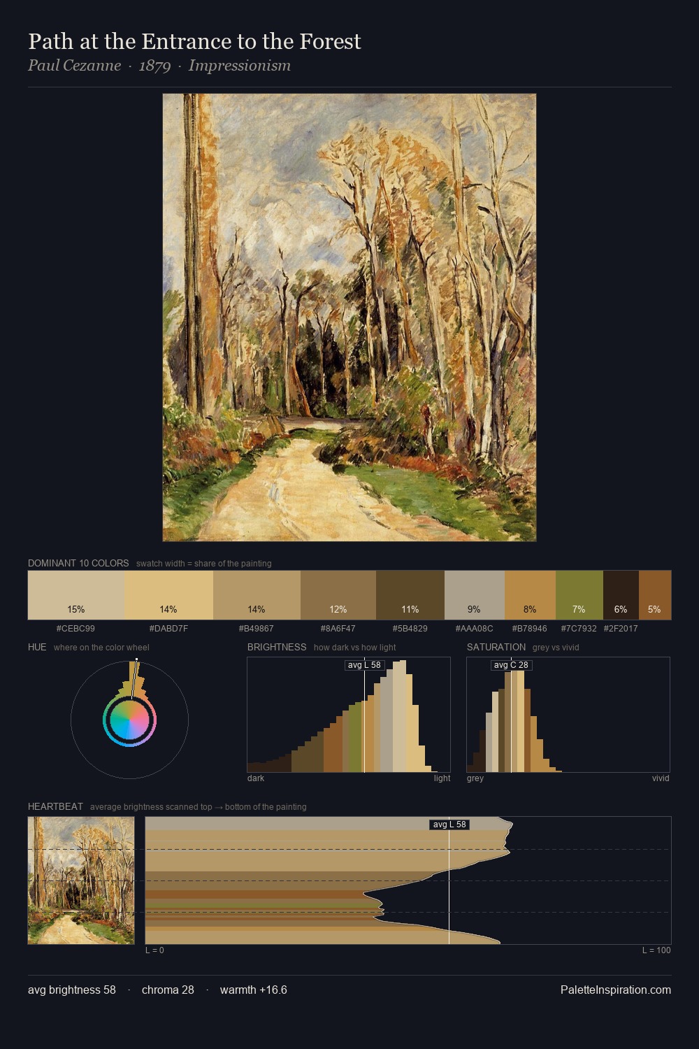
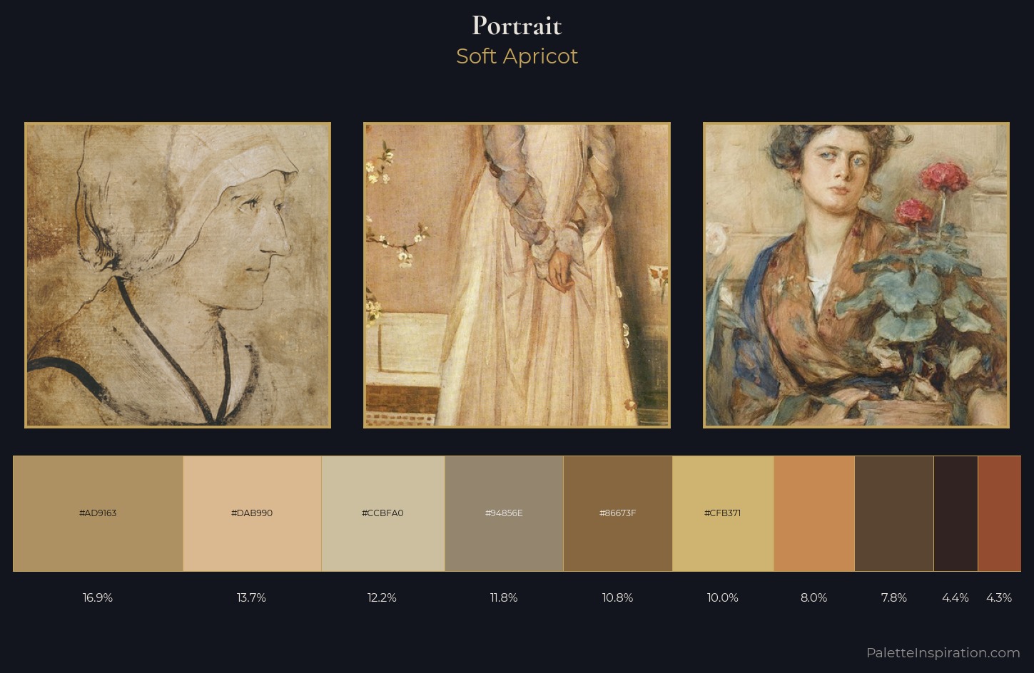
Light floods portrait; the palette keeps values pale and airy across its range. Neither warm nor cool has the upper hand here; the equilibrium between the two generates the palette's visual energy. Saturation is measured and controlled, giving the palette presence without visual aggression. The highest-chroma note - #944C31 - appears at just 4.3%, deployed as a precision accent against the quieter ground. 54 units of value spread create a palette that is varied but unified - contrast in the service of harmony. Together these qualities point to the open-air Impressionist method: recording light rather than local colour.
Example use cases
- ceramics & pottery
- boutique hospitality
- menswear
- heritage food brands
- craft & artisan brands
I Love This!
Use This Palette
Copy, export, or download for your project
Copy, export, or download for your project
Copy:
Download:
Share: