Portrait Palette 1
Gleaming Cream
Gleaming Bright and polished - high-key, often warm, suggesting reflective or luminous surfaces.
Cream Warm white - slightly yellowed, rich, the color of heavy dairy.

Palette Analysis
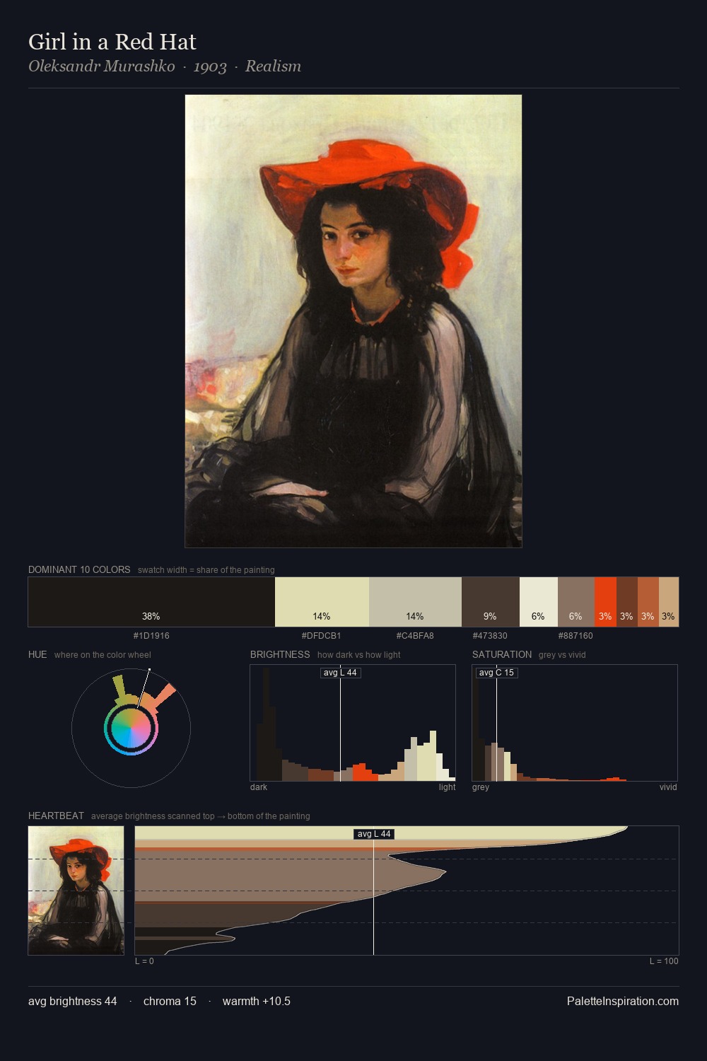
portrait is strongly light-biased - shadow is suggested rather than declared. The palette tilts toward cool - blues and silver-greys carry the structural weight. Saturation is deliberately withheld - the beauty here lies in the near-monochromatic gradations rather than colour difference. The dominant colour, #EAE3D3, takes 30.4% of the total area, establishing the overall mood before any other hue is introduced. The most saturated colour, #C19C69, is reserved to 5.4% of the surface, where it acts as a focal punctuation. 62 units of value range underpin the palette's structural clarity: the eye always knows where light falls. High luminosity and cool temperature suggest the plein-air condition: unfiltered daylight and open sky.
Example use cases
- ceramics & pottery
- boutique hospitality
- menswear
- heritage food brands
- craft & artisan brands
I Love This!
Use This Palette
Copy, export, or download for your project
Copy, export, or download for your project
Copy:
Download:
Share: