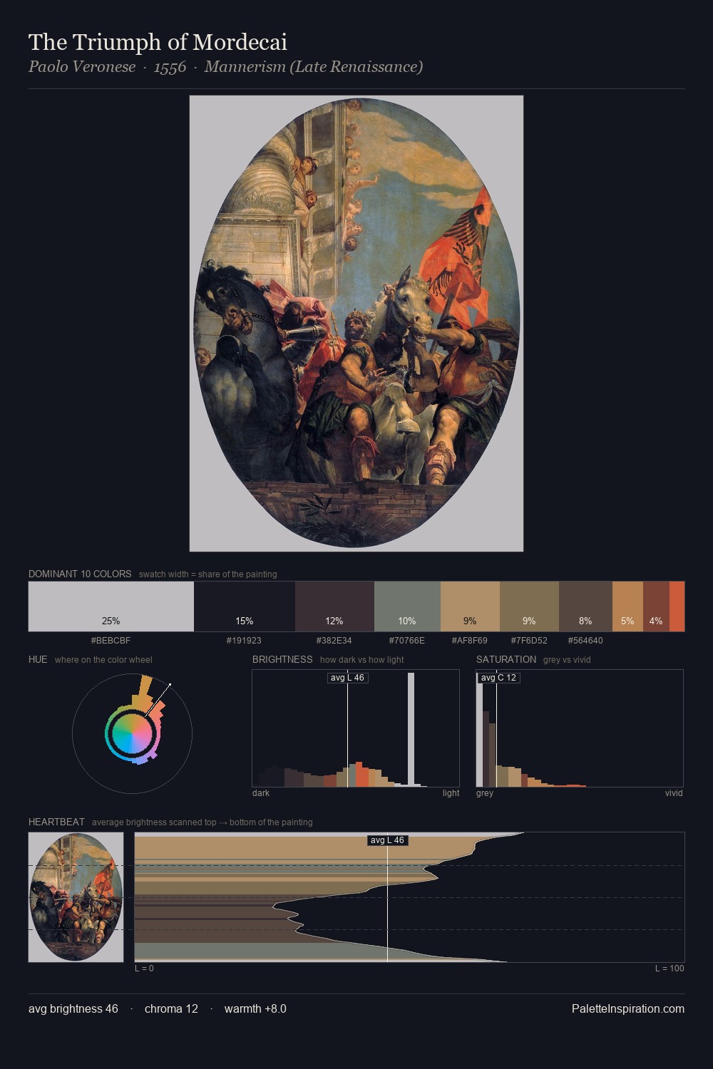
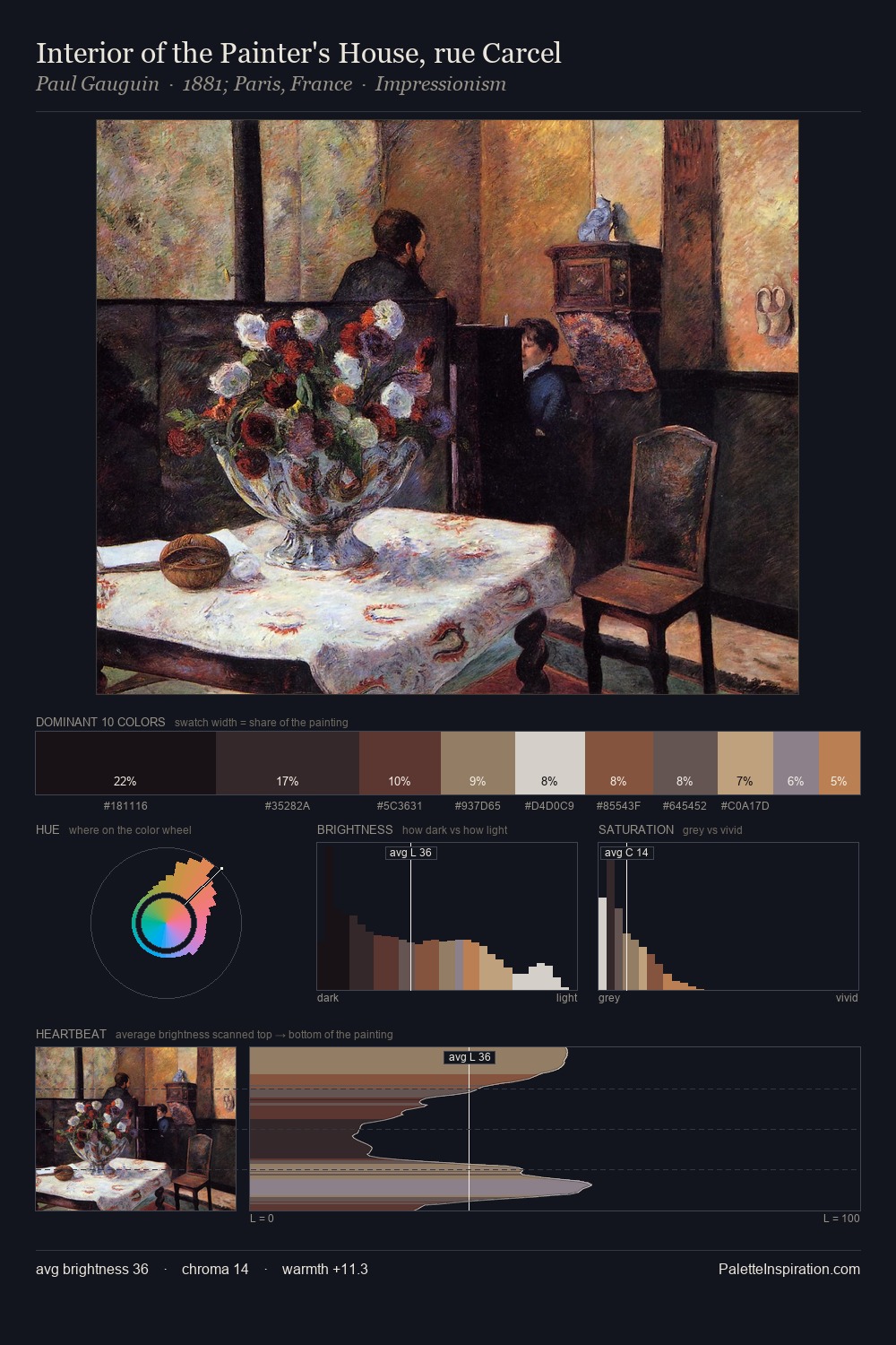
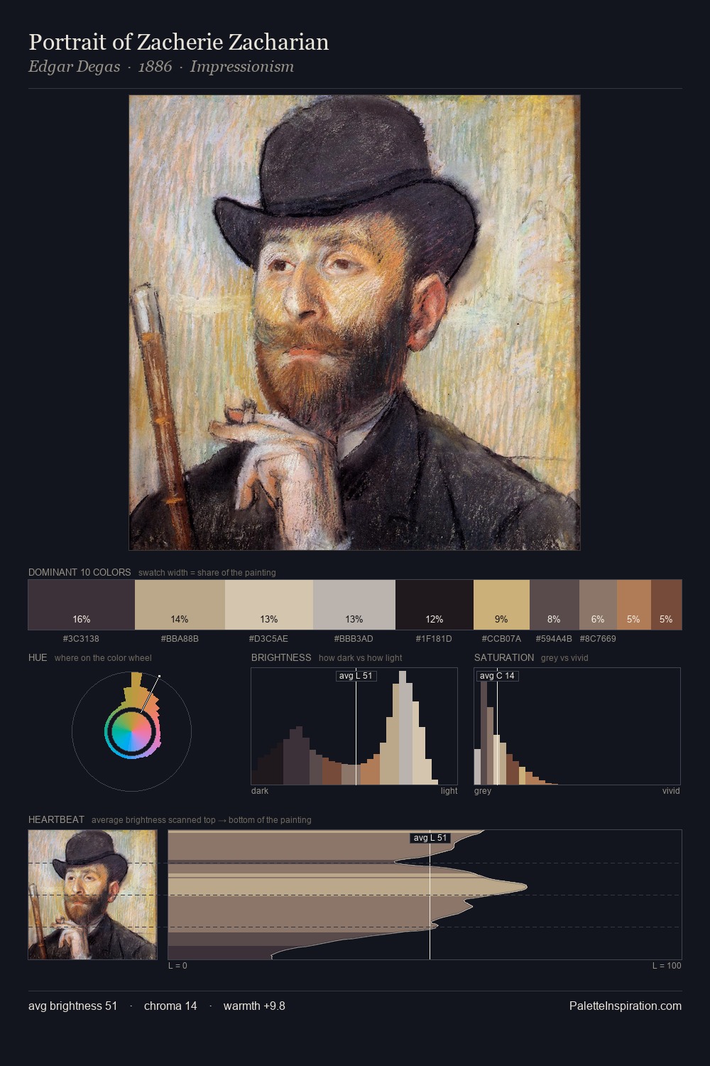
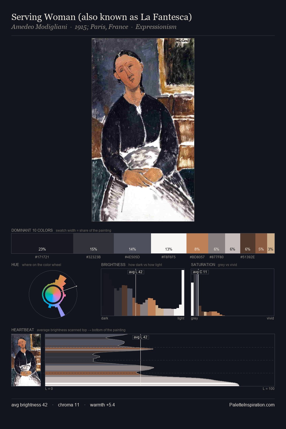
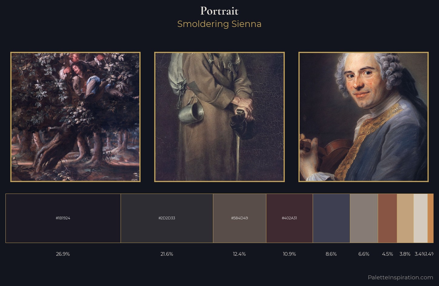
Portrait Palette 28
Smoldering Sienna
Smoldering Suppressed heat in dark register - low-key with a warm undertone, ember-like.
Sienna Warm red-brown earth - named after the Sienese pigment, a fundamental artist earth color.
Palette Analysis
Values in portrait rest in the mid-range - neither dramatically lit nor steeped in shadow. The artist keeps warm and cool in parity, a balance that lends the work a perceptual shimmer. All colours lean toward grey, building depth through value rather than colour punch. 26.9% of the palette belongs to #1B1924, a concentration that makes it the unmistakable visual centre. #C2A17D functions as the palette's exclamation mark: highest chroma, lowest percentage (3.8%). From deepest dark to palest light, the palette traverses 62 units of the value scale - a span that creates natural depth.
Example use cases
- art galleries
- creative studios
- consumer goods
- lifestyle media
- professional services
I Love This!
Use This Palette
Copy, export, or download for your project
Copy, export, or download for your project
Copy:
Download:
Share: