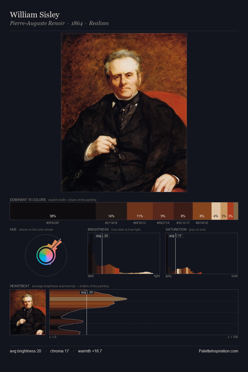
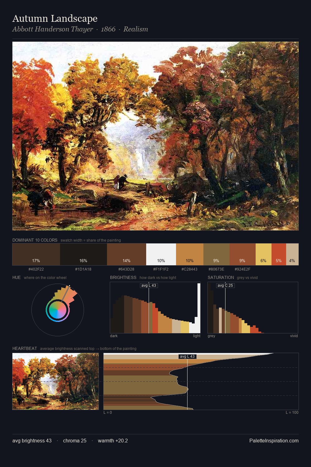
Portrait Palette 32
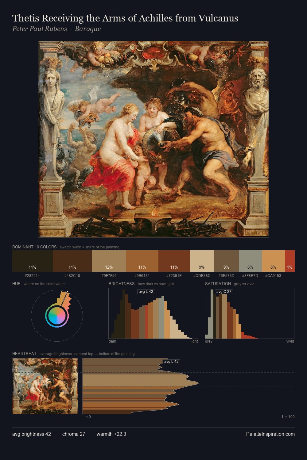
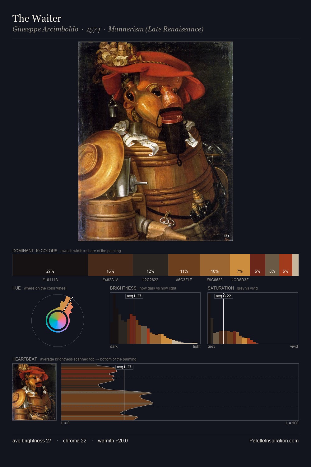
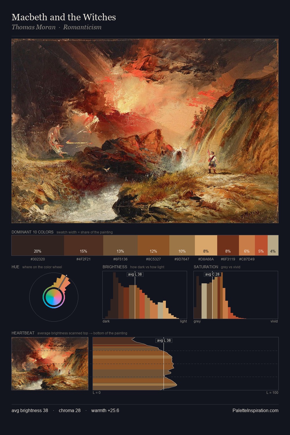
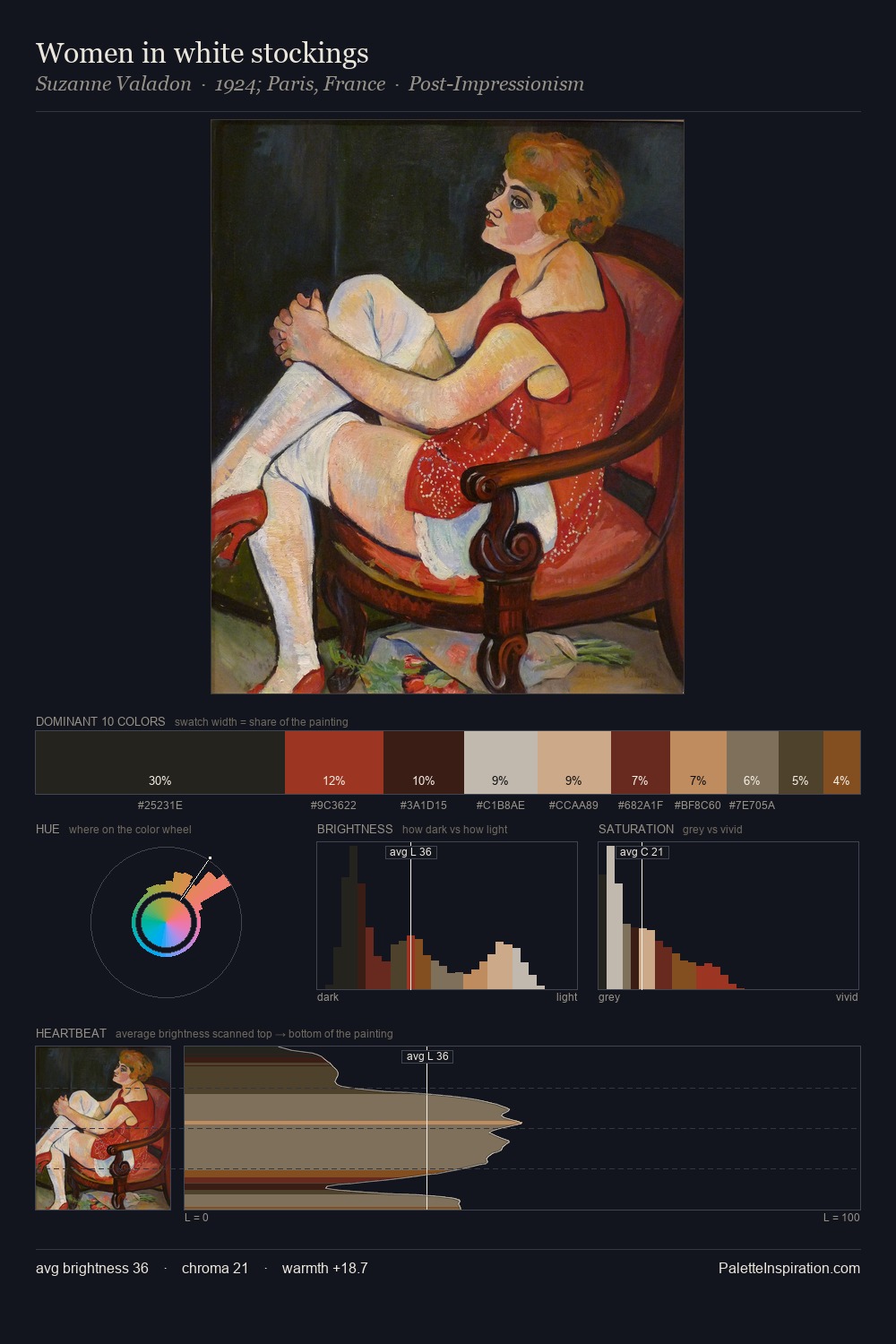
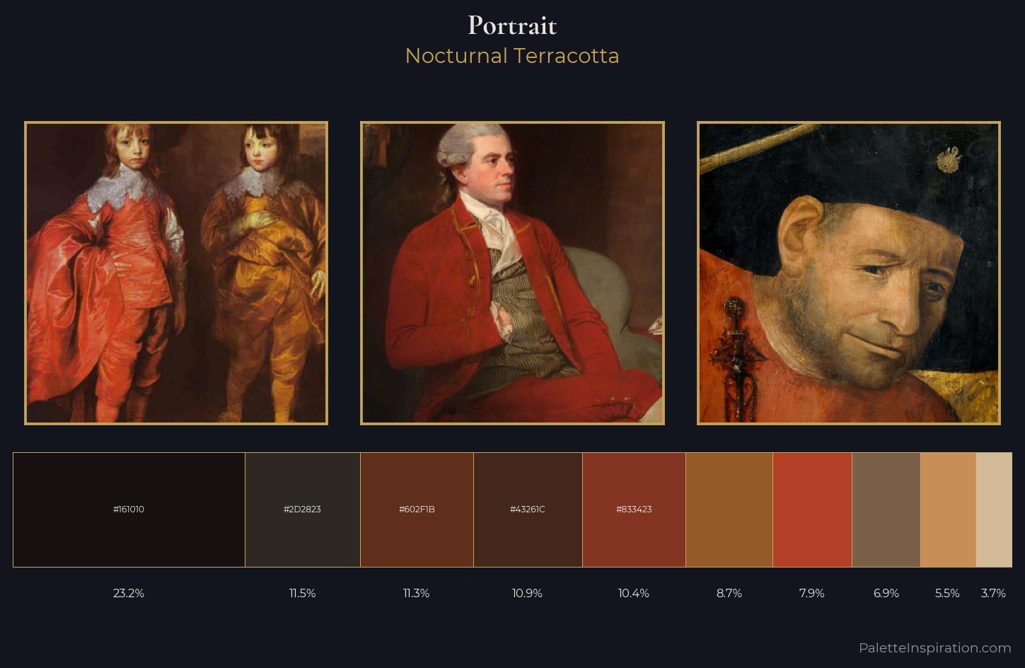
Nocturnal Terracotta
Nocturnal Night-register palette - very low values, the world after dark.
Terracotta Fired clay red-orange - the color of unglazed earthenware pottery.
Palette Analysis
portrait occupies the comfortable middle of the value scale, avoiding both extremes to hold the eye in a sustained middle grey. Warm hues command this palette; it favours the reds, oranges, and yellows of firelight and earth. A restrained, mid-chroma palette: every hue is present and legible, but nothing shouts. At 8.7%, #965A28 carries the palette's sharpest chromatic charge: an accent that earns its place precisely because it is withheld. 62 units of value range underpin the palette's structural clarity: the eye always knows where light falls.
Example use cases
- theater design
- jewelry brands
- tobacco-adjacent retail
- event branding
- film & entertainment
I Love This!
Use This Palette
Copy, export, or download for your project
Copy, export, or download for your project
Copy:
Download:
Share: