Konstantin Korovin Palette 5

Palette Analysis
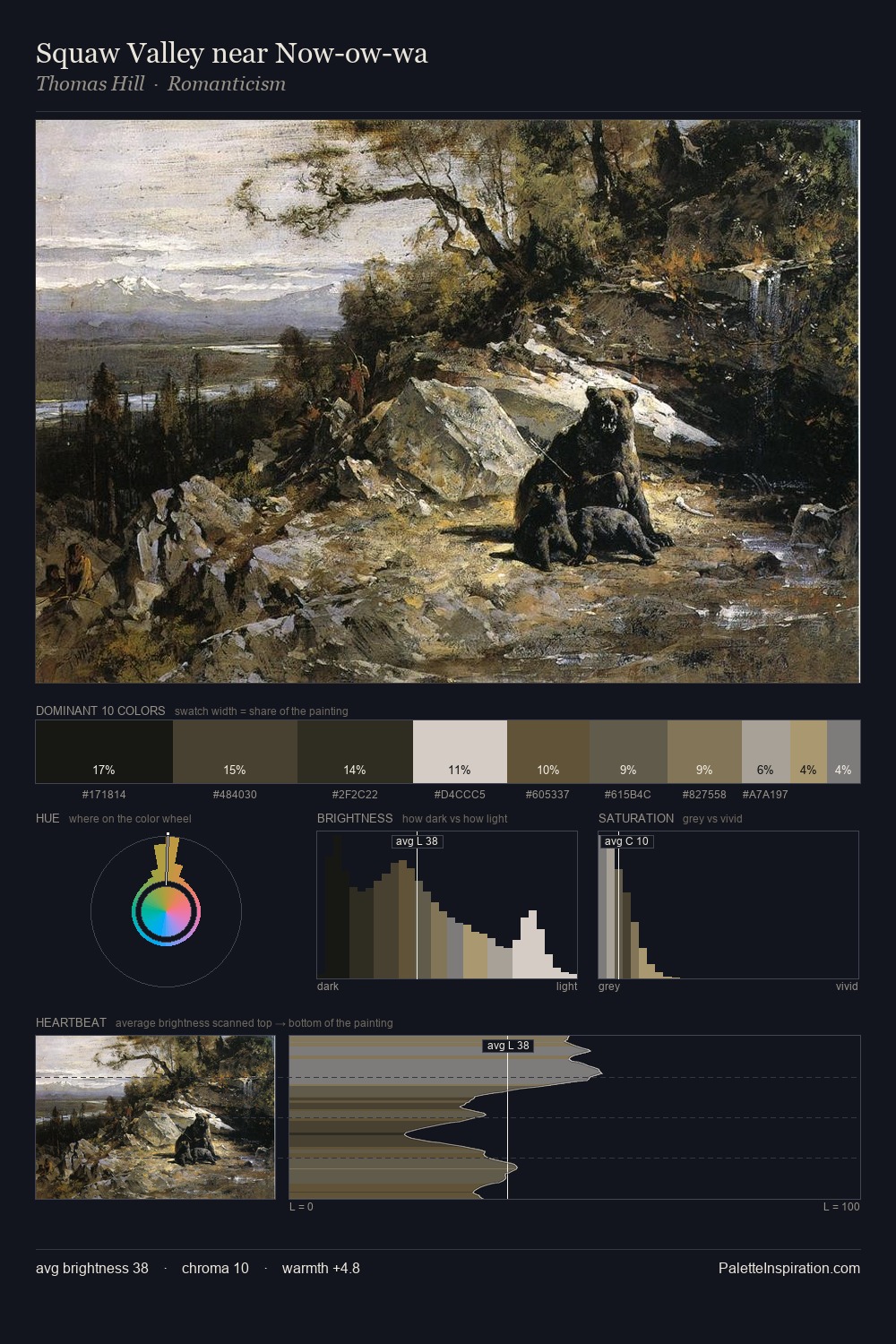
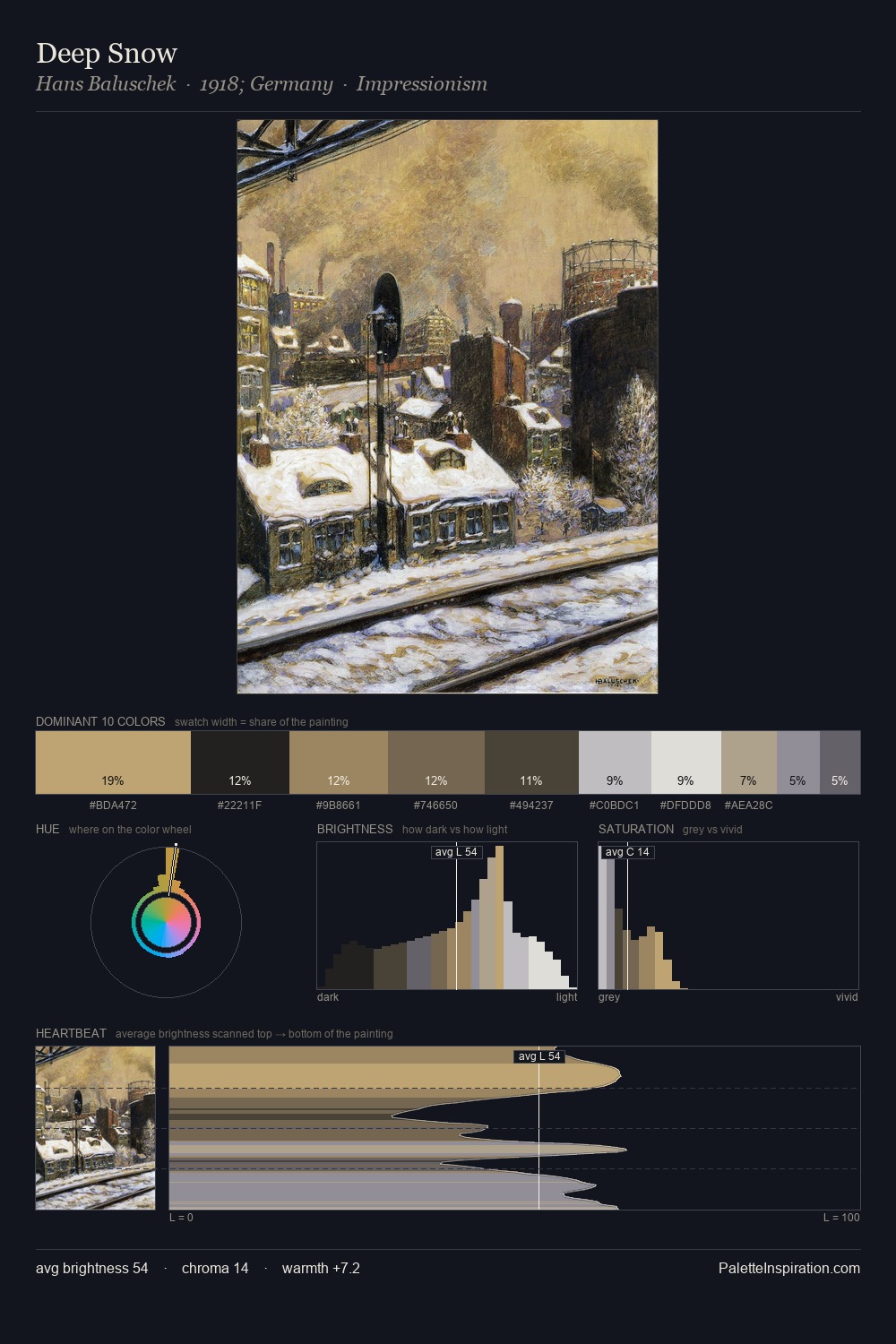
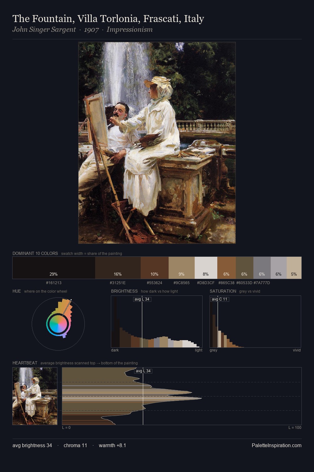
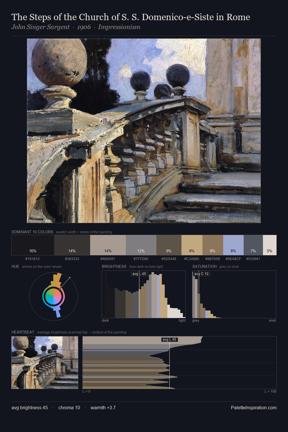
Mid-key values give Konstantin Korovin its characteristic quietness - nothing blazes, nothing disappears. Warm and cool are kept in productive tension, creating the kind of chromatic harmony that sustains the eye. Chroma hovers near zero; colour declares itself through subtle shifts in hue rather than outright saturation. #D6CFC7 at 25.4% of the palette: an overwhelming presence that pulls all other colours into its gravitational field. #BEA77E functions as the palette's exclamation mark: highest chroma, lowest percentage (4.9%). At 57 units of value range, the palette has the tonal breadth to sustain complex spatial readings. Konstantin Korovin's palette 5 carries its own internal logic while remaining in conversation with the artist's broader colour intelligence.
Example use cases
- exhibition design
- foundation branding
- estate management
- art education
- museums & galleries
I Love This!
Copy, export, or download for your project