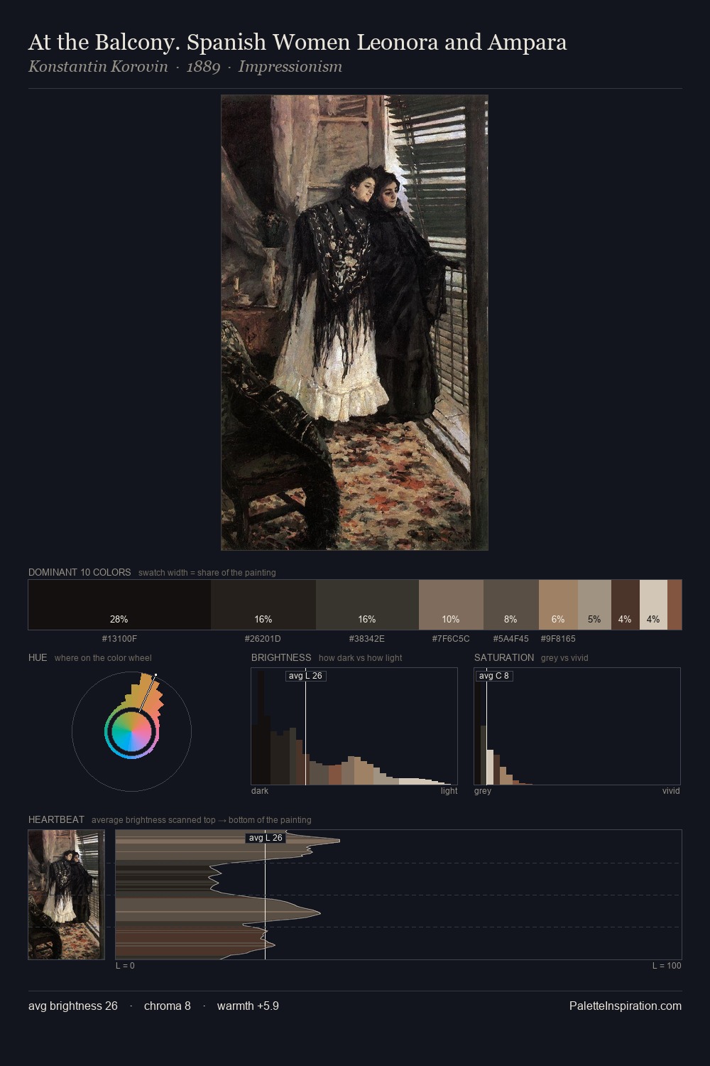
Konstantin Korovin Palette 19
Nocturnal Sienna
Nocturnal Night-register palette - very low values, the world after dark.
Sienna Warm red-brown earth - named after the Sienese pigment, a fundamental artist earth color.

Palette Analysis
Values in Konstantin Korovin rest in the mid-range - neither dramatically lit nor steeped in shadow. Warm hues command this palette; Konstantin Korovin favours the reds, oranges, and yellows of firelight and earth. Every colour is desaturated; the palette proceeds through near-neutrals and gently-coloured greys. #CAB8A2 functions as the palette's exclamation mark: highest chroma, lowest percentage (2.0%). 59 units of value range underpin the palette's structural clarity: the eye always knows where light falls. Palette 19 sits within the larger chromatic argument that Konstantin Korovin's complete body of work advances.
Example use cases
- music labels
- luxury hospitality
- editorial photography
- leather goods
- premium streaming
I Love This!
Use This Palette
Copy, export, or download for your project
Copy, export, or download for your project
Copy:
Download:
Share: