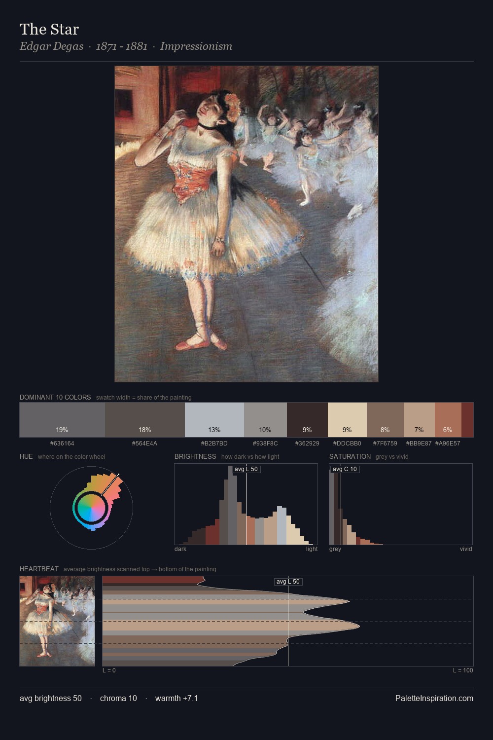
Konstantin Korovin Palette 6

Palette Analysis
Konstantin Korovin distributes its values across the middle register, creating harmony without high contrast. Konstantin Korovin tilts toward cool - blues and silver-greys carry the structural weight. Saturation is deliberately withheld - the beauty here lies in the near-monochromatic gradations rather than colour difference. #A26E53 functions as the palette's exclamation mark: highest chroma, lowest percentage (3.0%). The palette spans 53 value units: a measured range that delivers coherence over drama. The palette has the character of outdoor light: cool, mid-bright, with colour rendered faithfully rather than expressively. Konstantin Korovin's palette 6 carries its own internal logic while remaining in conversation with the artist's broader colour intelligence.
Example use cases
- exhibition design
- foundation branding
- estate management
- art education
- museums & galleries
I Love This!
Copy, export, or download for your project