Konstantin Korovin Palette 18

Palette Analysis
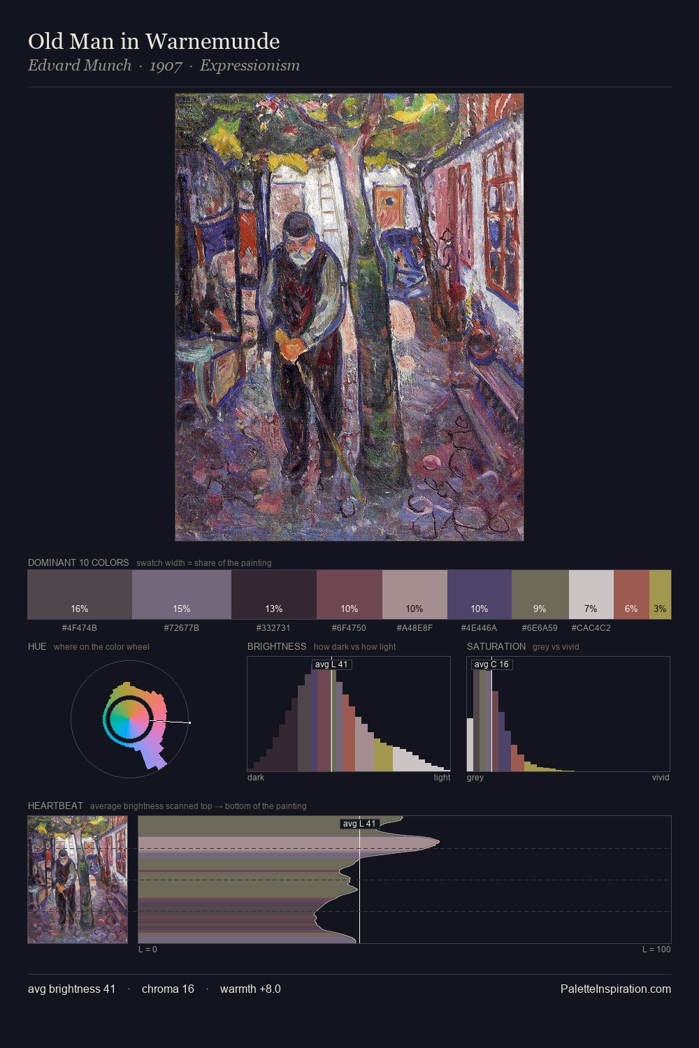
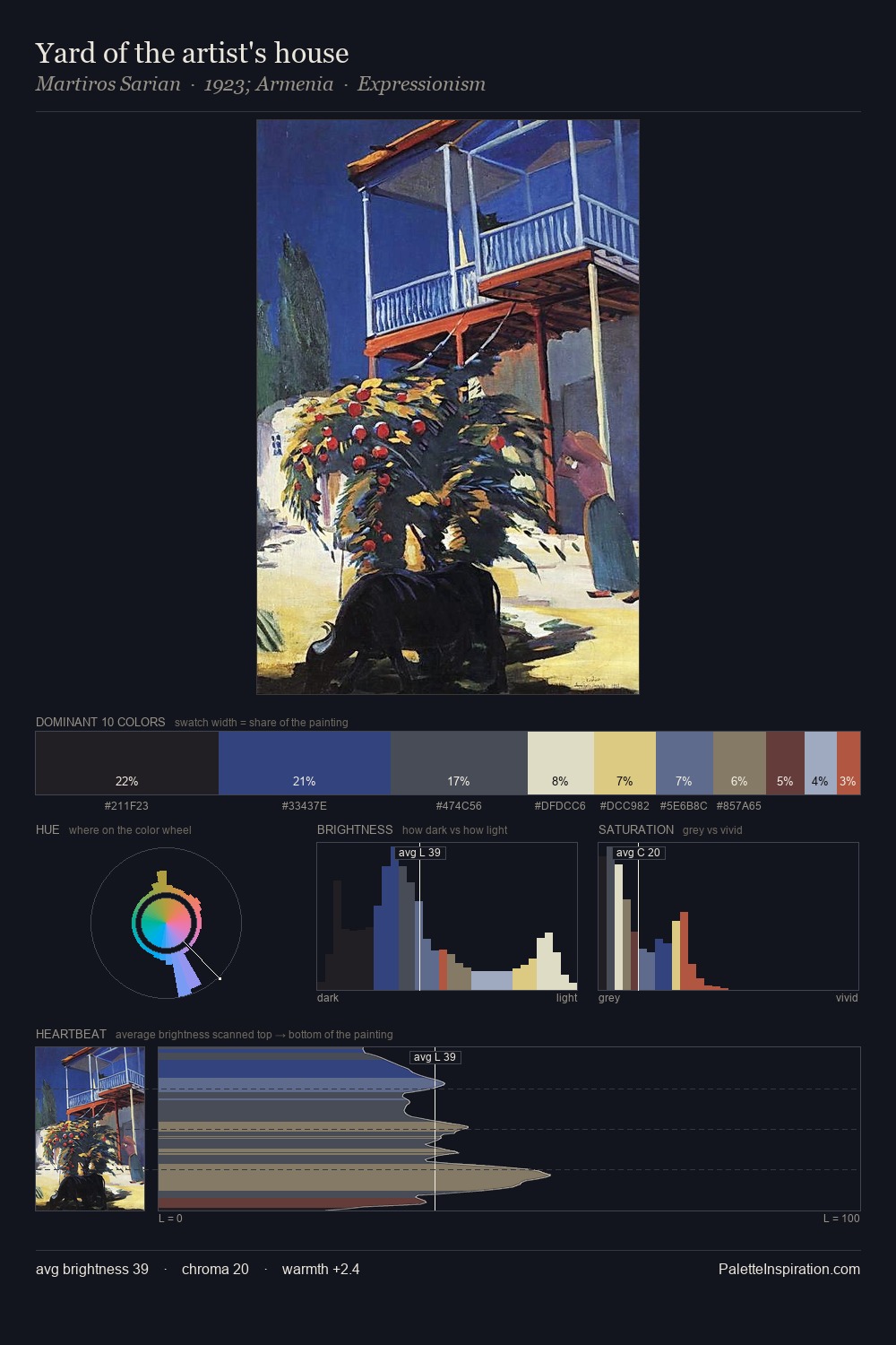
Konstantin Korovin occupies the comfortable middle of the value scale, avoiding both extremes to hold the eye in a sustained middle grey. A distinctly cool atmosphere runs through this palette: sky, water, and mist given colour form. Chroma is kept low across all colours, producing the soft, enveloping quality that characterises tonal painting. The most saturated colour, #3E4C79, is reserved to 3.4% of the surface, where it acts as a focal punctuation. The palette spans 54 value units: a measured range that delivers coherence over drama. The mid-to-high key, cool bias, and moderate chroma point to outdoor observation - sky and diffused daylight as the dominant light source. This is palette 18 of Konstantin Korovin's sequence - a single chapter in a chromatic story told across many works.
Example use cases
- publishing
- corporate identity
- consumer apps
- hospitality
- design agencies
I Love This!
Copy, export, or download for your project