Konstantin Korovin Palette 1

Palette Analysis
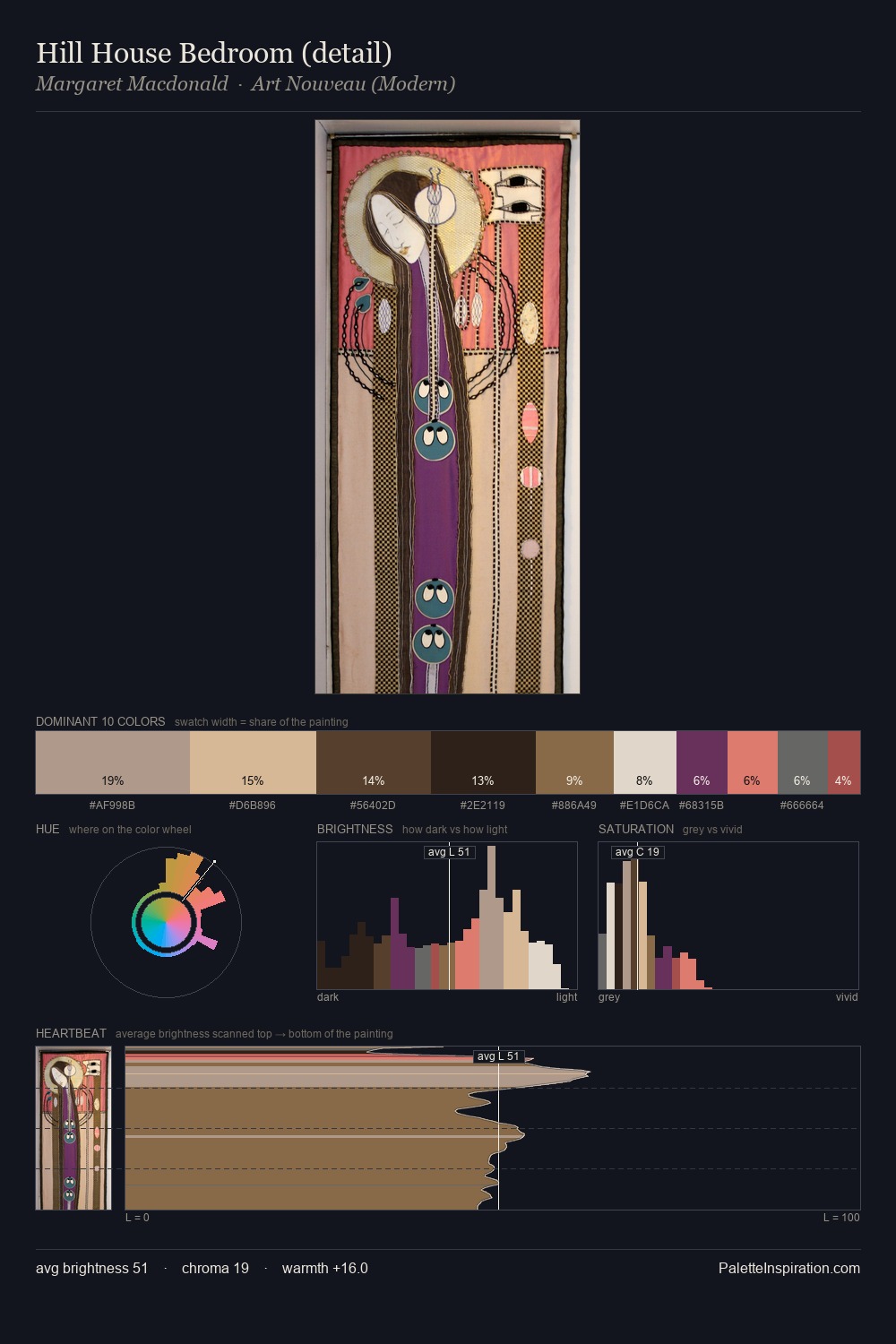
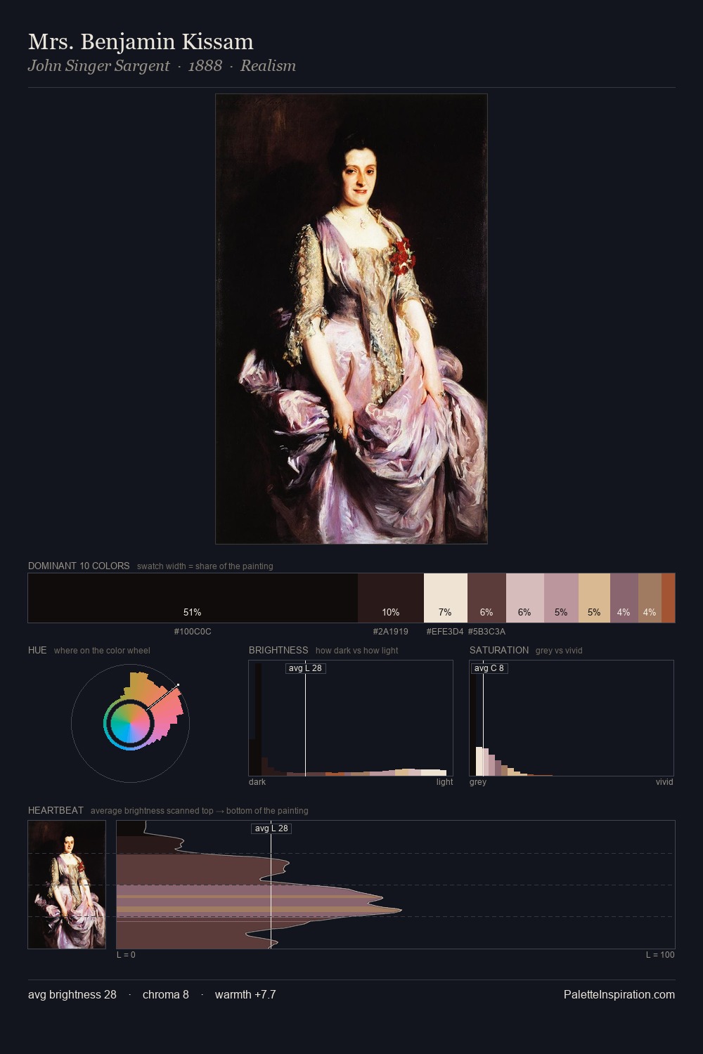
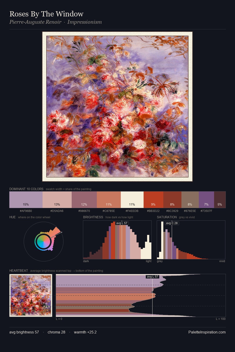
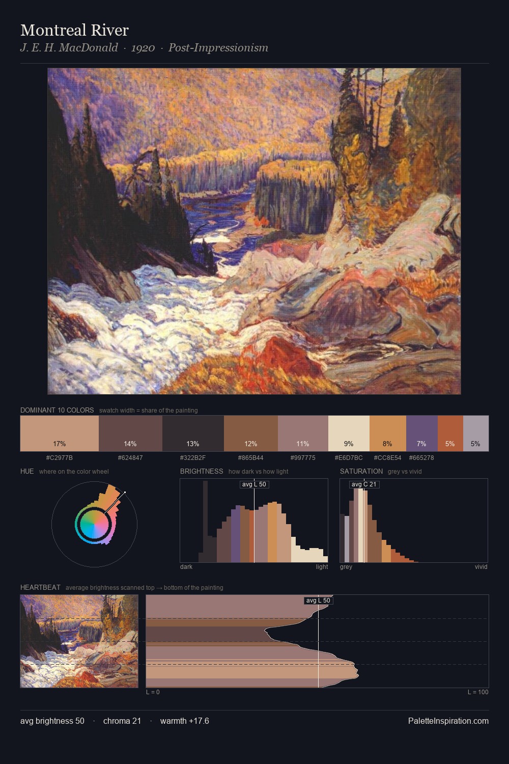
Values in Konstantin Korovin tilt decisively toward white, giving the palette its luminous character. Konstantin Korovin balances warm and cool with remarkable evenness, giving the composition its characteristic vibrancy. The absence of saturated colour is itself an expressive choice: this is a palette of restraint and atmosphere. #DCD3AC at 38.0% of the palette: an overwhelming presence that pulls all other colours into its gravitational field. The saturated accent, #9E4E40, registers at 2.3% - sparse enough to feel like a deliberate surprise. From deepest dark to palest light, the palette traverses 73 units of the value scale - a span that creates natural depth. Konstantin Korovin's palette 1 carries its own internal logic while remaining in conversation with the artist's broader colour intelligence.
Example use cases
- publishing
- corporate identity
- consumer apps
- hospitality
- design agencies
I Love This!
Copy, export, or download for your project