Emil Barbarini Palette 2

Palette Analysis
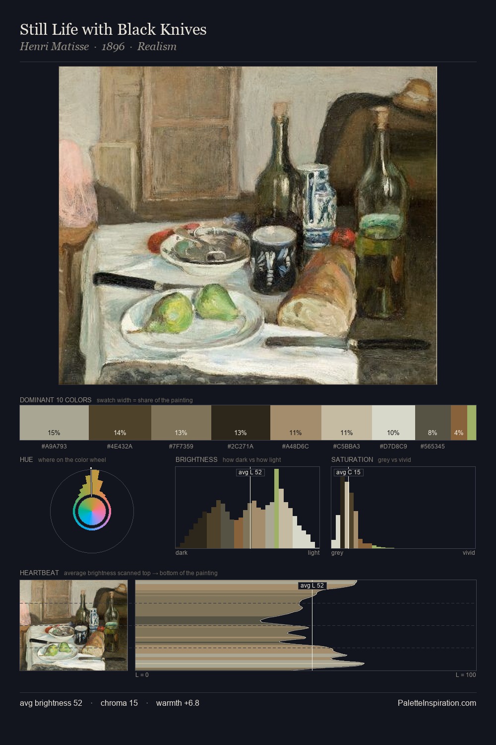
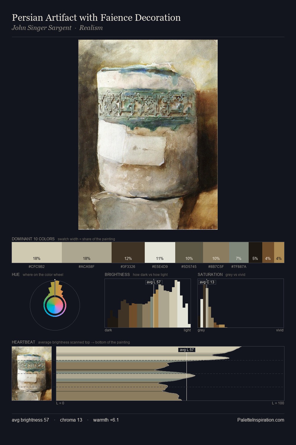
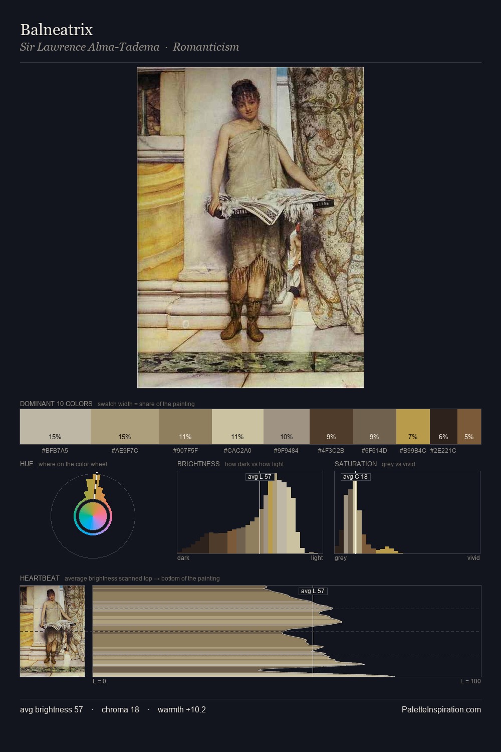
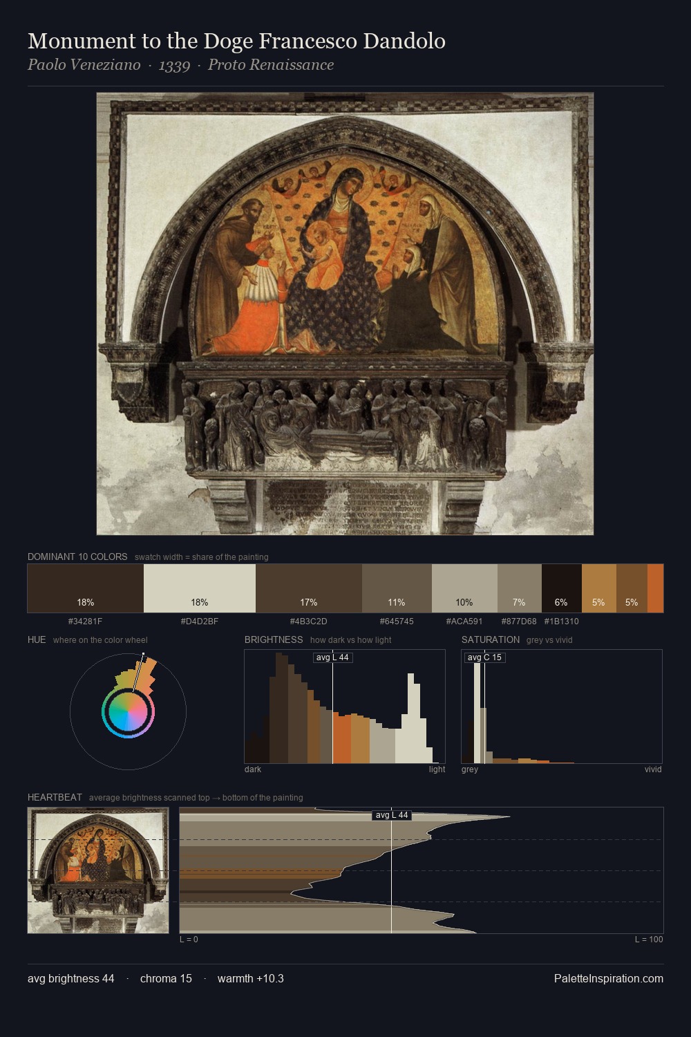
Emil Barbarini distributes its values across the middle register, creating harmony without high contrast. Cool hues prevail: blues, greens, and greys anchor the palette's emotional temperature. Chroma hovers near zero; colour declares itself through subtle shifts in hue rather than outright saturation. The dominant colour, #D2CAB3, takes 25.1% of the total area, establishing the overall mood before any other hue is introduced. The highest-chroma note - #716145 - appears at just 8.4%, deployed as a precision accent against the quieter ground. The value range spans 56 units across the palette, providing the full gamut from deep shadow to near-white and ensuring clear tonal hierarchy. The palette has the character of outdoor light: cool, mid-bright, with colour rendered faithfully rather than expressively. Emil Barbarini's palette 2 carries its own internal logic while remaining in conversation with the artist's broader colour intelligence.
Example use cases
- exhibition design
- foundation branding
- estate management
- art education
- museums & galleries
I Love This!
Copy, export, or download for your project