Cubism Palette 4
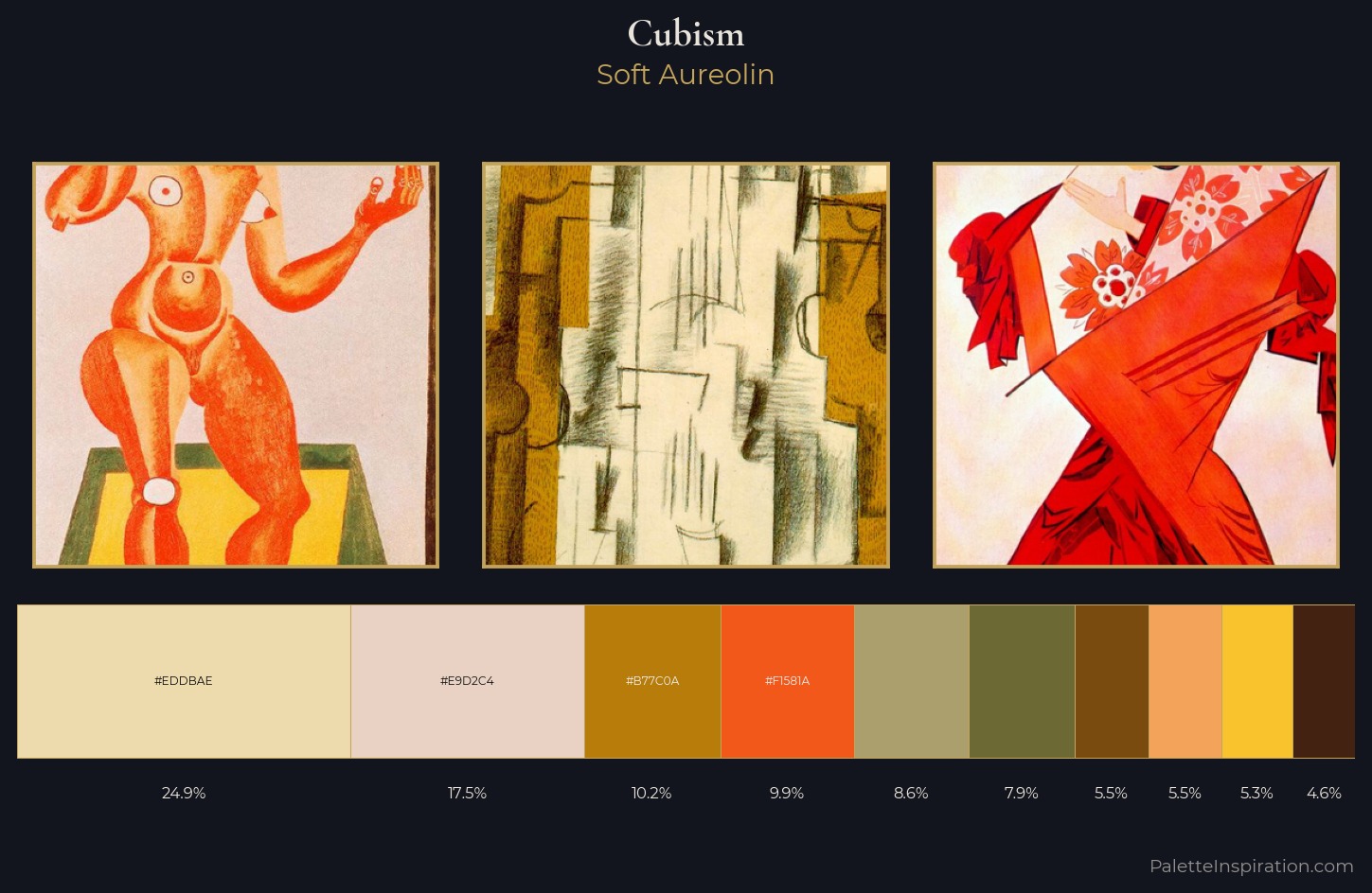
Soft Aureolin
Soft Low-contrast, gentle chroma - mid-key values and low saturation, approachable and calm.
Aureolin Bright transparent yellow - a clear, luminous lemon-gold pigment hue.
Palette Analysis
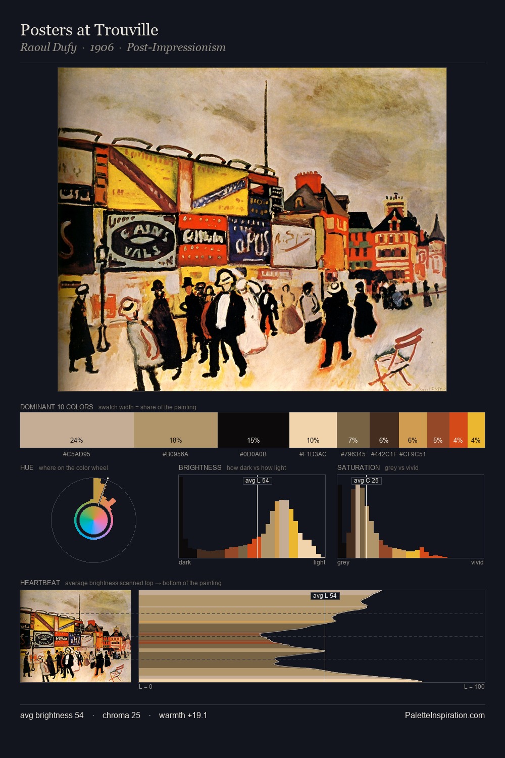
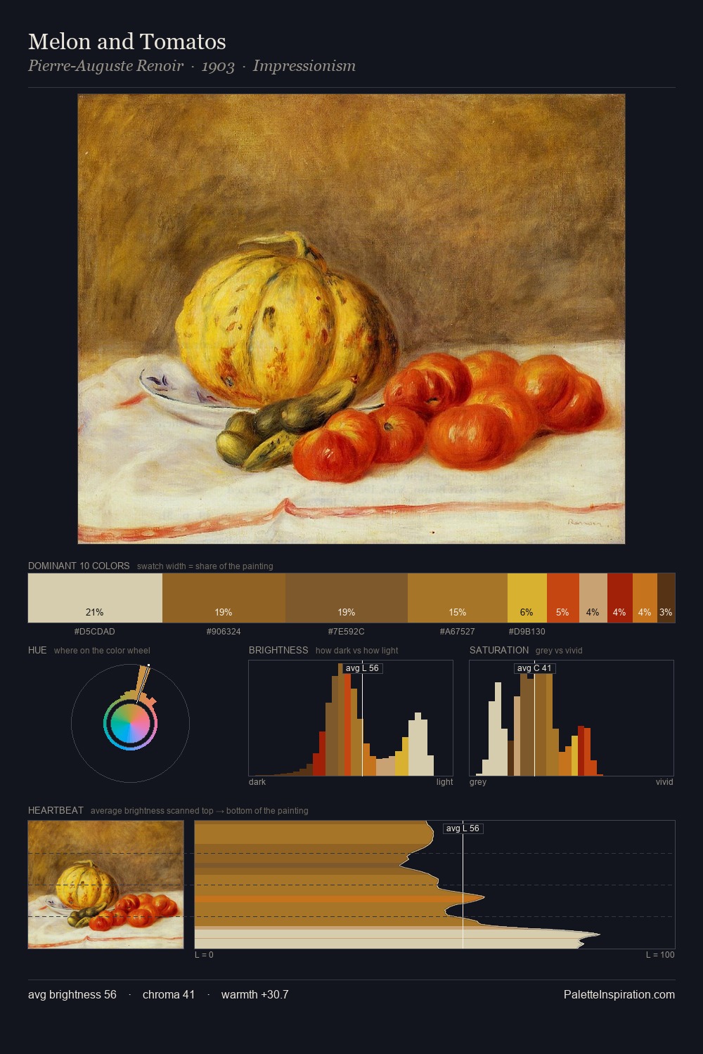
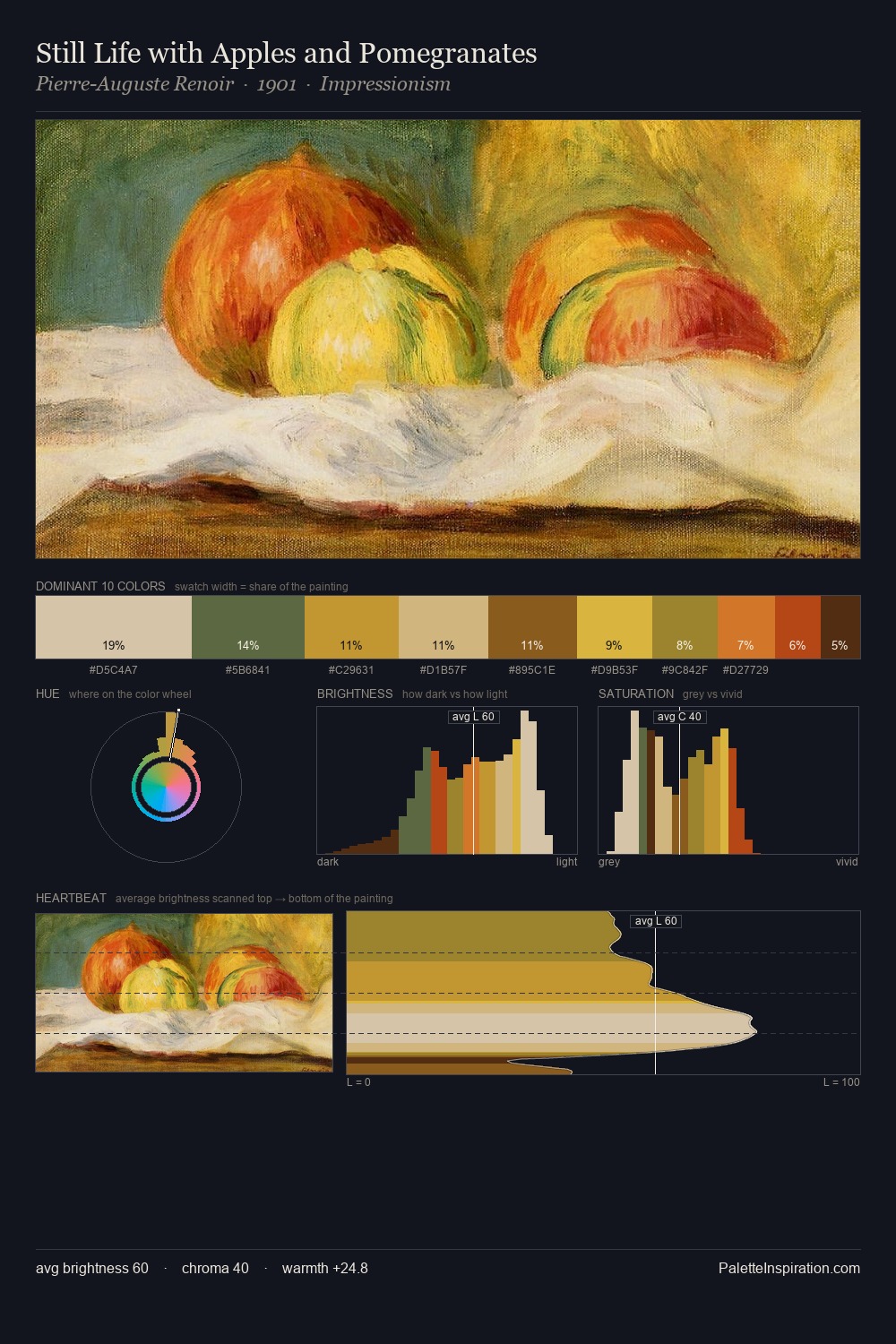
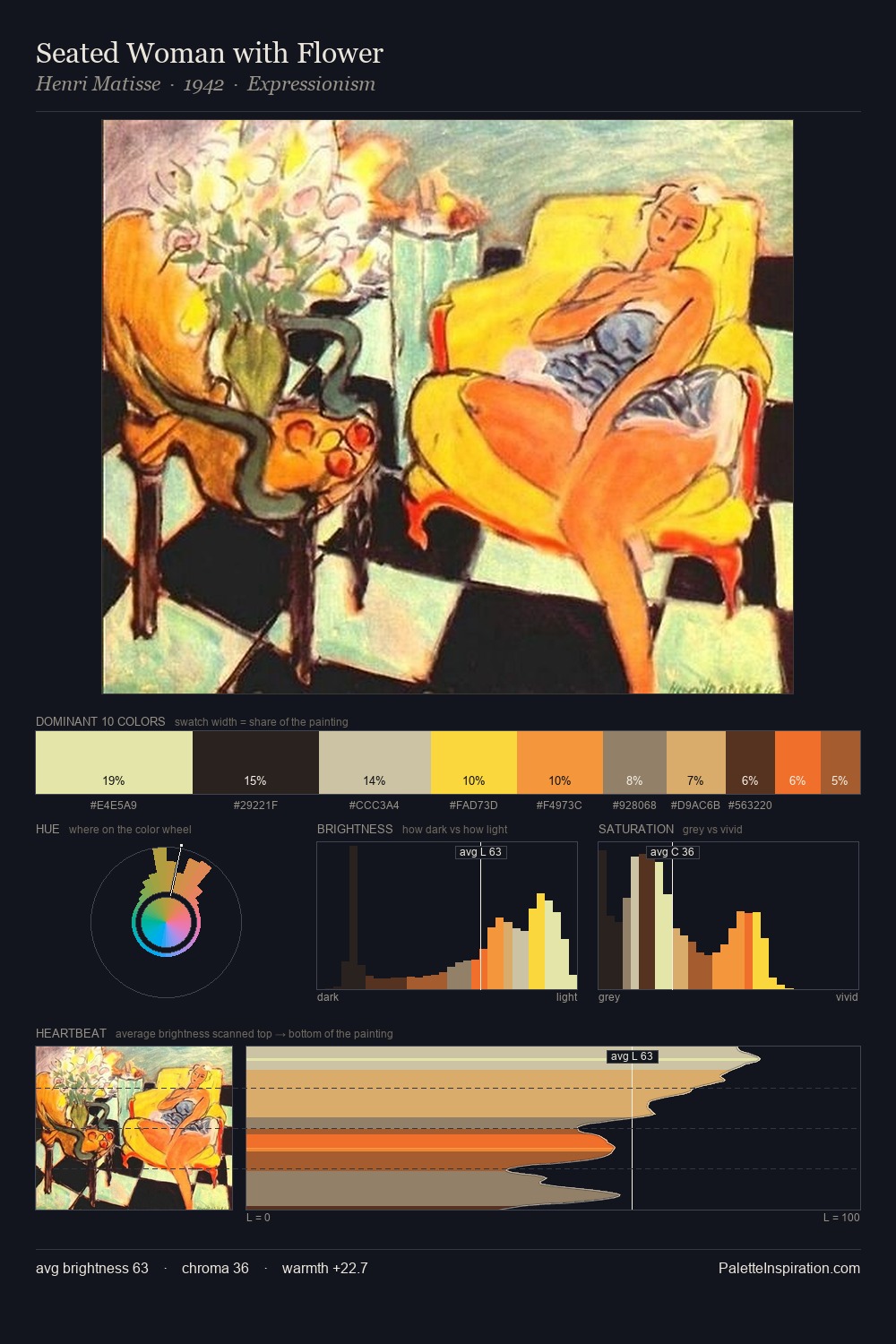
Cubism is high in key: pale, luminous, and filled with optical air. Warm and cool are kept in productive tension, creating the kind of chromatic harmony that sustains the eye. A restrained, mid-chroma palette: every hue is present and legible, but nothing shouts. The highest-chroma note - #F4A45A - appears at just 5.5%, deployed as a precision accent against the quieter ground. The full value range is 60 units: broad enough to build convincing three-dimensional form. The palette reads as an Impressionist one - light-biased, chromatically direct, and built on temperature contrast rather than value opposition.
Example use cases
- design agencies
- product brands
- e-commerce
- editorial sites
- publishing
I Love This!
Use This Palette
Copy, export, or download for your project
Copy, export, or download for your project
Copy:
Download:
Share: