Cubism Palette 2
Soft Ivory
Soft Low-contrast, gentle chroma - mid-key values and low saturation, approachable and calm.
Ivory Warm creamy white - the color of natural ivory, warmer than pure white.
Palette Analysis
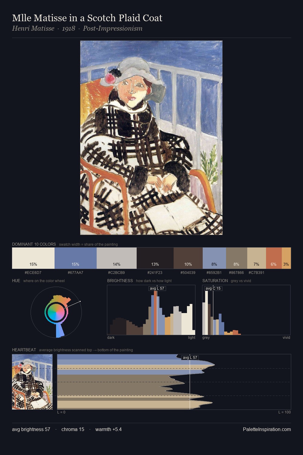
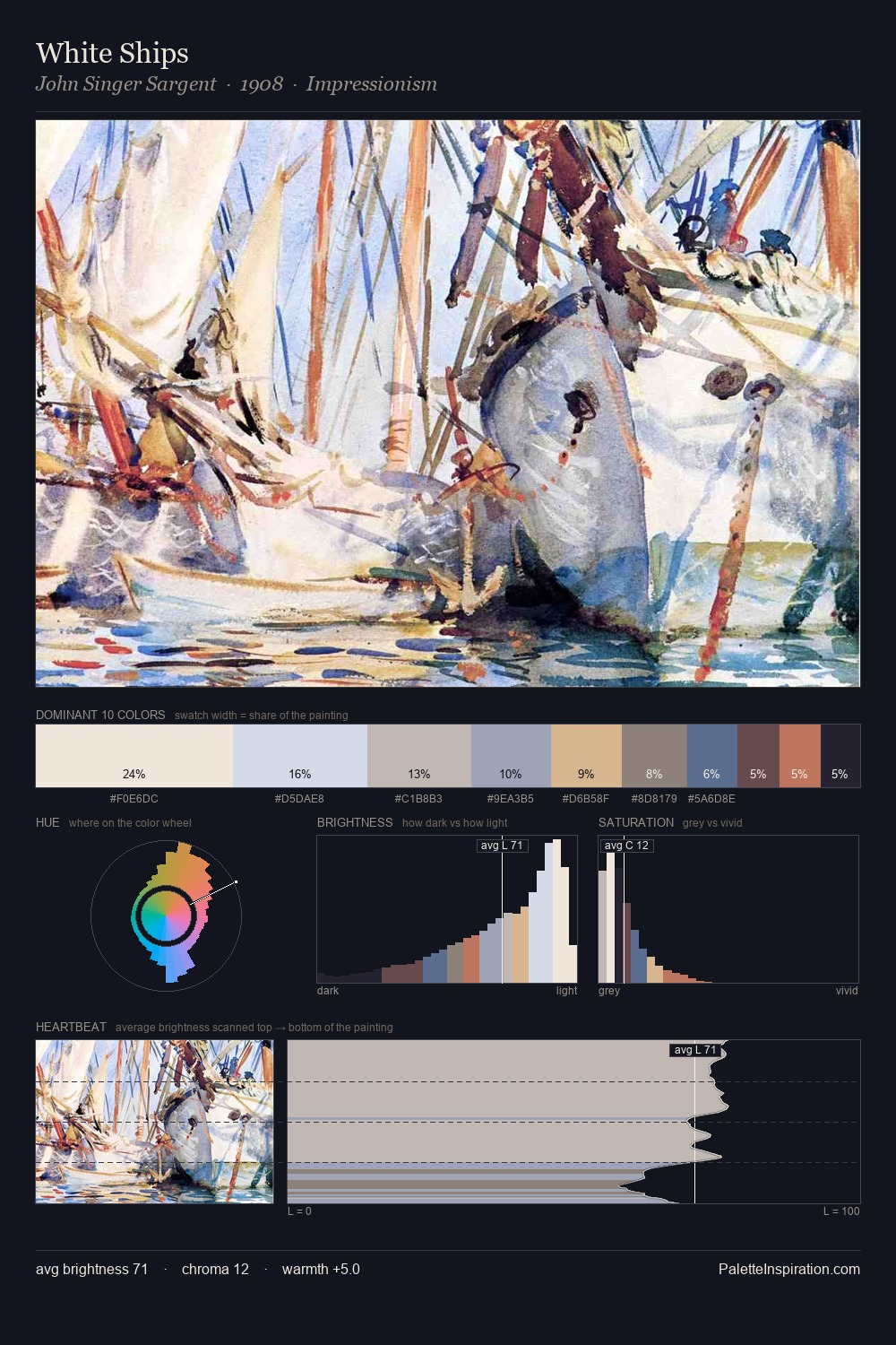
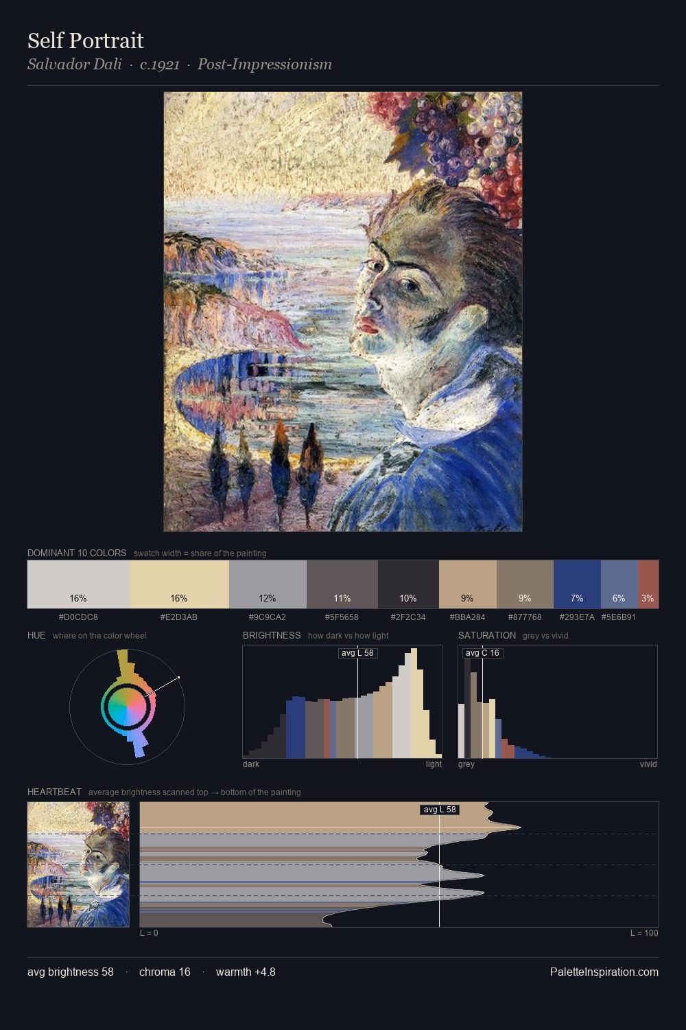
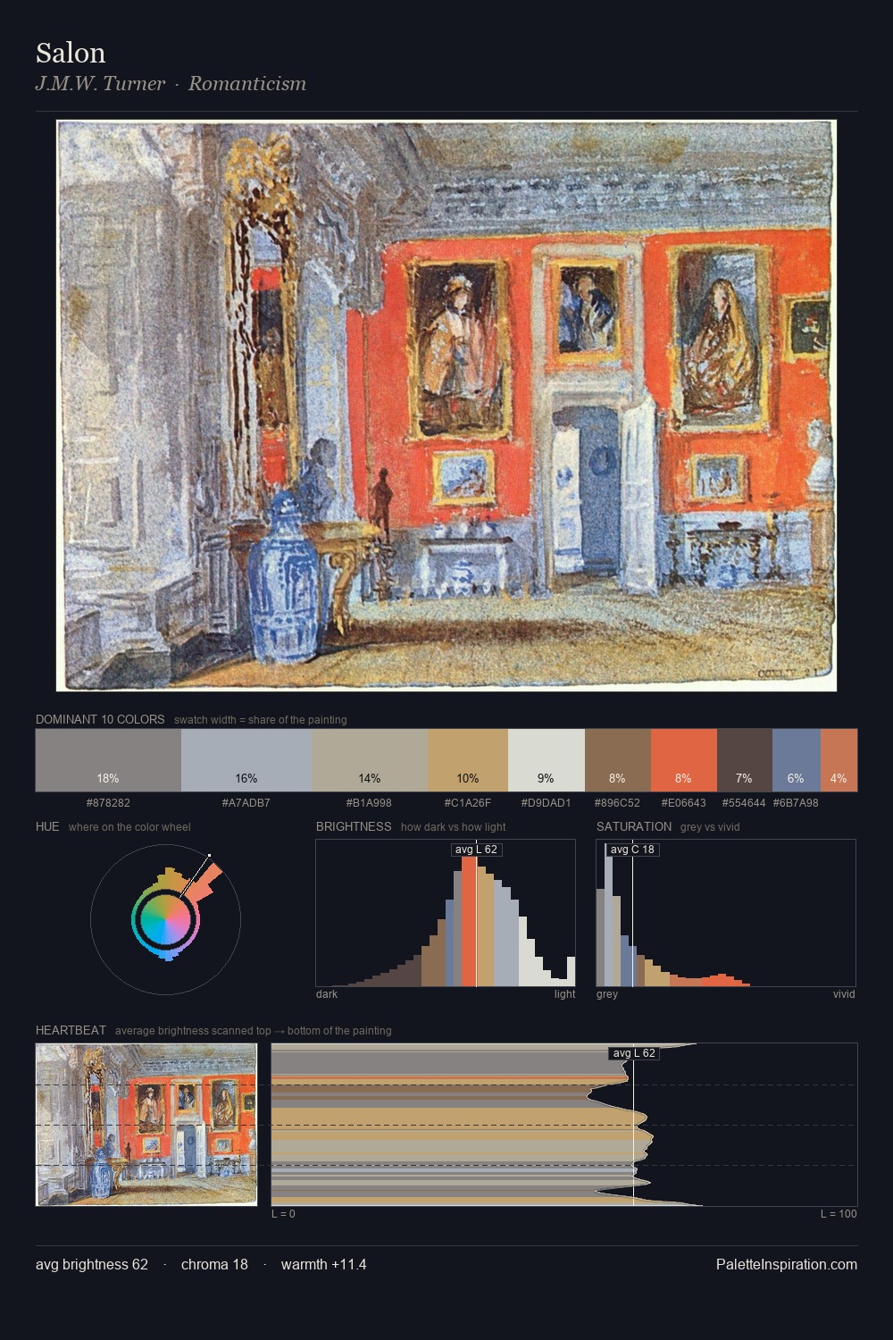
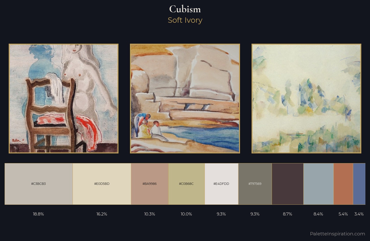
Light floods Cubism; the palette keeps values pale and airy across its range. Warm and cool are kept in productive tension, creating the kind of chromatic harmony that sustains the eye. Chroma hovers near zero; colour declares itself through subtle shifts in hue rather than outright saturation. The saturated accent, #C0B68C, registers at 10.0% - sparse enough to feel like a deliberate surprise. A value spread of 55 units gives the palette both depth and air - shadows are genuinely dark, lights genuinely light.
Example use cases
- food & beverage
- wedding stationery
- lifestyle brands
- interior design
- fashion retail
I Love This!
Use This Palette
Copy, export, or download for your project
Copy, export, or download for your project
Copy:
Download:
Share: