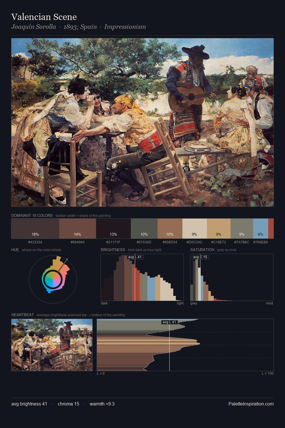
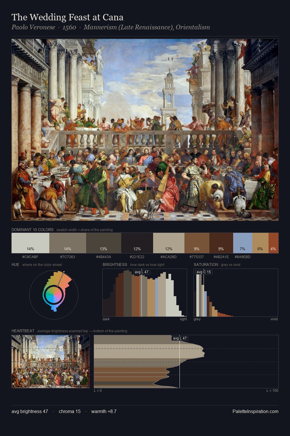
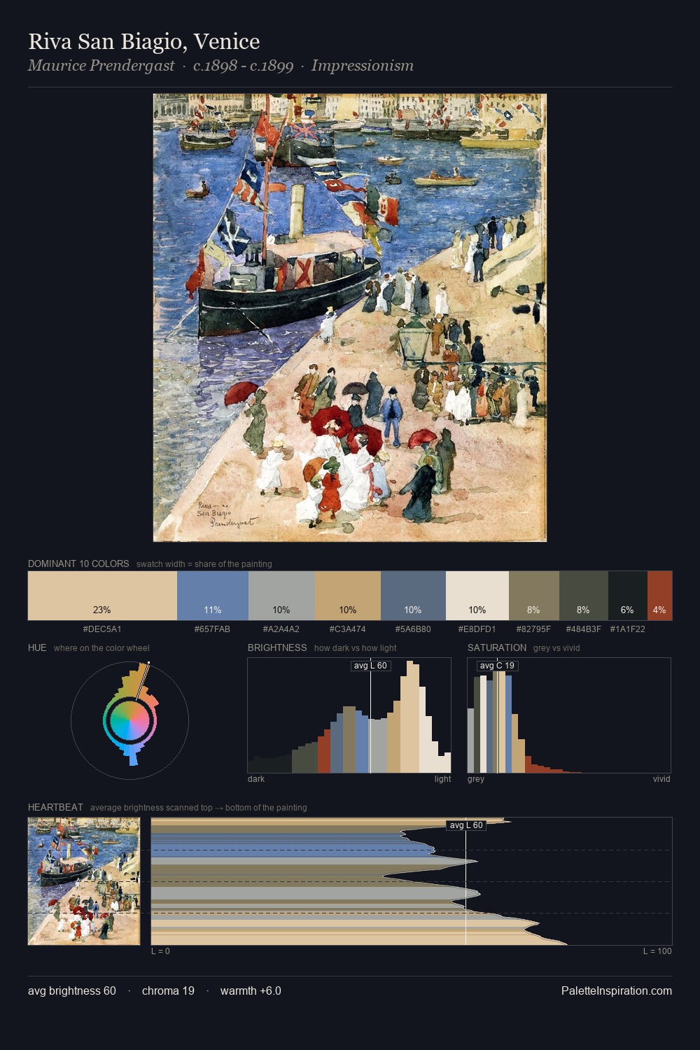
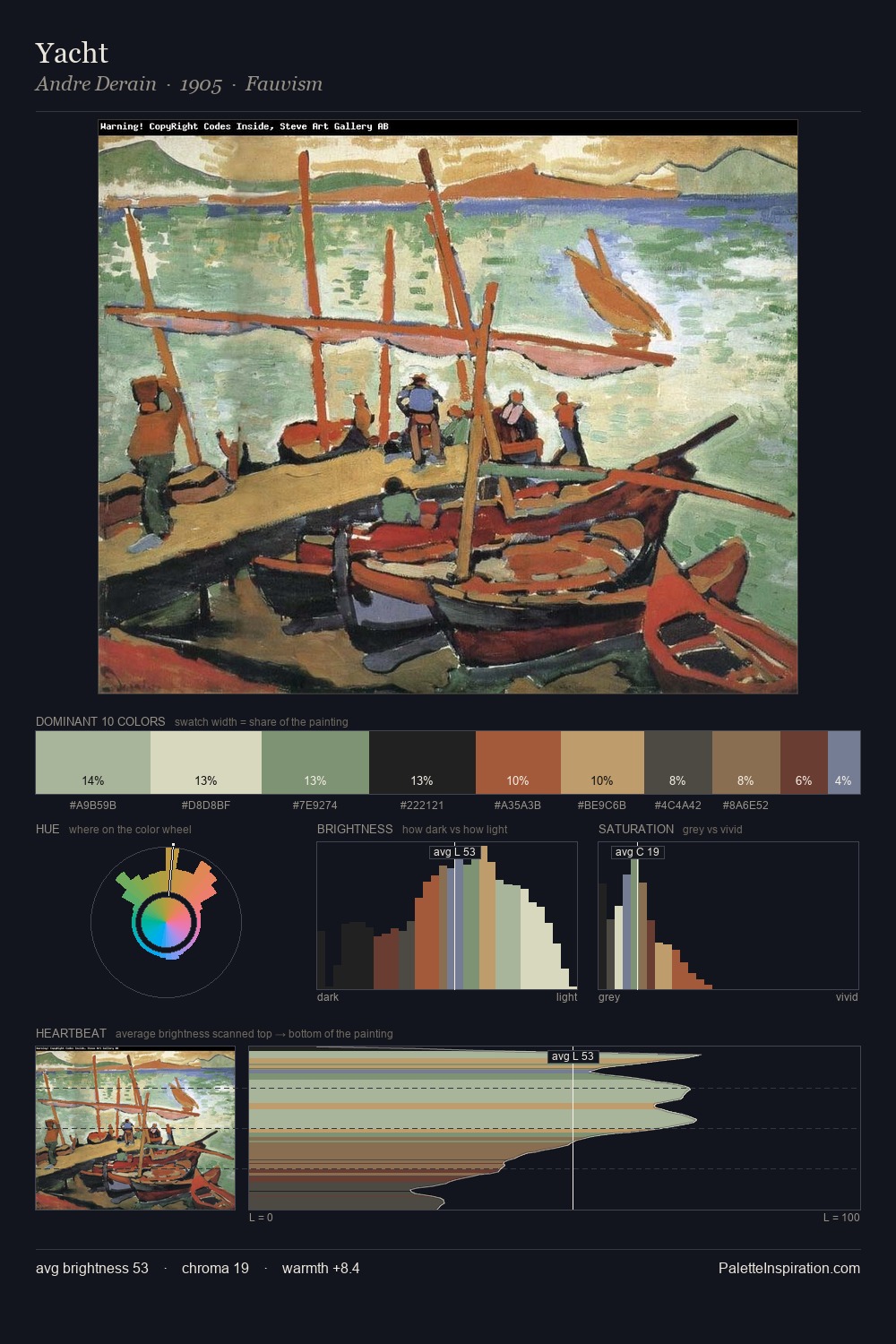
Cubism Palette 27
Shadowed Parchment
Shadowed Low-key - values weighted toward shadow, the palette of dim interiors and overcast skies.
Parchment Aged warm neutral - the color of old manuscript parchment, tan and slightly yellowed.

Palette Analysis
Values in Cubism rest in the mid-range - neither dramatically lit nor steeped in shadow. The palette orchestrates warmth above all else - reds, ambers, and siennas take the lead. Saturation is deliberately withheld - the beauty here lies in the near-monochromatic gradations rather than colour difference. Only 10.2% is devoted to #B99B70, yet that small allocation delivers the palette's entire chromatic tension. From deepest dark to palest light, the palette traverses 63 units of the value scale - a span that creates natural depth.
Example use cases
- exhibition design
- foundation branding
- estate management
- art education
- museums & galleries
I Love This!
Use This Palette
Copy, export, or download for your project
Copy, export, or download for your project
Copy:
Download:
Share: