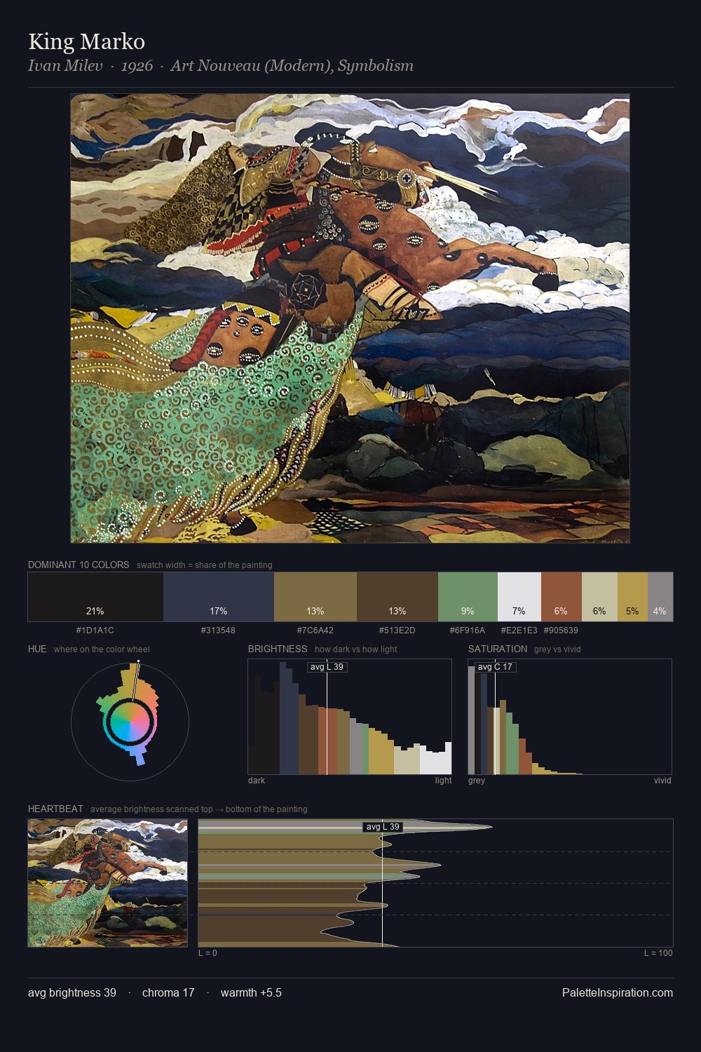
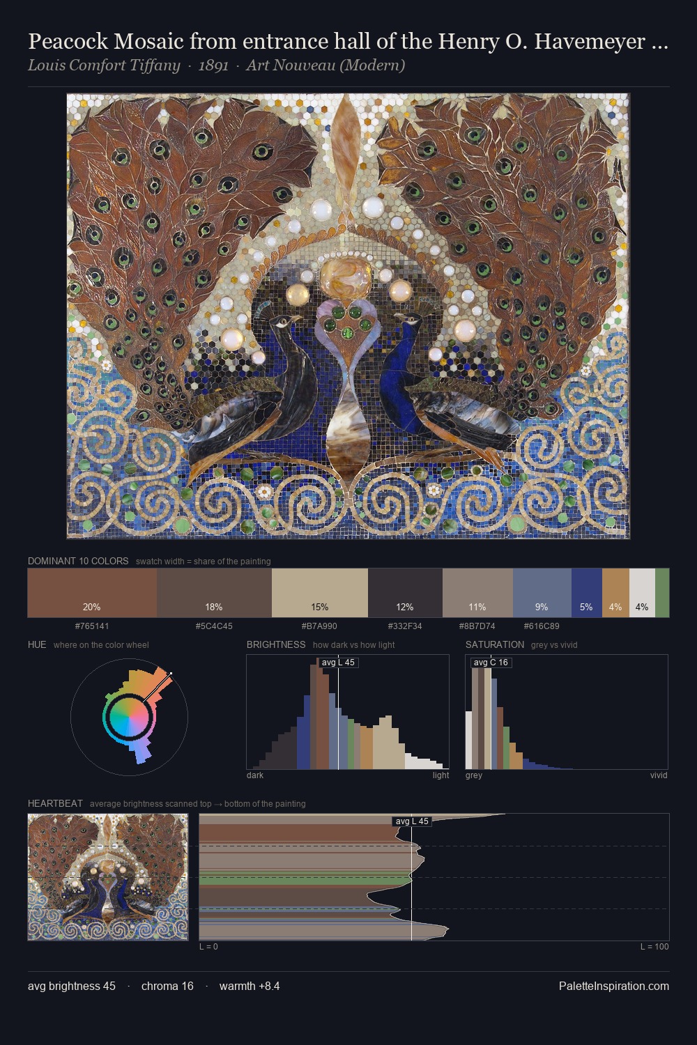
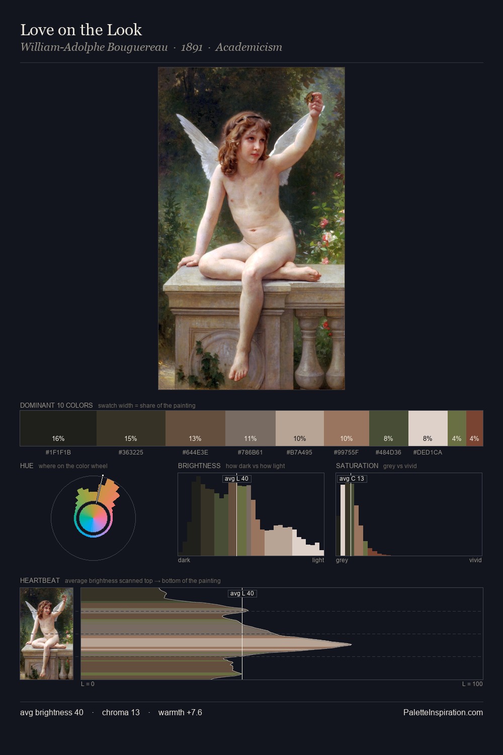
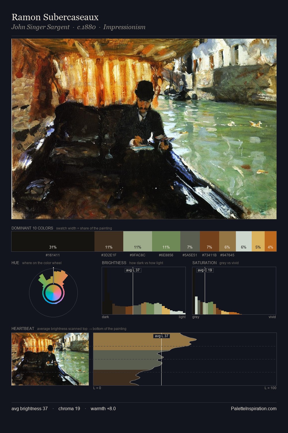
Cubism Palette 10
Soft Ecru
Soft Low-contrast, gentle chroma - mid-key values and low saturation, approachable and calm.
Ecru Unbleached linen - warm mid-neutral, slightly grayed, raw and natural.

Palette Analysis
Cubism is high-key - luminous, open, and weighted toward light. Temperature is balanced: the palette pits warm earth against cool sky without declaring a winner. The absence of saturated colour is itself an expressive choice: this is a palette of restraint and atmosphere. The highest-chroma note - #94774D - appears at just 7.5%, deployed as a precision accent against the quieter ground. A value spread of 66 units gives the palette both depth and air - shadows are genuinely dark, lights genuinely light.
Example use cases
- exhibition design
- foundation branding
- estate management
- art education
- museums & galleries
I Love This!
Use This Palette
Copy, export, or download for your project
Copy, export, or download for your project
Copy:
Download:
Share: