Romanticism Palette 9
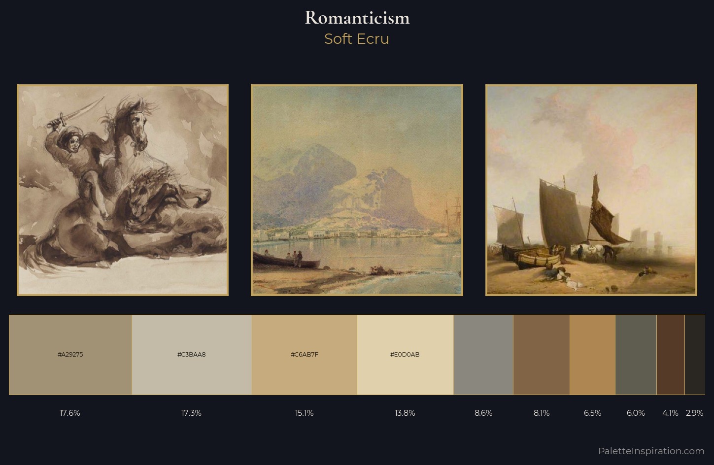
Soft Ecru
Soft Low-contrast, gentle chroma - mid-key values and low saturation, approachable and calm.
Ecru Unbleached linen - warm mid-neutral, slightly grayed, raw and natural.
Palette Analysis
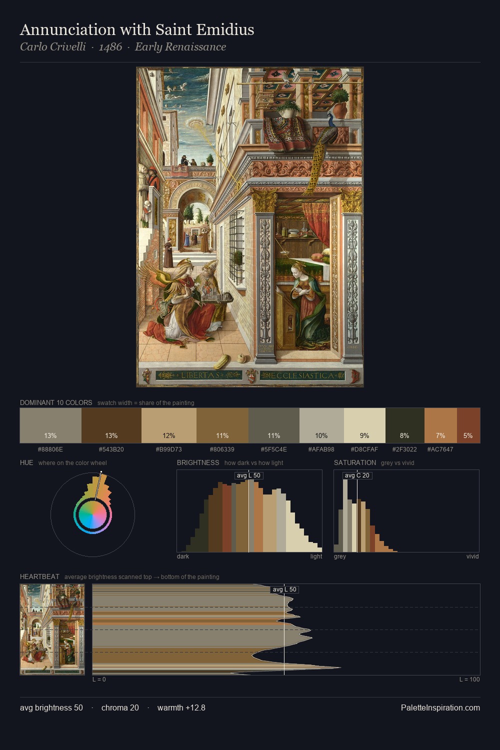
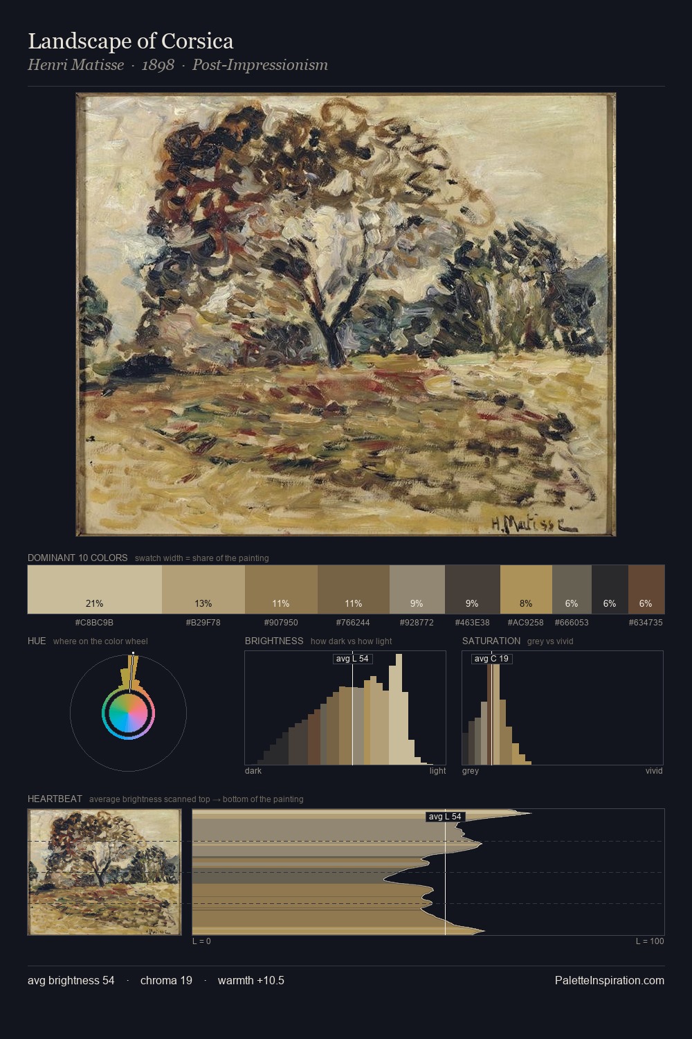
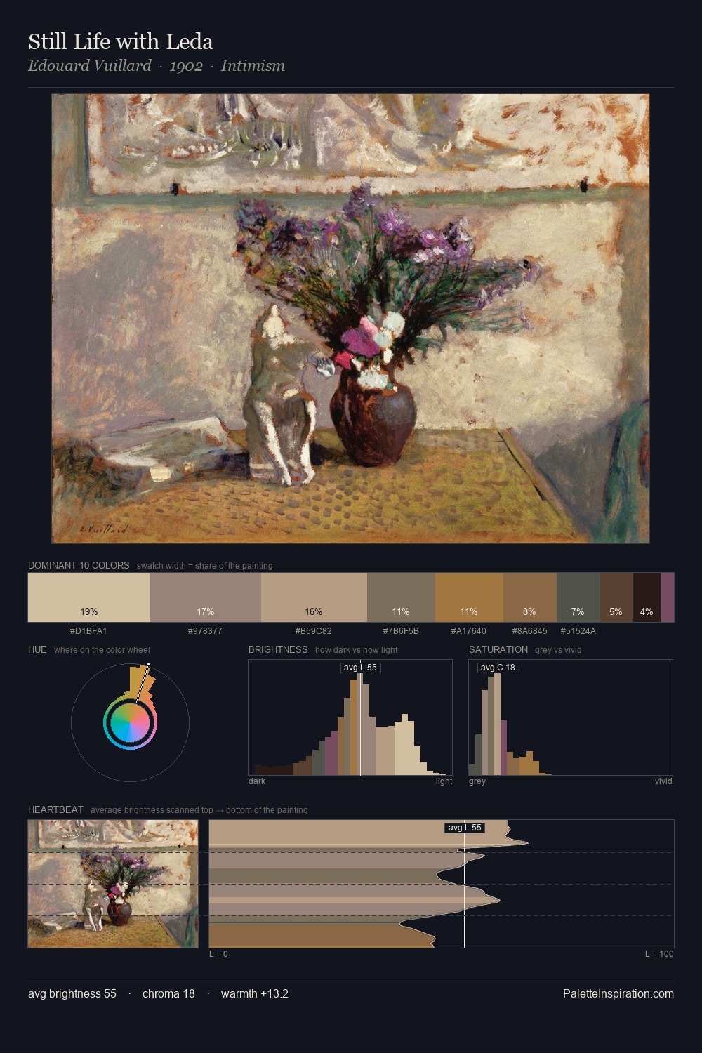
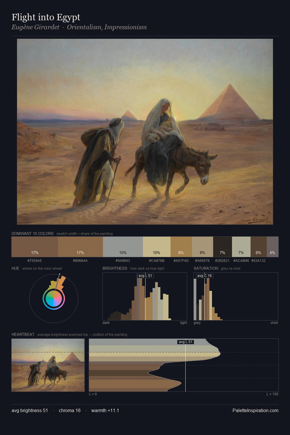
Romanticism is high in key: pale, luminous, and filled with optical air. Blues and teal-greys govern the palette, lending it an aquatic or atmospheric quality. Chroma hovers near zero; colour declares itself through subtle shifts in hue rather than outright saturation. The most saturated colour, #543A27, is reserved to 4.0% of the surface, where it acts as a focal punctuation. 59 units of value range underpin the palette's structural clarity: the eye always knows where light falls. The mid-to-high key, cool bias, and moderate chroma point to outdoor observation - sky and diffused daylight as the dominant light source.
Example use cases
- ceramics & pottery
- boutique hospitality
- menswear
- heritage food brands
- craft & artisan brands
I Love This!
Use This Palette
Copy, export, or download for your project
Copy, export, or download for your project
Copy:
Download:
Share: