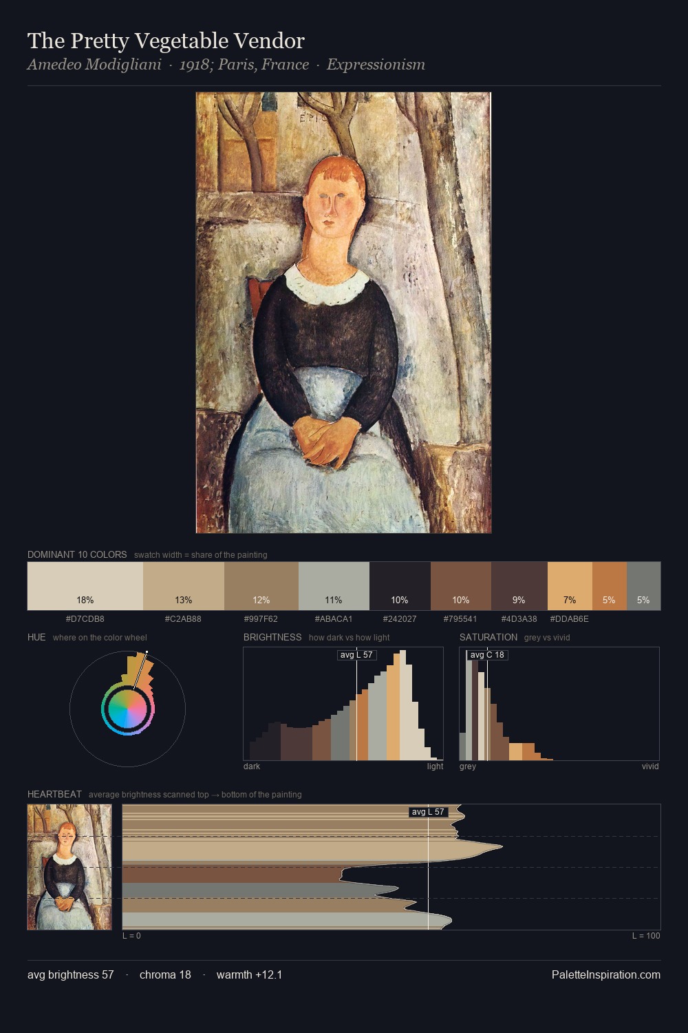
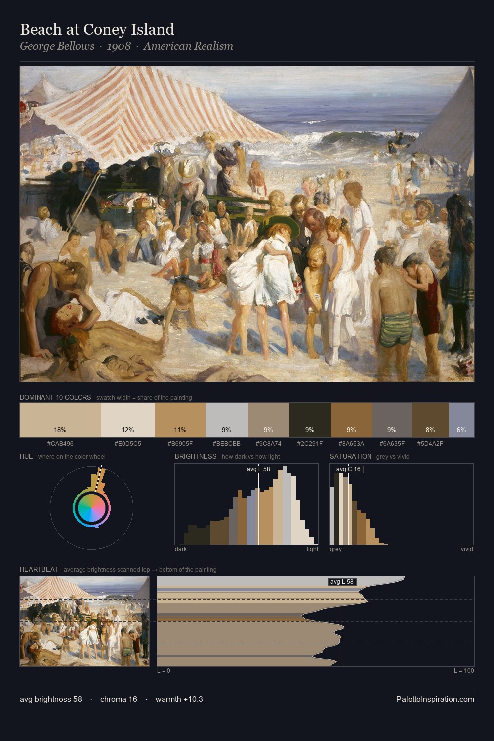
Romanticism Palette 4
Palette Analysis
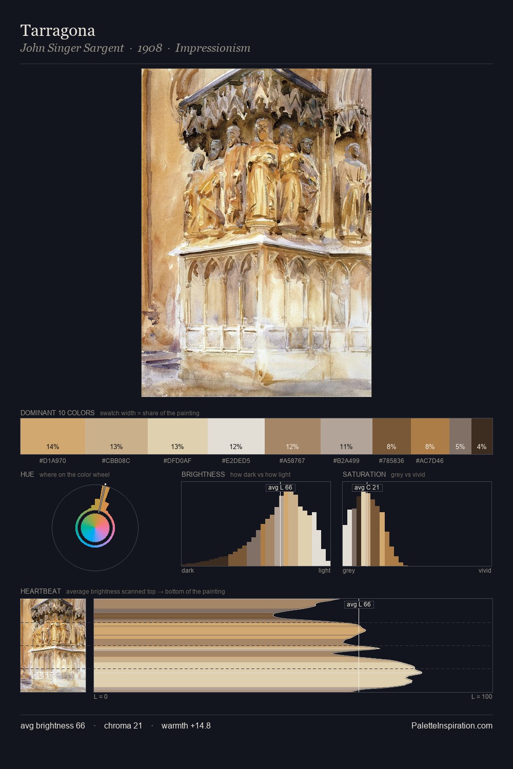
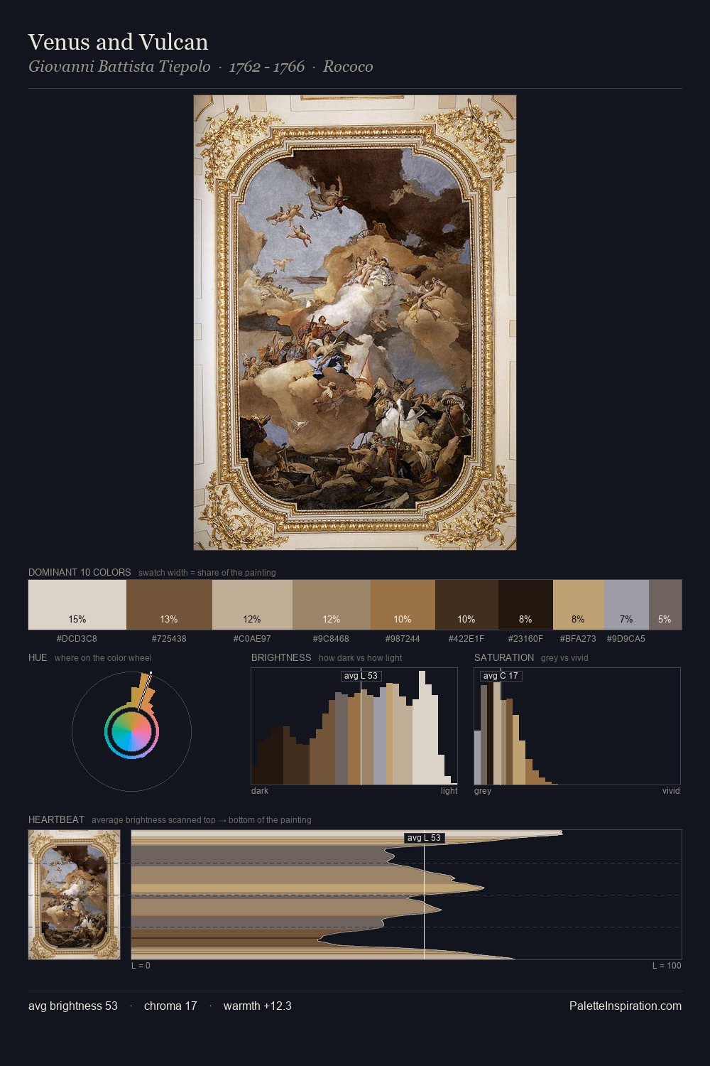
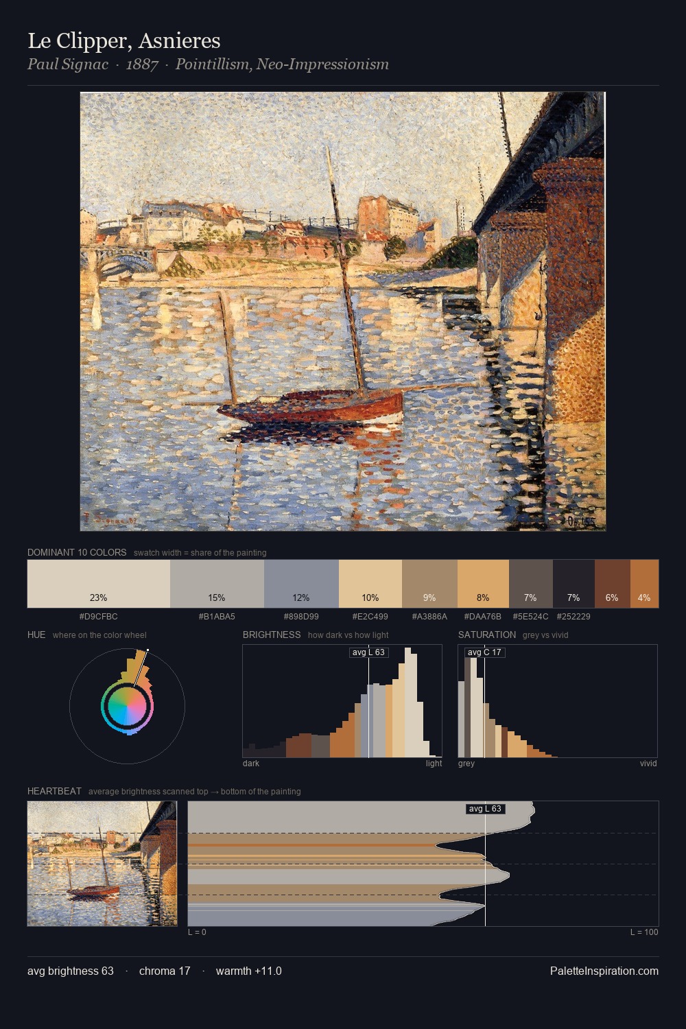
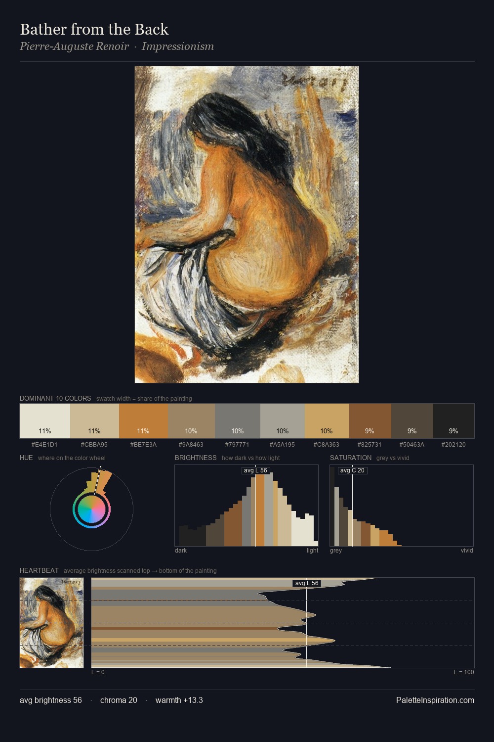
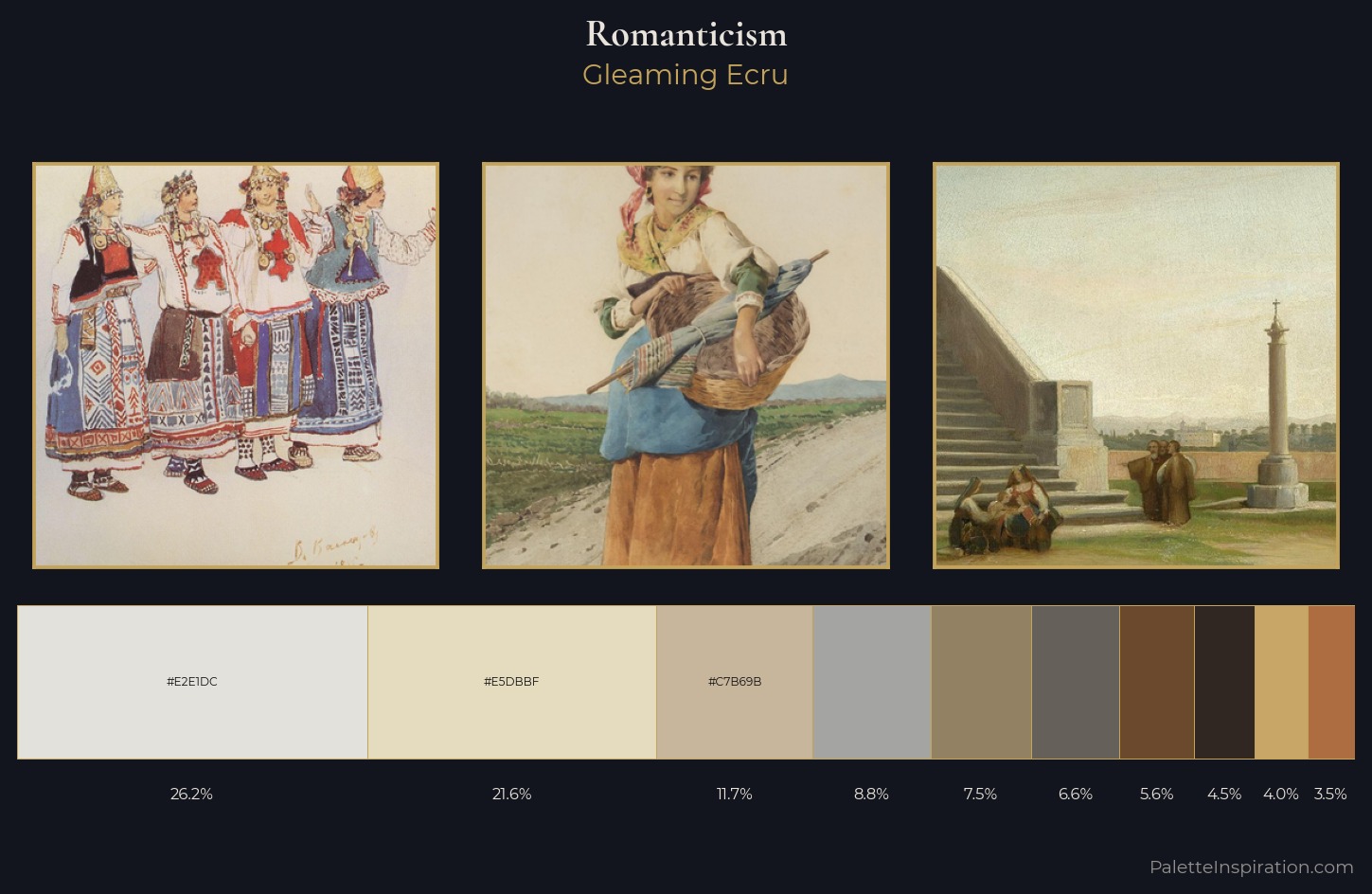
Values in Romanticism tilt decisively toward white, giving the palette its luminous character. Temperature is cool-dominant, with blue and green families claiming the largest areas. Chroma hovers near zero; colour declares itself through subtle shifts in hue rather than outright saturation. 26.2% of the palette belongs to #E2E1DC, a concentration that makes it the unmistakable visual centre. The highest-chroma note - #AD6D41 - appears at just 3.5%, deployed as a precision accent against the quieter ground. The value range spans 63 units across the palette, providing the full gamut from deep shadow to near-white and ensuring clear tonal hierarchy. High luminosity and cool temperature suggest the plein-air condition: unfiltered daylight and open sky.
Example use cases
- ceramics & pottery
- boutique hospitality
- menswear
- heritage food brands
- craft & artisan brands
I Love This!
Copy, export, or download for your project