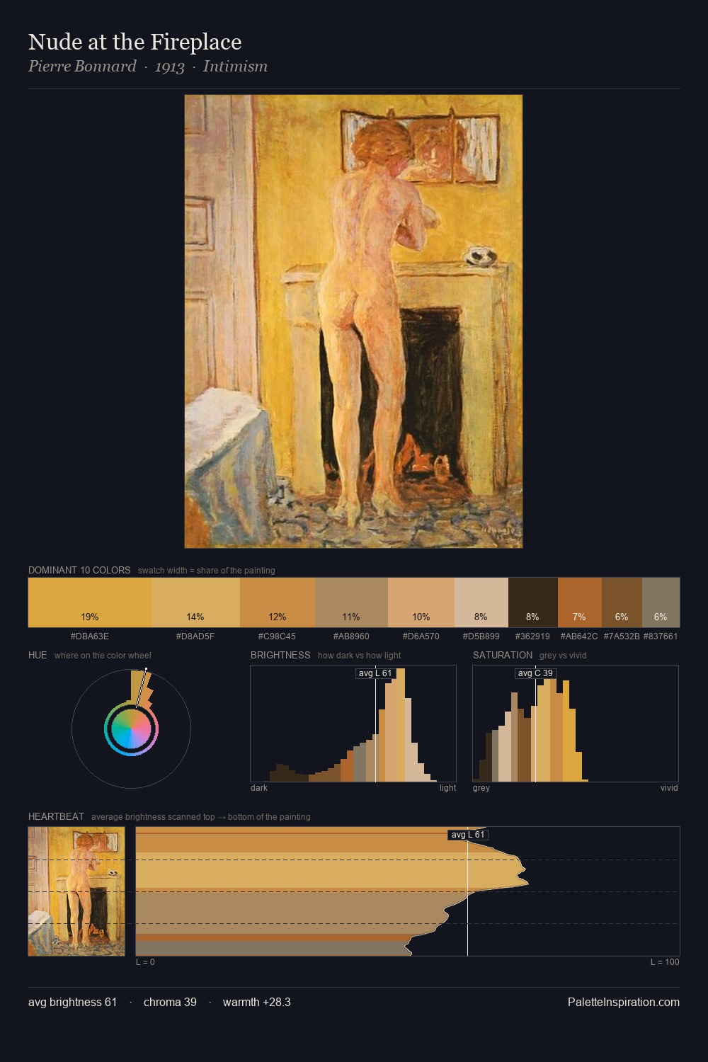
Romanticism Palette 11
Veiled Fawn
Veiled Partially obscured light - mid-dark with a hazy, scrim-filtered quality.
Fawn Light warm tan - the color of a young deer, soft and golden-brown.

Palette Analysis
Romanticism occupies the comfortable middle of the value scale, avoiding both extremes to hold the eye in a sustained middle grey. Warm and cool are kept in productive tension, creating the kind of chromatic harmony that sustains the eye. Colours are neither washed out nor blazing; they occupy the productive middle ground of the chroma scale. Only 5.6% is devoted to #9B542B, yet that small allocation delivers the palette's entire chromatic tension. The full value range is 56 units: broad enough to build convincing three-dimensional form. The palette reads as an Impressionist one - light-biased, chromatically direct, and built on temperature contrast rather than value opposition.
Example use cases
- food packaging
- leather accessories
- travel & outdoor
- natural cosmetics
- interior design
I Love This!
Use This Palette
Copy, export, or download for your project
Copy, export, or download for your project
Copy:
Download:
Share: