Romanticism Palette 1
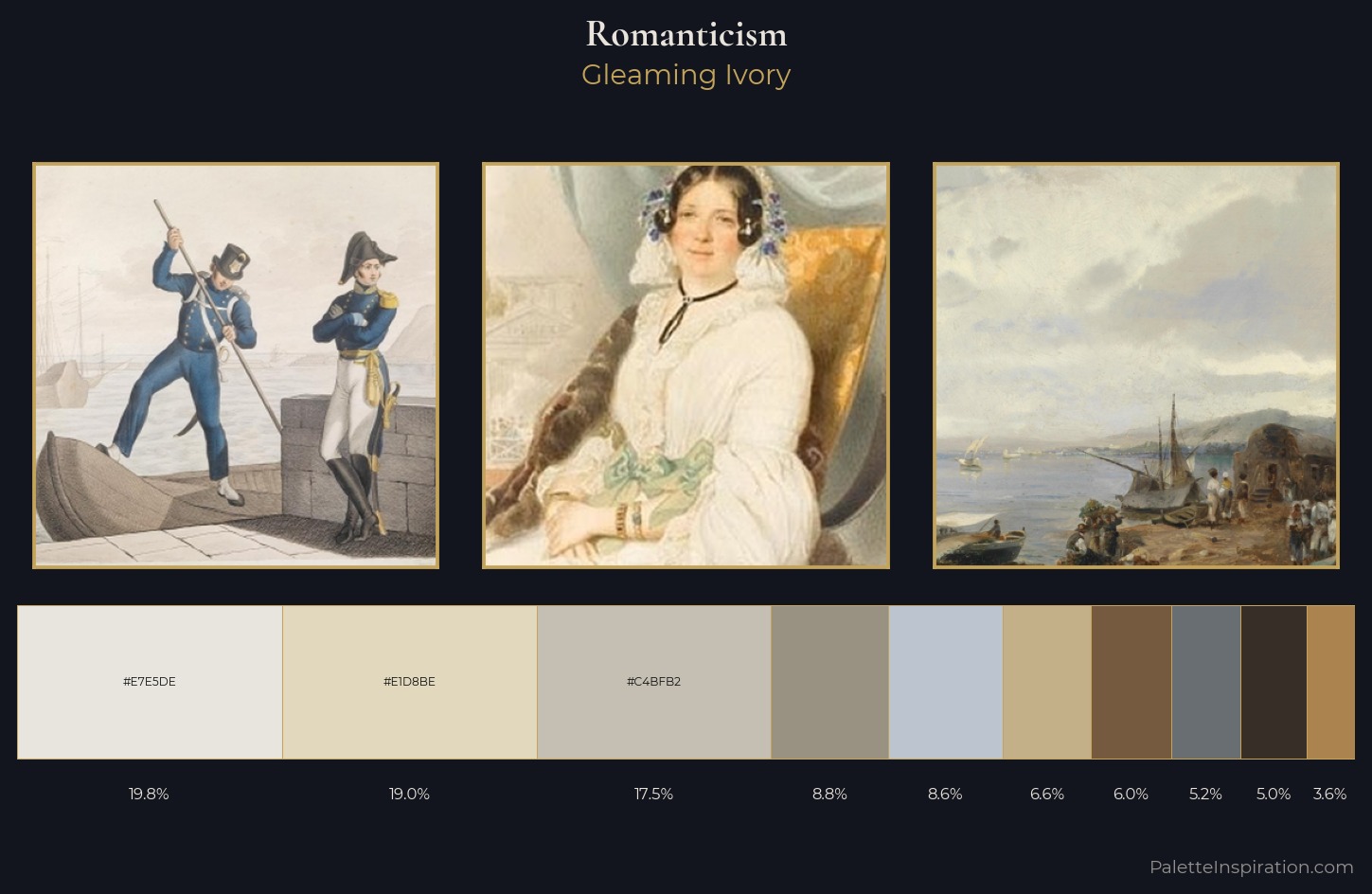
Gleaming Ivory
Gleaming Bright and polished - high-key, often warm, suggesting reflective or luminous surfaces.
Ivory Warm creamy white - the color of natural ivory, warmer than pure white.
Palette Analysis
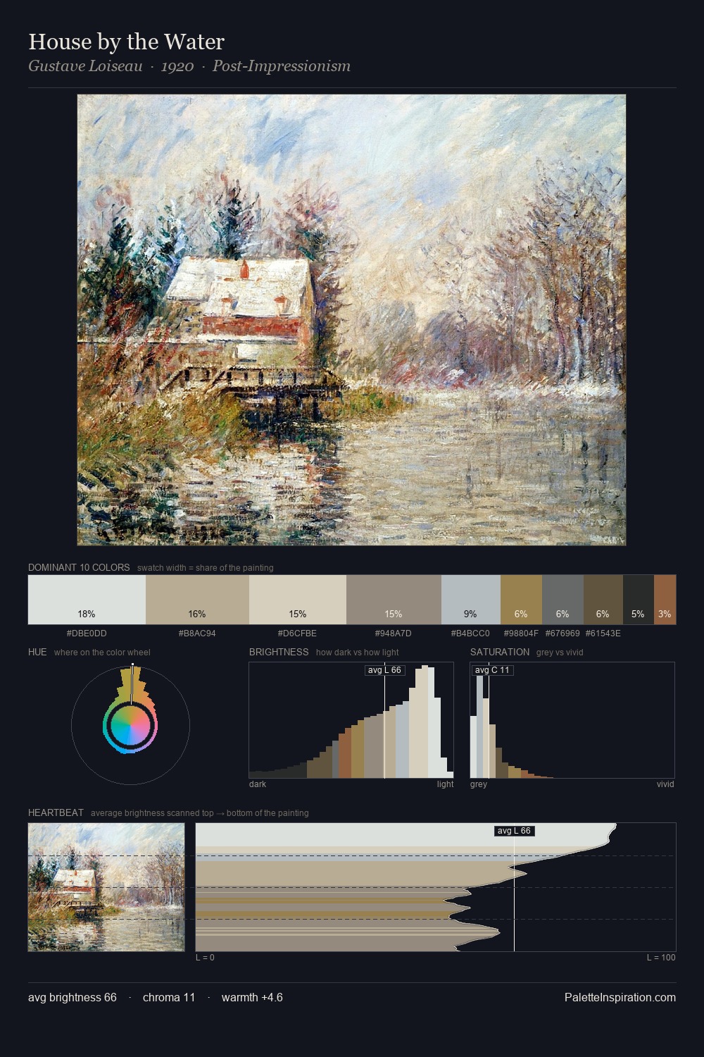
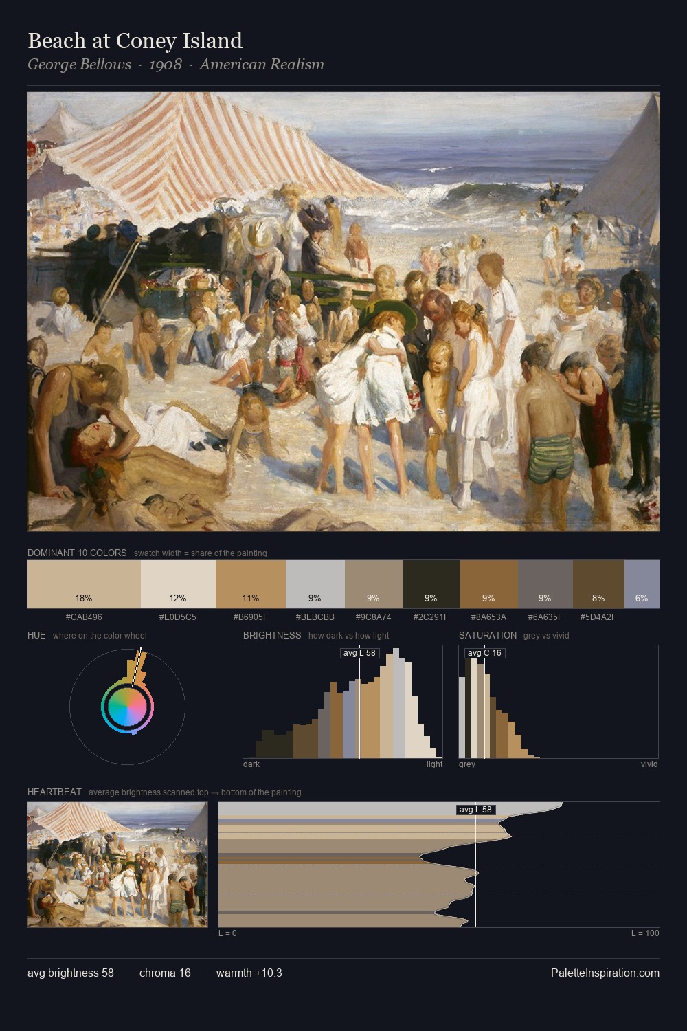
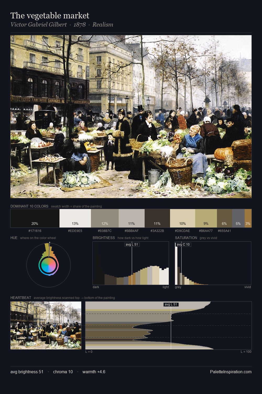
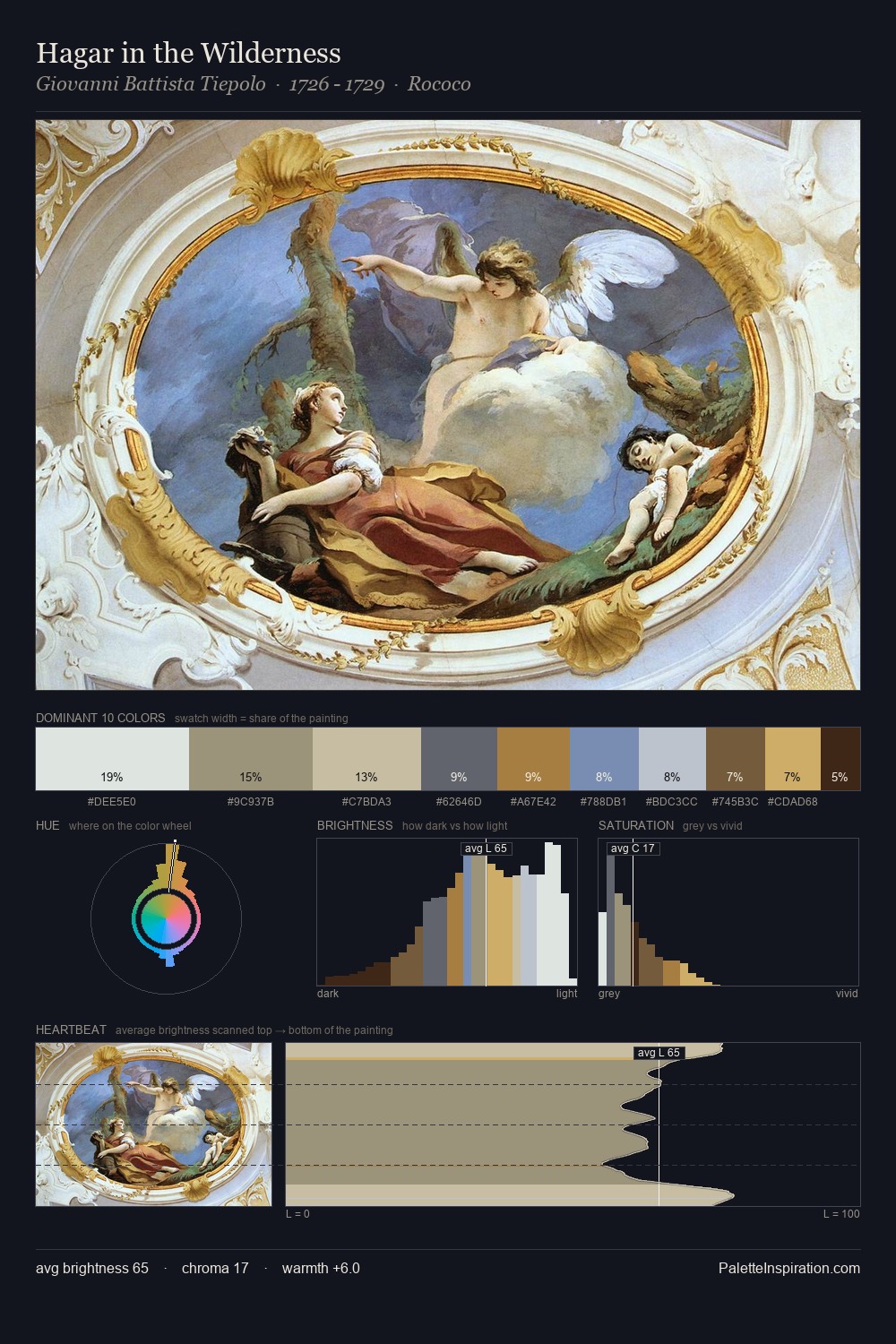
The high-key values of Romanticism give it an effulgent, almost bleached quality. Cool tones set the register here - the blues and greens easily outweigh any warm accents. Chroma is kept low across all colours, producing the soft, enveloping quality that characterises tonal painting. The highest-chroma note - #755A40 - appears at just 6.0%, deployed as a precision accent against the quieter ground. At 61 units of value range, the palette has the tonal breadth to sustain complex spatial readings. The mid-to-high key, cool bias, and moderate chroma point to outdoor observation - sky and diffused daylight as the dominant light source.
Example use cases
- florist branding
- event design
- real estate
- jewelry retail
- hospitality branding
I Love This!
Use This Palette
Copy, export, or download for your project
Copy, export, or download for your project
Copy:
Download:
Share: