Pointillism Master Palette

Palette Analysis
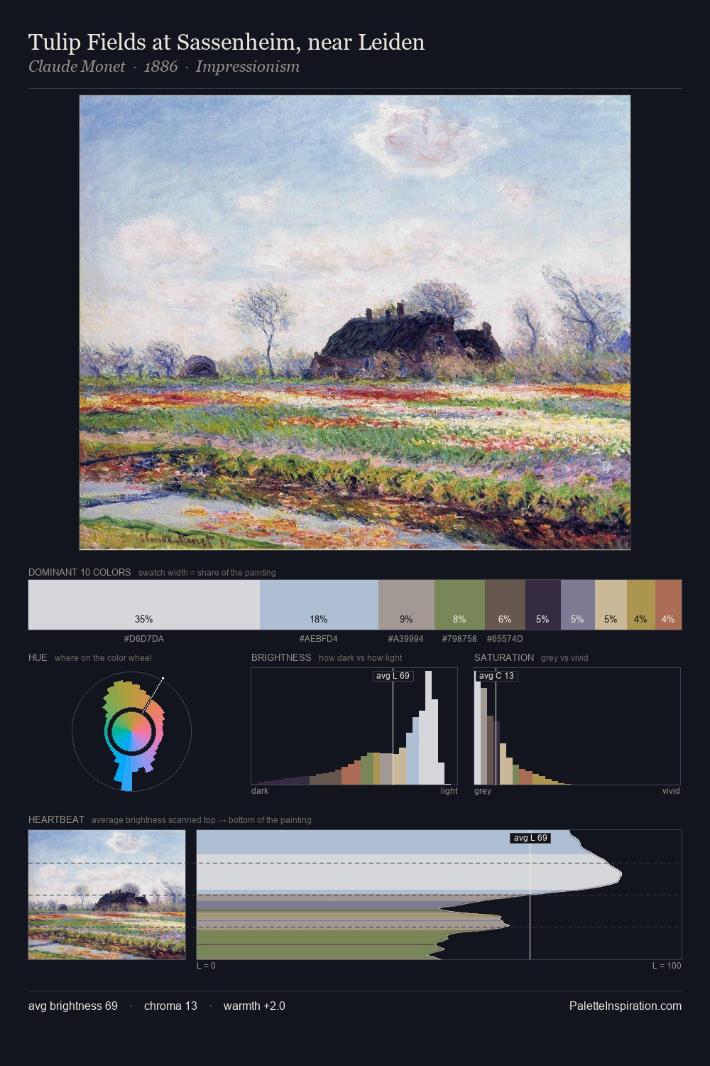
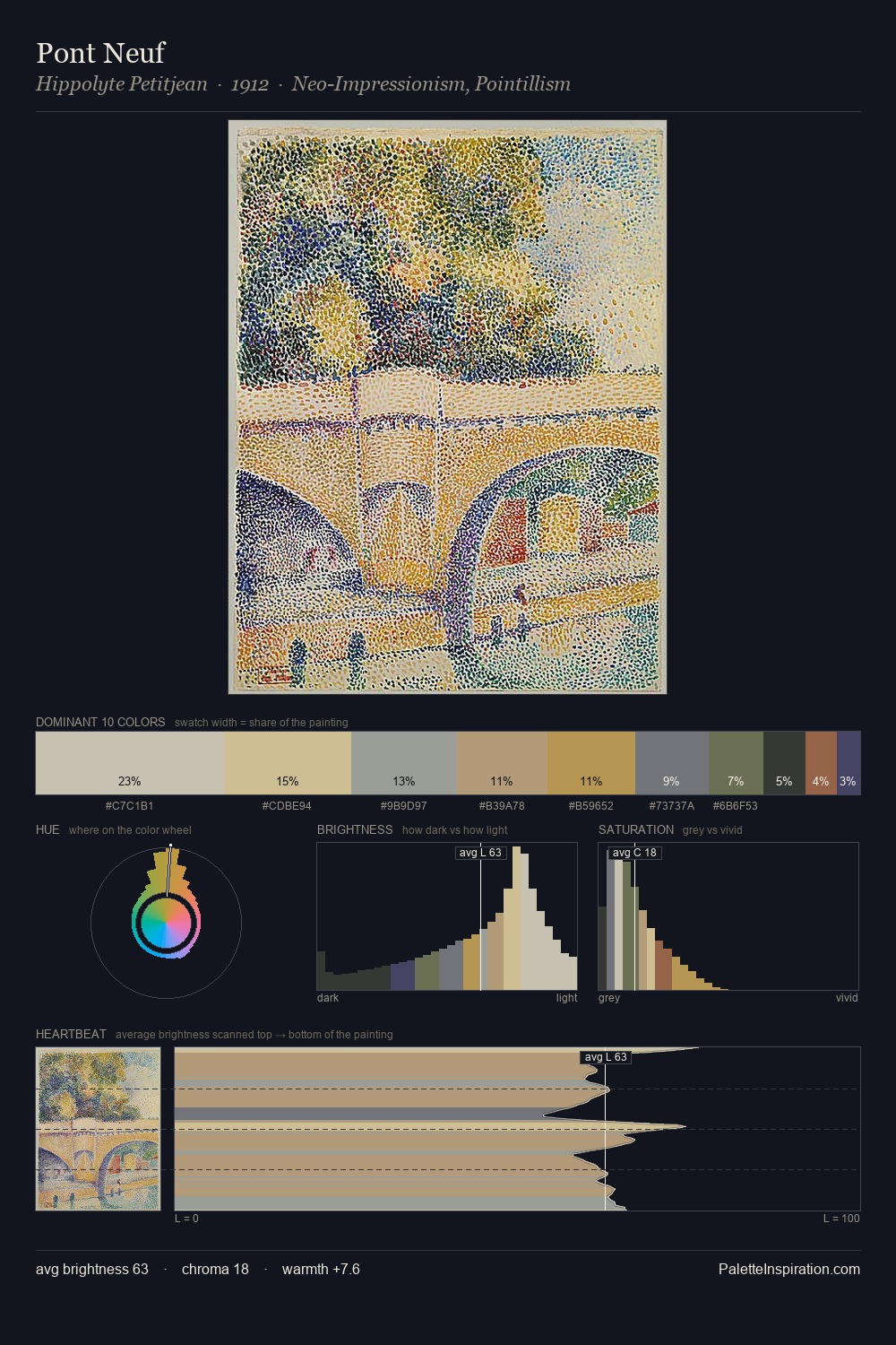
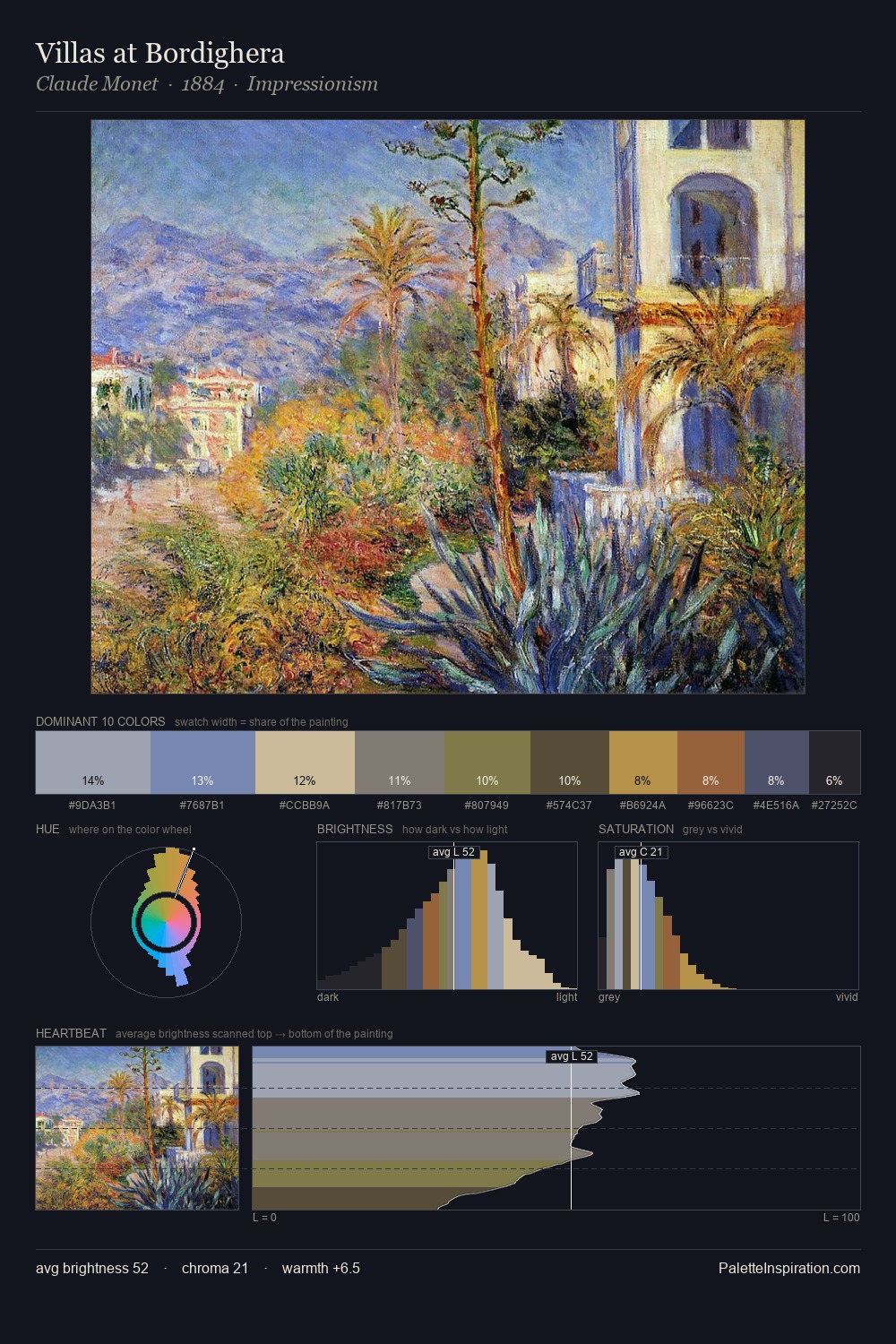
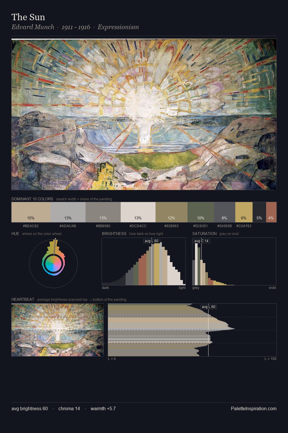
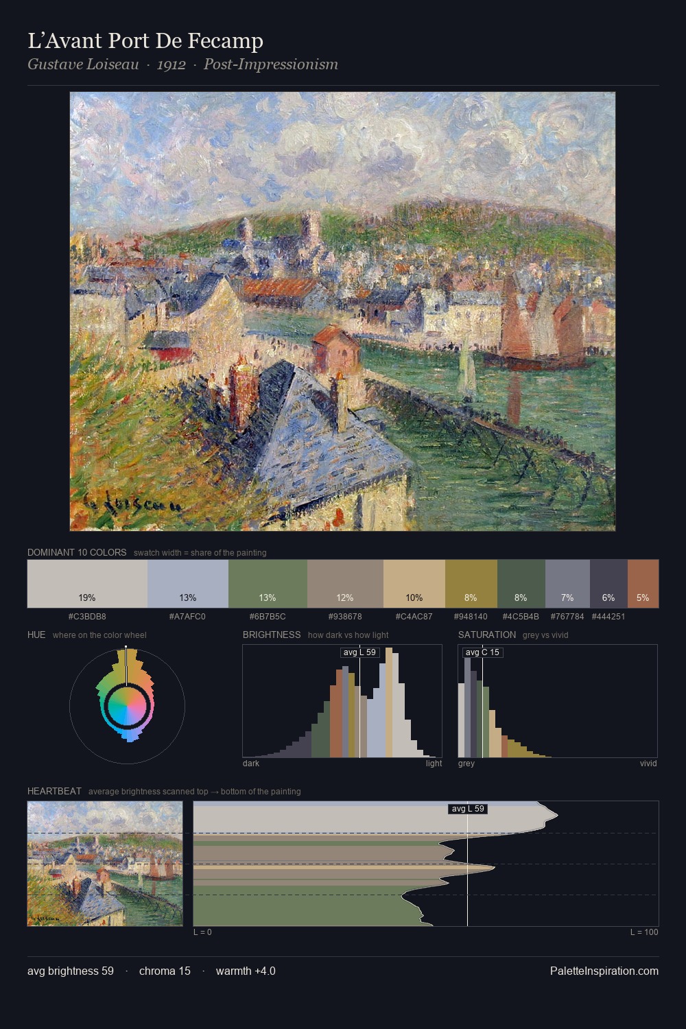
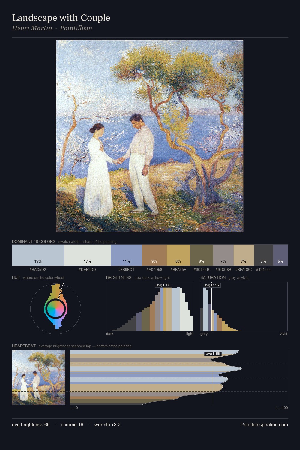
Pointillism as a style is partly defined by its colour: this palette makes that definition concrete. Pointillism distributes its values across the middle register, creating harmony without high contrast. A distinctly cool atmosphere runs through this palette: sky, water, and mist given colour form. Muted throughout, the palette achieves its effects through value and temperature rather than chromatic force. The saturated accent, #9C674B, registers at 6.9% - sparse enough to feel like a deliberate surprise. The value range of 52 units sits in the comfortable middle: enough depth, enough light, neither extreme. High luminosity and cool temperature suggest the plein-air condition: unfiltered daylight and open sky. This is the light that Pointillism painters chose to live inside.
Example use cases
- archival print
- university identity
- rare books
- cultural institutions
- nonprofit identity
I Love This!
Copy, export, or download for your project