Pointillism Palette 21
Shadowed Parchment
Shadowed Low-key - values weighted toward shadow, the palette of dim interiors and overcast skies.
Parchment Aged warm neutral - the color of old manuscript parchment, tan and slightly yellowed.

Palette Analysis
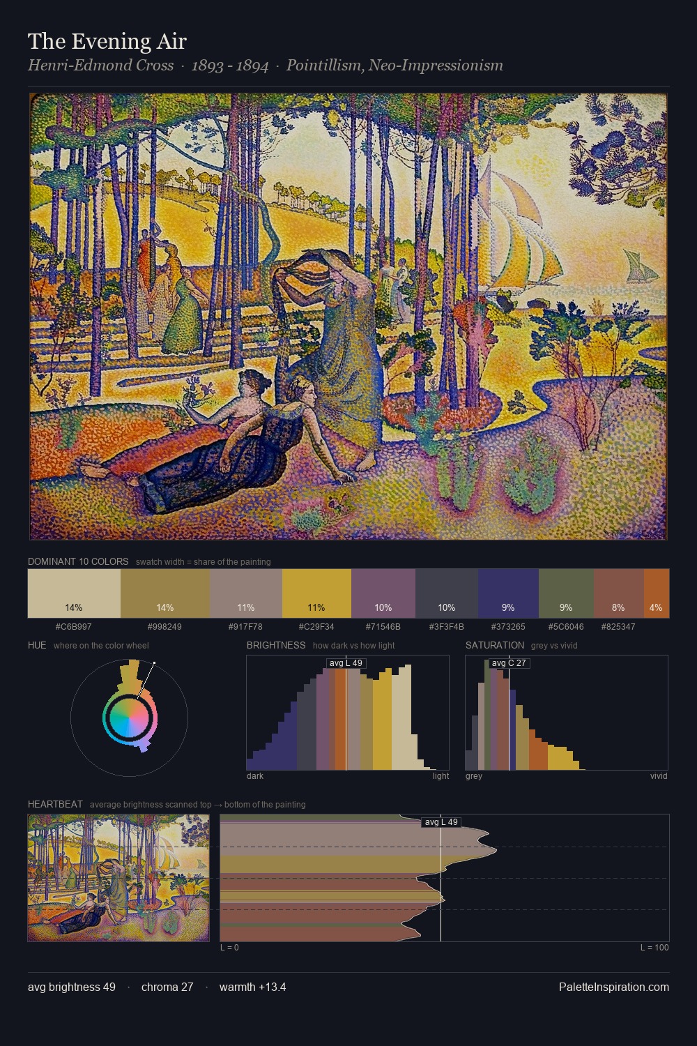
Pointillism occupies the comfortable middle of the value scale, avoiding both extremes to hold the eye in a sustained middle grey. Temperature is balanced: the palette pits warm earth against cool sky without declaring a winner. Every colour is desaturated; the palette proceeds through near-neutrals and gently-coloured greys. #92634F delivers the chromatic peak at only 10.9% - a small shot of colour with outsized visual impact. At 52 units across the value scale, the palette keeps contrast readable without letting it dominate.
Example use cases
- exhibition design
- foundation branding
- estate management
- art education
- museums & galleries
I Love This!
Use This Palette
Copy, export, or download for your project
Copy, export, or download for your project
Copy:
Download:
Share: