Pointillism Palette 1
Luminous Linen
Luminous Self-illuminated feeling - high-key values with an inner glow quality.
Linen Warm light neutral - the color of natural linen, slightly warm beige.

Palette Analysis
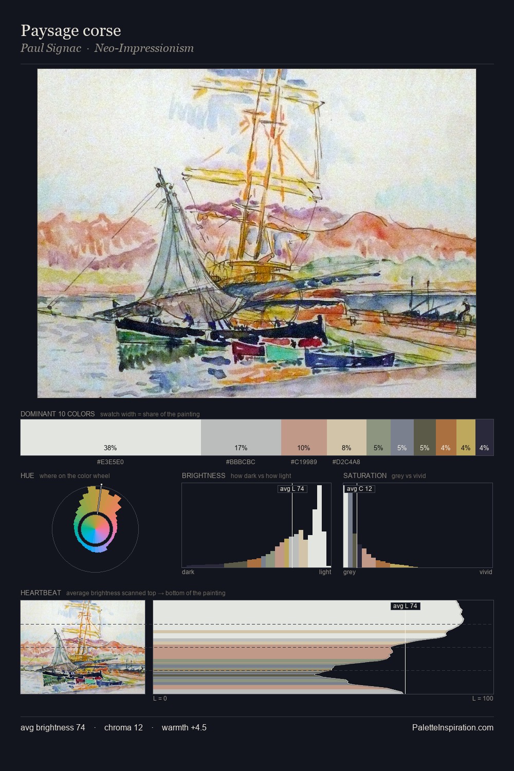
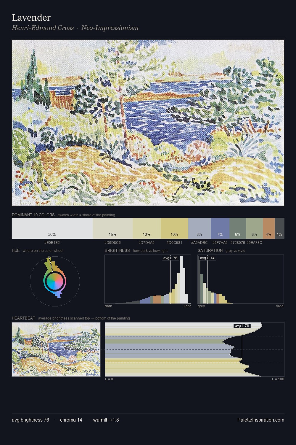
Values in Pointillism tilt decisively toward white, giving the palette its luminous character. The palette balances warm and cool with remarkable evenness, giving the composition its characteristic vibrancy. All colours lean toward grey, building depth through value rather than colour punch. The most saturated colour, #A67B61, is reserved to 6.6% of the surface, where it acts as a focal punctuation. Value range is moderate at 50 units - enough contrast for legibility, not so much as to fragment the tonal unity.
Example use cases
- florist branding
- event design
- real estate
- jewelry retail
- hospitality branding
I Love This!
Use This Palette
Copy, export, or download for your project
Copy, export, or download for your project
Copy:
Download:
Share: