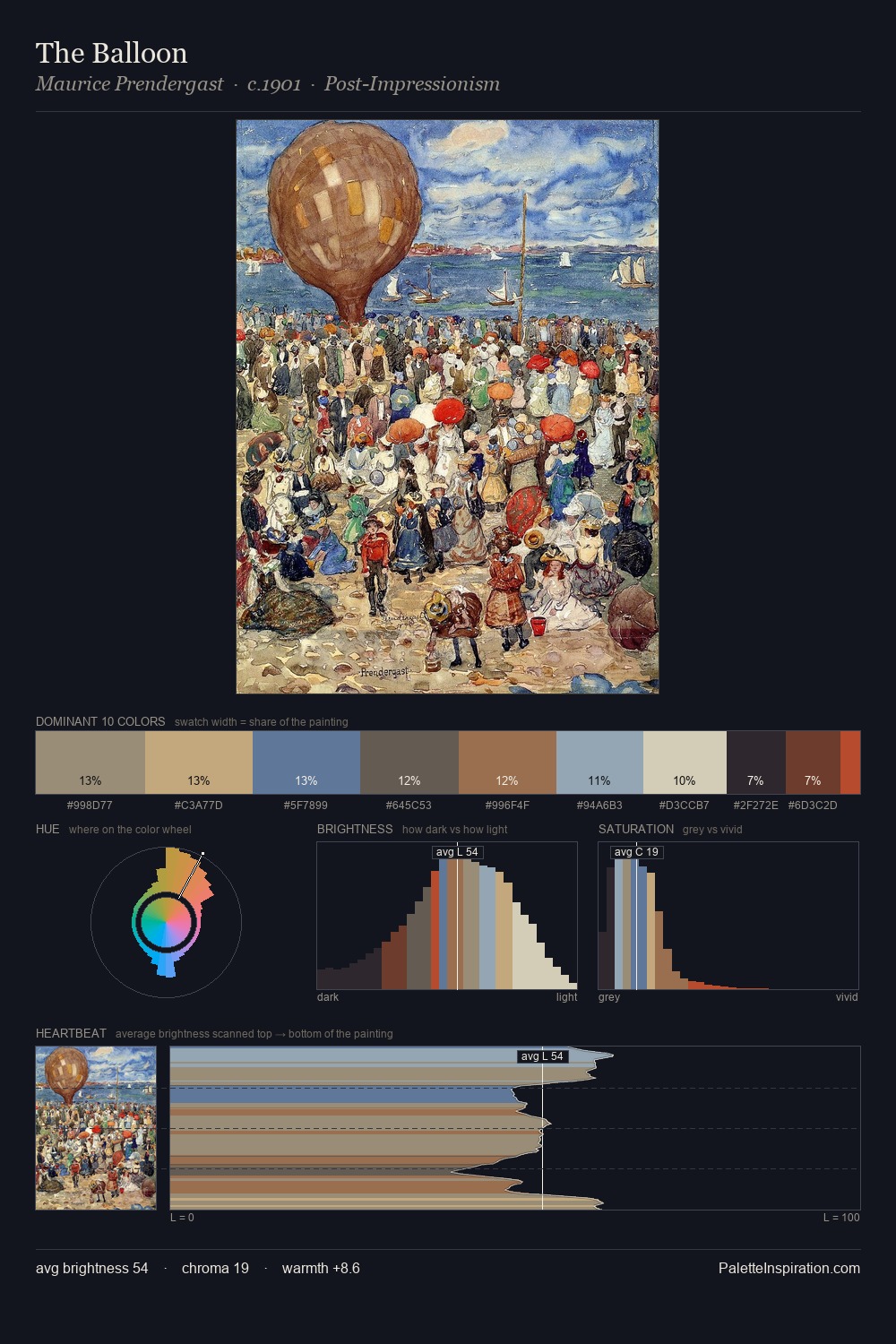
Pointillism Palette 8
Soft Ivory
Soft Low-contrast, gentle chroma - mid-key values and low saturation, approachable and calm.
Ivory Warm creamy white - the color of natural ivory, warmer than pure white.

Palette Analysis
Light floods Pointillism; the palette keeps values pale and airy across its range. Temperature is balanced: the palette pits warm earth against cool sky without declaring a winner. The absence of saturated colour is itself an expressive choice: this is a palette of restraint and atmosphere. Only 4.5% is devoted to #9C715D, yet that small allocation delivers the palette's entire chromatic tension. The palette spans 53 value units: a measured range that delivers coherence over drama.
Example use cases
- florist branding
- event design
- real estate
- jewelry retail
- hospitality branding
I Love This!
Use This Palette
Copy, export, or download for your project
Copy, export, or download for your project
Copy:
Download:
Share: