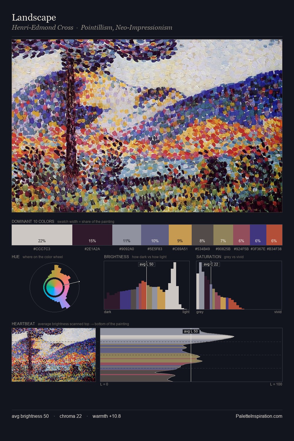
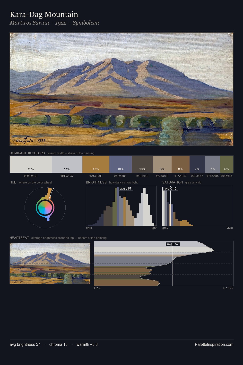
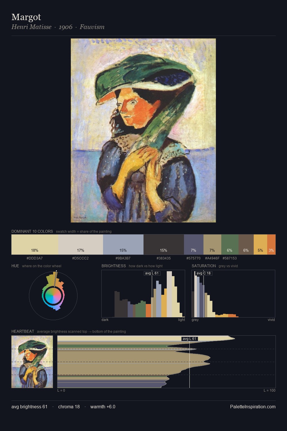
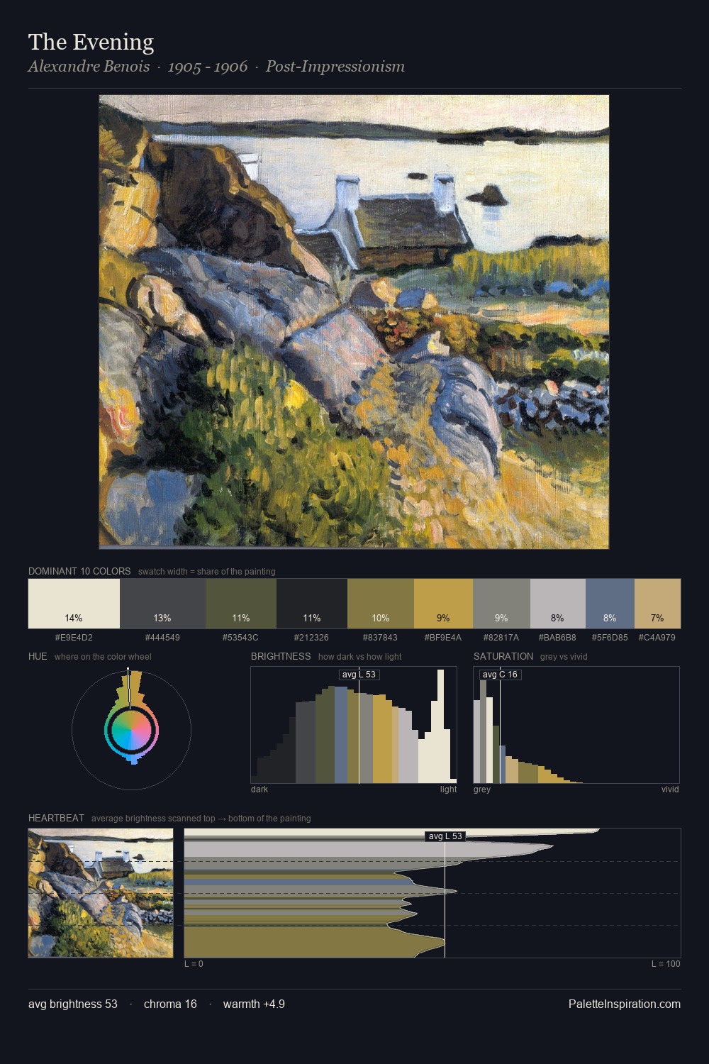
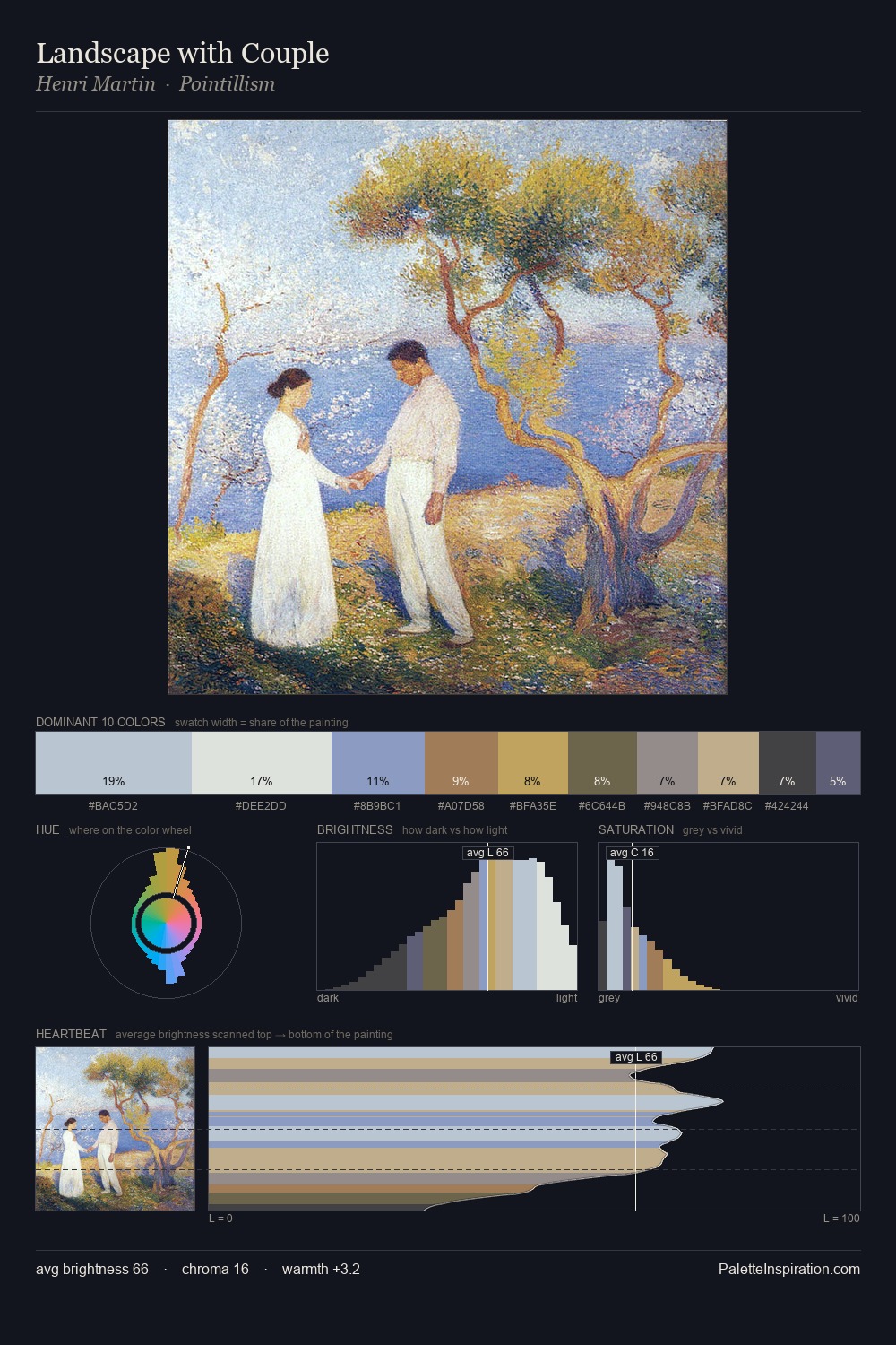
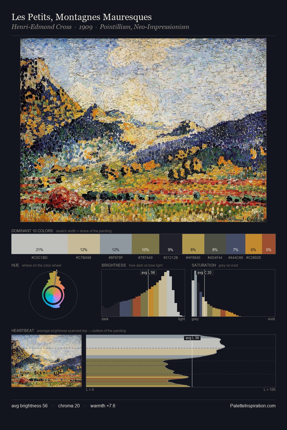
Pointillism Palette 2
Luminous Ivory
Luminous Self-illuminated feeling - high-key values with an inner glow quality.
Ivory Warm creamy white - the color of natural ivory, warmer than pure white.

Palette Analysis
Values in Pointillism tilt decisively toward white, giving the palette its luminous character. Warm and cool are kept in productive tension, creating the kind of chromatic harmony that sustains the eye. Chroma is kept low across all colours, producing the soft, enveloping quality that characterises tonal painting. #C39D80 functions as the palette's exclamation mark: highest chroma, lowest percentage (7.7%). Value range is moderate at 53 units - enough contrast for legibility, not so much as to fragment the tonal unity.
Example use cases
- fashion retail
- home textiles
- travel platforms
- beauty packaging
- food & beverage
I Love This!
Use This Palette
Copy, export, or download for your project
Copy, export, or download for your project
Copy:
Download:
Share: