Pointillism Palette 6
Pale Ivory
Pale High-key and low-chroma - delicate, bleached, washed with light.
Ivory Warm creamy white - the color of natural ivory, warmer than pure white.

Palette Analysis
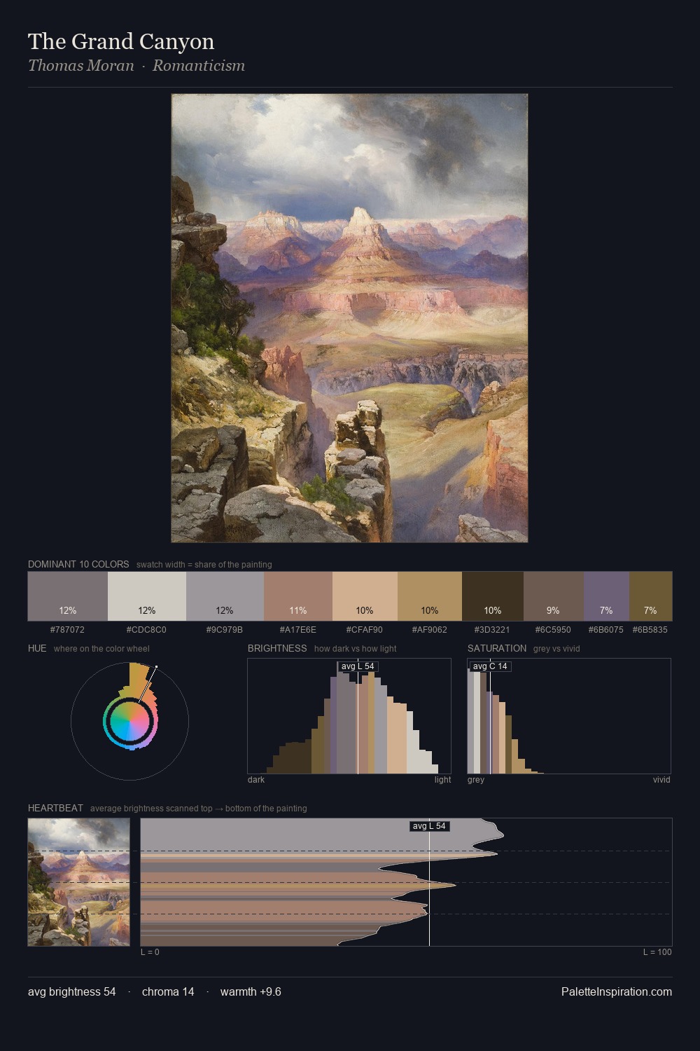
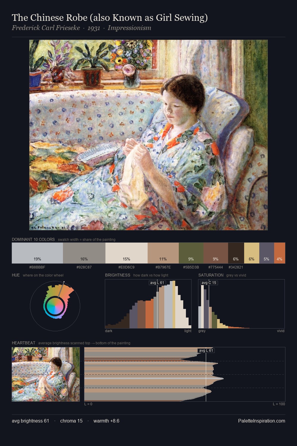
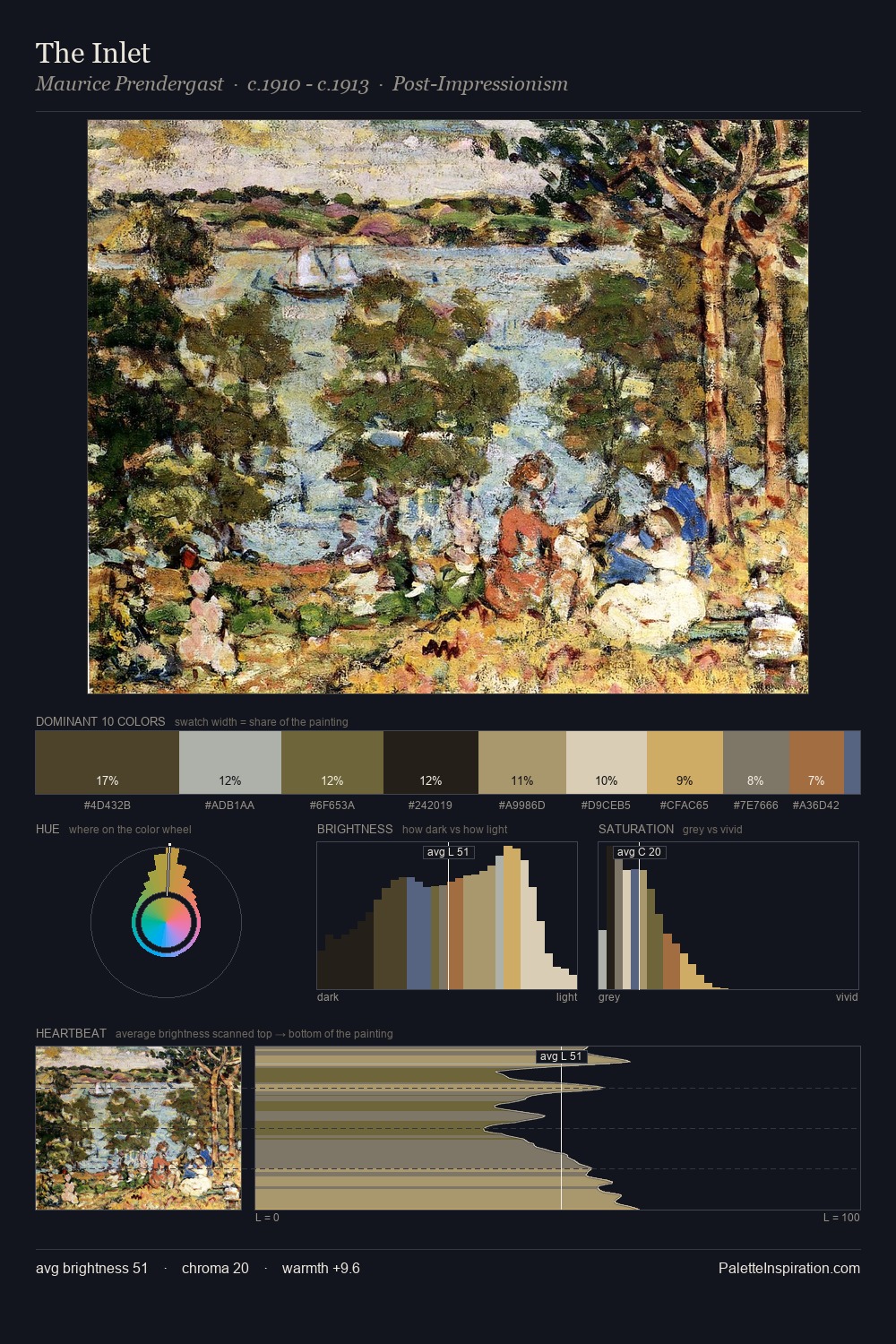
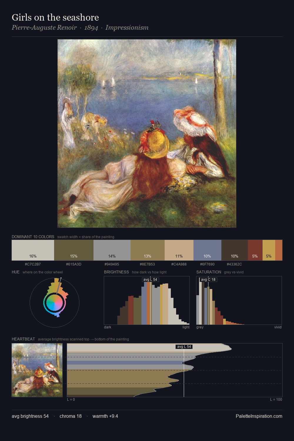
Pointillism is high in key: pale, luminous, and filled with optical air. The dominant temperature is warm, with earth tones and fire-hues setting the emotional key. Saturation is deliberately withheld - the beauty here lies in the near-monochromatic gradations rather than colour difference. At 3.4%, #625D29 carries the palette's sharpest chromatic charge: an accent that earns its place precisely because it is withheld. The palette spans 52 value units: a measured range that delivers coherence over drama.
Example use cases
- florist branding
- event design
- real estate
- jewelry retail
- hospitality branding
I Love This!
Use This Palette
Copy, export, or download for your project
Copy, export, or download for your project
Copy:
Download:
Share: